


Tutorial: Create a hard beveled stoney text effect!
 is licensed under a Create Commons Attribution-Non Commercial 3.0 Unported license.")

Download GIMP workspace (.xcfbz2) (3.32 MB)
Motivation
This tutorial shows you how to create a hard beveled text on a stoney surface with some special shadows. I took that idea from the Game of Thrones facebook page, where they had a similar effect on their title image.
Tutorial details
- Category: Text effects
- Time to reproduce: ≈50.0 minutes

- Tested with GIMP 2.8
-
1
The tutorial is splitted into 3 parts (beveled text, stoney background and an interesting long shadow)
Let’s make the beveld text first.
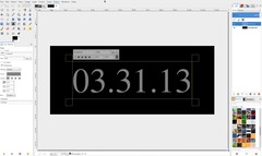
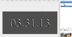
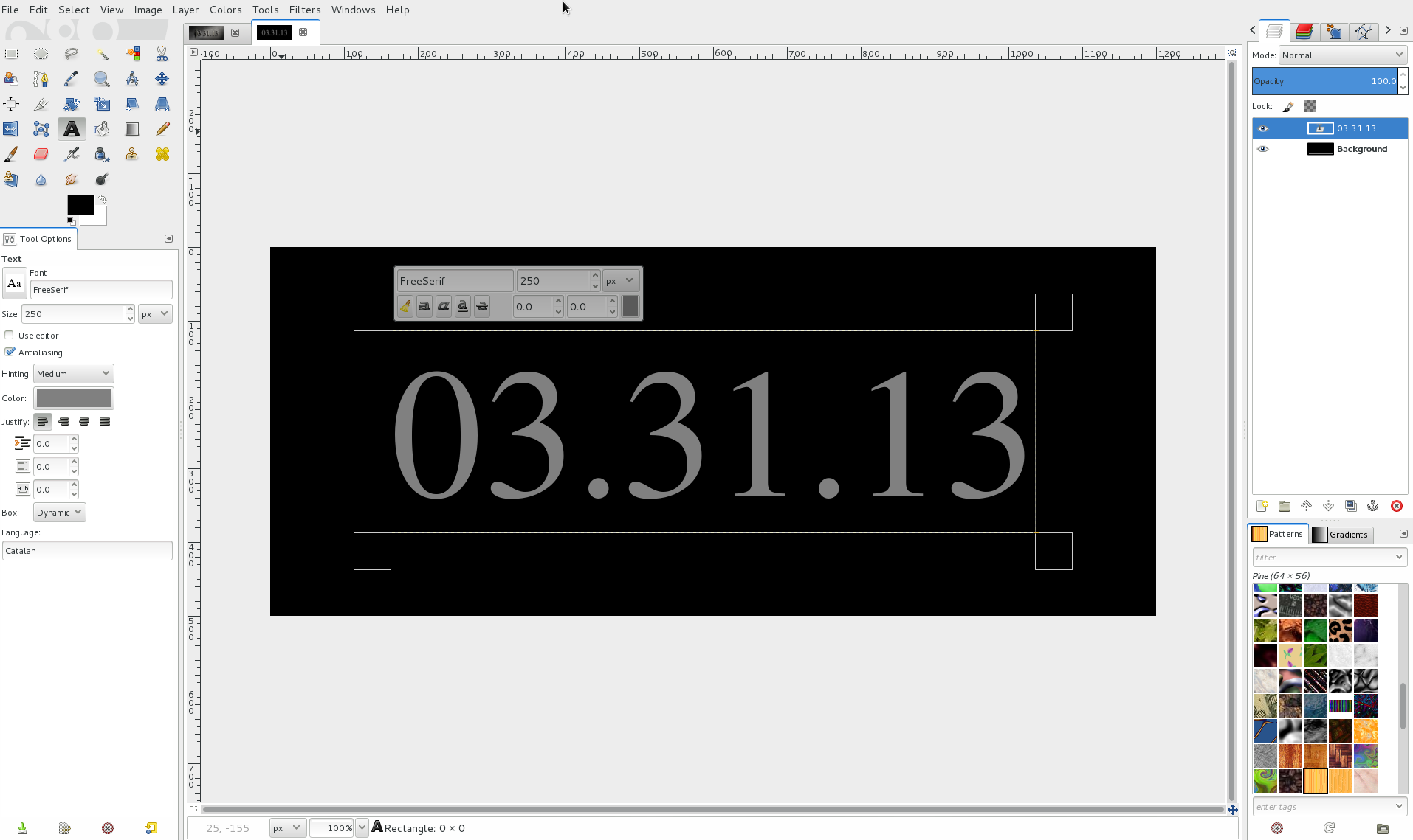
Create a 1200×500px image with black background.
Choose the Text Tool, set the size to 250 and choose a medium gray as text color (i.e. #808080). Then write something into the middle of the screen. I chose the date of the season 3 premier of Game of Thrones.
-
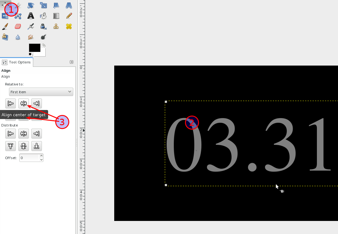
2
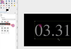
To easily center the text use the alignment tool (1). Click on the text on the canvas (2), then center horizontally and vertically by clicking the appropriate buttons (3).
-
3
Go to Layer / Layer to Image Size. This discards the text information.
For the bevel we need a channel that will contain the information where the bevel of the text should reflect light and where not. A channel can only contain black, white and shades of gray. For the kind of thing we want to do it should contain a blurred version of the text we just created. The quick and dirty way to do this is:
- Right click the text layer in the layers stack and choose “Alpha to selection”. (alternatively holt ALT and click the layer thumb in the stack [ALT+WINDOWS in Ubuntu])
- Menu: Select / Feather: at least 15px with the size of the text we just wrote.
- Select / Save to channel – This will activate the channels stack.
-
4
Disable the Selection by clicking CTRL+SHIFT+A or Select / None.
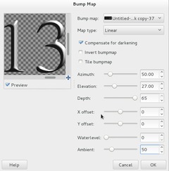
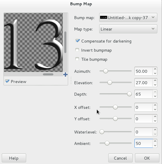
We’ve got a blurred version of the text now in our channels stack. To use it switch back to the layers stack and click the text layer to activate it.
Go to Filter / Map / Bump-Map and use the values from the image. Don’t forget to choose the channel mask we’ve just created in the Bump map drop down menu!
-
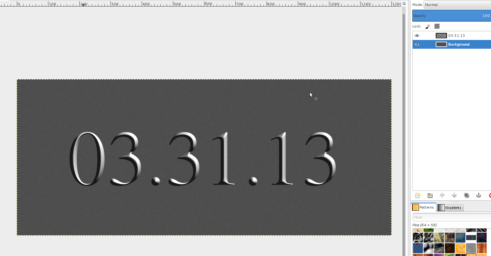
5
Now we’ve got a nice and sharp beveled text.
Time for the stoney background:
Select the background layer. Fill it with a darker gray: #4e4e4e. Then fo to Filter / Noise / HSV Noise (values 2/15/0/11).
-
6
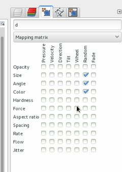
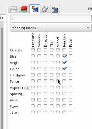
Create a new transparent layer above the Background layer.
Window / Dockable Dialogs / Paint dynamics. click the “new dynamics” button. Check these values:
-
7
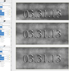
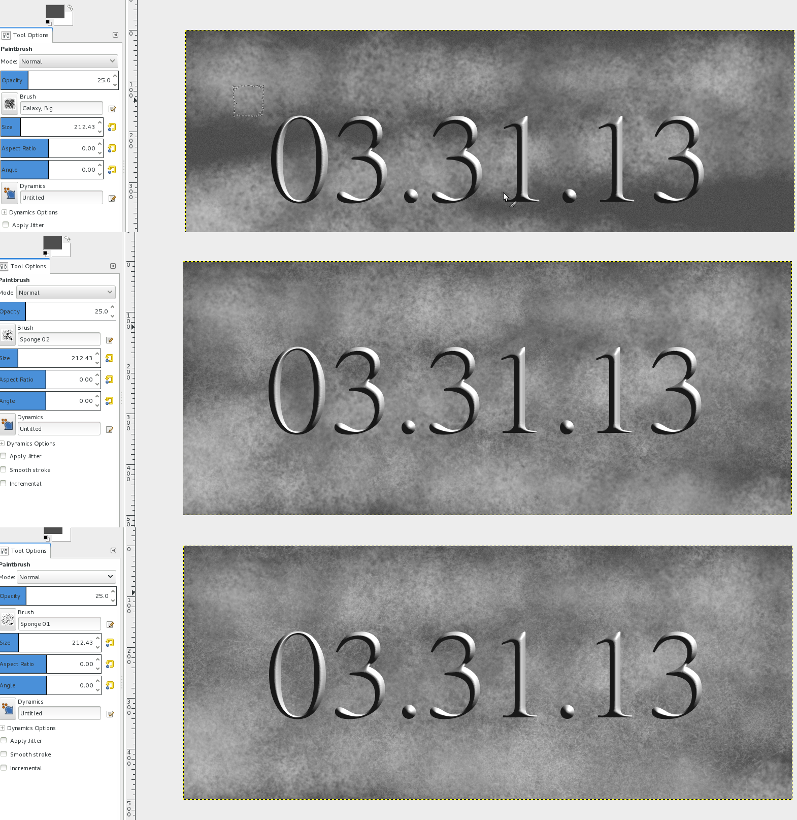
We need some kind of grungy texture now. I’m combining 3 brushes with paint dynamics to get a nice texture.
Set the FG/BG color to a dark gray and white (The "color"+"random" value in the paint dynamics gives you a random color from the gradient thats selected. Normally you’ll have a FG-BG-gradient, so if you paint you’ll get a random color out of the current gradient).
Choose the Paintbrush tool. First choose the “Galaxy Big” brush (Opacity 25%, Size: ~200px). Paint randomly on the canvas, as seen on the picture. Next repeat the painting with the brush “Sponge 02”. Then a third time with “Sponge 01”. You could also experiment with other brushes (brush: texture four and three)
-
8
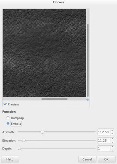
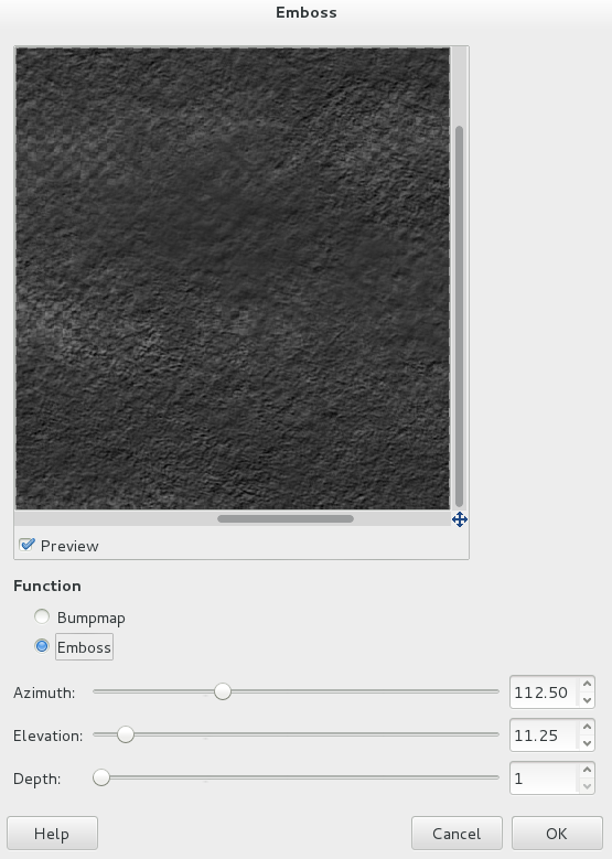
After you got a nice random texture go to Filter / Distorts / Emboss (values: “Emboss”, 112, 11, 1).
-
9

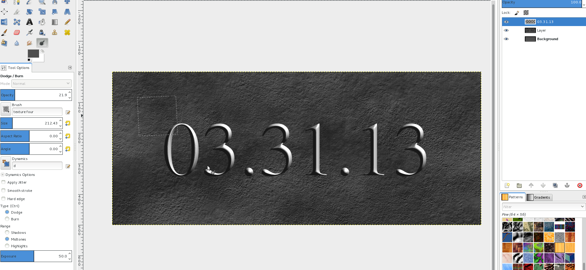
The color shadings are pretty plain – so we need to make this more interesting. Choose the Dodge/Burn Tool, use a special brush – I used “texture four” brush to dodge and burn some areas of the background.
I also lowered the opacity (to 90%) a bit of this layer so that the noisy BG layer is sligtly visible.
-
10

Lets do the special shadow now:
What I didn’t want was a normal drop shadow, since that does not fit the light direction. I wanted a more interesting, a long shadow.
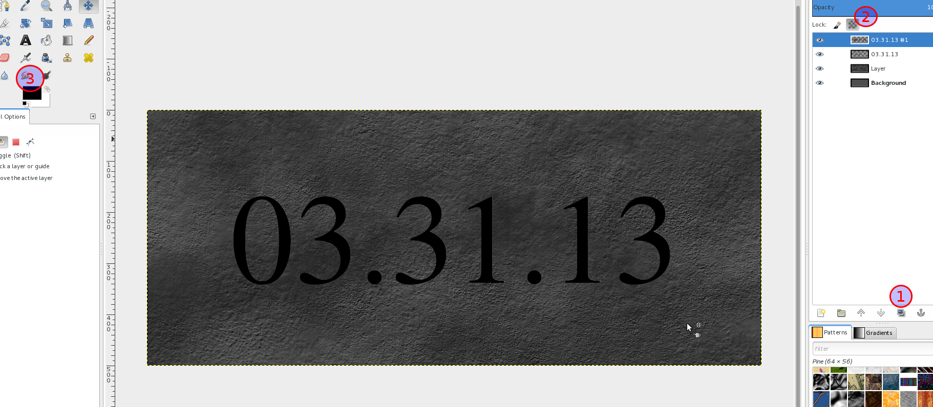
- To do it duplicate the date layer. (1)
- Select the duplicate and move it above the dates layer.
- Click teh “Lock transparency” field (found above the layers stack and below the layers mode drop down menu) (see 2 in image)
- Set black as FG color. Fill the layer with pure black by going to Edit “Fill FG color”. (3)
-
11
- Unlock transparency of the layer again
- Filter / Blur / Motion Blur: Linear / 50 / 320.
The “shadow” is pretty soft now.
-
12
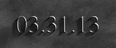
The scene is more intense if the shadow is a little harder and darker: To accomplish this I used the curves tool:
- Colors / Curves. Select the Alpha channel and drag the curve to the top as seen in the image.
-
13
Move the shadow layer below the original date layer. I did some fine-tuning now:
- On a new layer: I used the blend tool and “FG to transparency” gradient to darken the left top and right bottom corners.
- Then I chose the paintbrush tool with a very big size soft circle brush and painted over the right part of the image, then I lowered the opacity down to 15%.
-
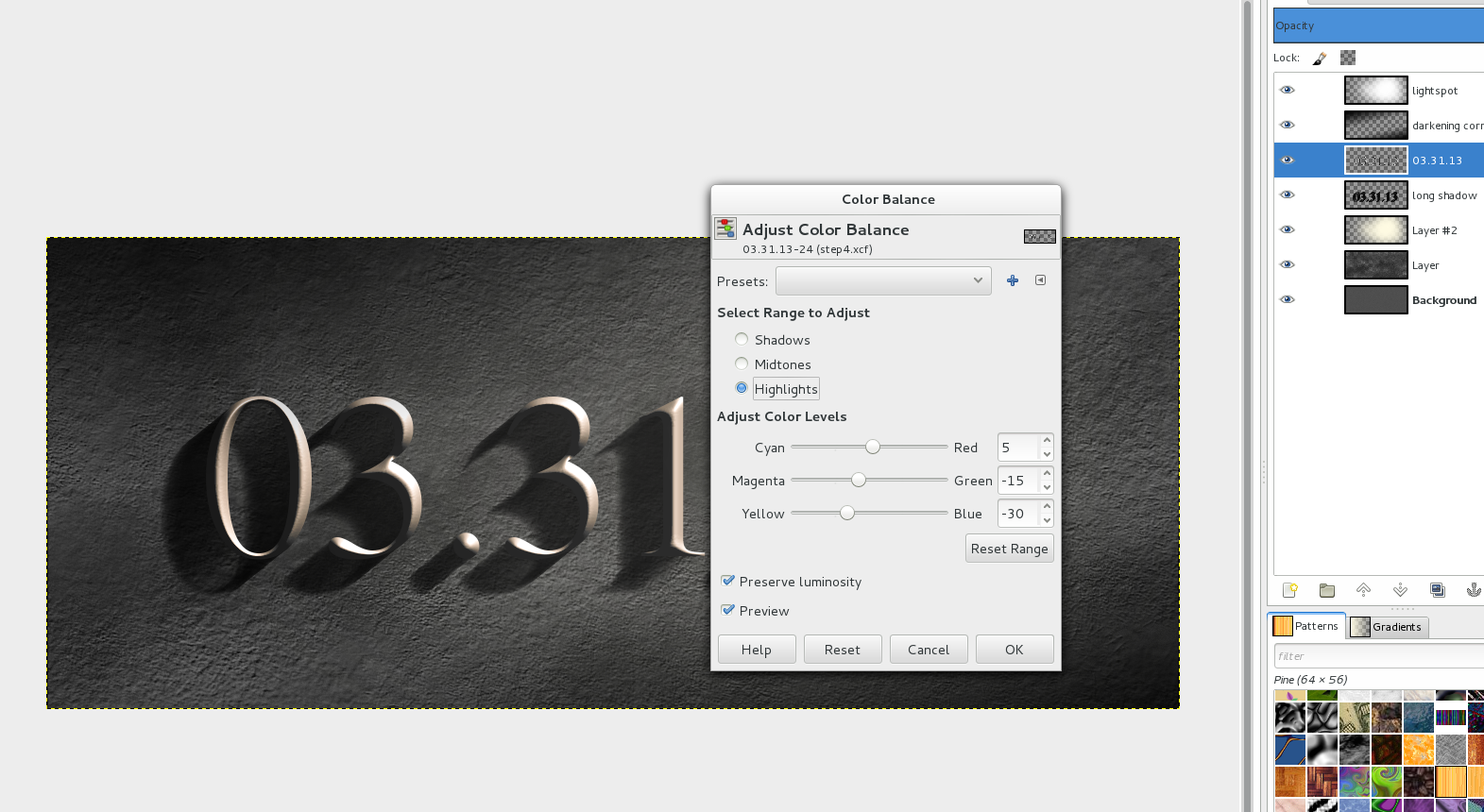
14
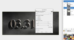
A very small but cool detail was added at the end. I added a slight yellowish color tone to the highlights of the text layer:
- Color / Color balance: Shadows: 0, Midtones:10 / 0 / -10, Highlights: 5 / -15 / -30.
-
15
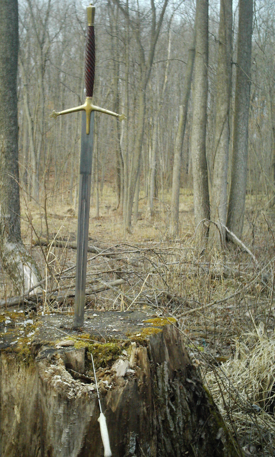
 schwert_raw.jpg
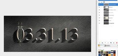
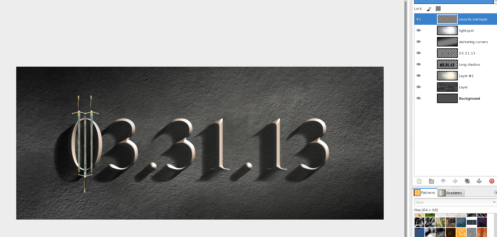
Triple swords
After that I did the triple swords effect on the zero. I have attached the basic photo which I used to extract the sword. I masked it, pasted it into my image rotated/transformed it accordingly to be exactly vertical and smaller. I duplicated it 2 times and one copy was flipped vertically.
Then I merged the 3 sword layers down to one to have them on one layer.
Photo by Troy2007 on http://www.sxc.hu/photo/443841
-
16
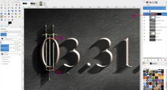
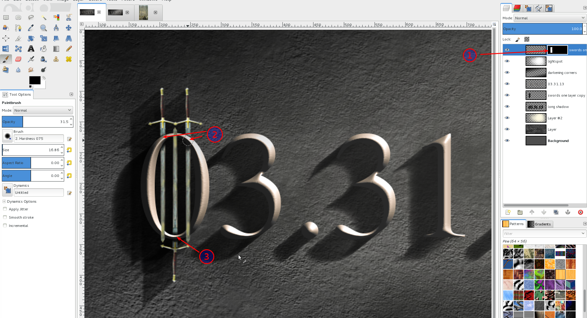
I repeated the steps for the long shadow (steps 10-12, but now for the swords layer).
On the swords layer right click the layer in the stack and “Add Layer mask” – Fill it white. You’ll see the mask right beside the layer you added it to (1). Then use a black soft brush with a small size and paint over the overlapping parts of the swords (2) + (3) so that it seems that they would be inside the zero.
-
17
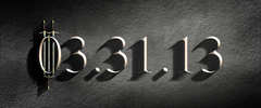
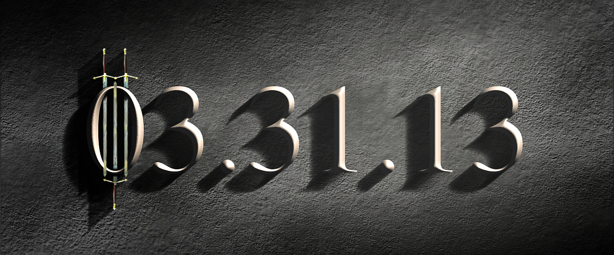
Finally we’re done! I hope you enjoyed this tutorial and I would be happy to see your results ;)


Comments
Post your own comments, questions or hints here. The author and other users will see your posting and can reply to it.
Of course, you can also ask in the chat.
Subscription management
Please log in to manage your subscriptions.
User rating
This topic (Create a hard beveled stoney text effect!) has been rated 5.0/5.0.
New comments are disabled because of spam.