


Tutorial: Creating a Vista-like wallpaper
 is licensed under a Create Commons Attribution-Non Commercial 3.0 Unported license.")

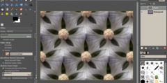
Motivation
There are different opinions about Microsoft Vista, but one thing impresses even me: the desktop backgrounds / Aero wallpapers. In this tutorial I will show you how to create a Vista-like background with GIMP. It needs some sensitivity, but this shouldn't stop you.
Tutorial details
- Category: Photos / wallpapers
- Time to reproduce: ≈45.0 minutes

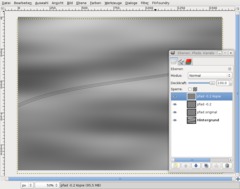
- Tested with GIMP 2.6
-
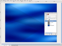
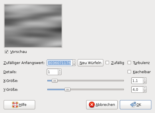
1
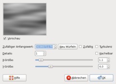
Create a new image: 1600×1200px, white background.
Use Filter / Render / Clouds / Solid noise with these values:
-
2
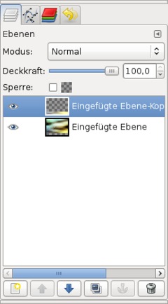
Create a new empty layer.
Choose the
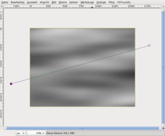
Nehmt nun das Paths tool (hit B). Click one time left of the image area, then one time right of the image area. A line appears. -
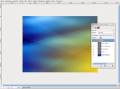
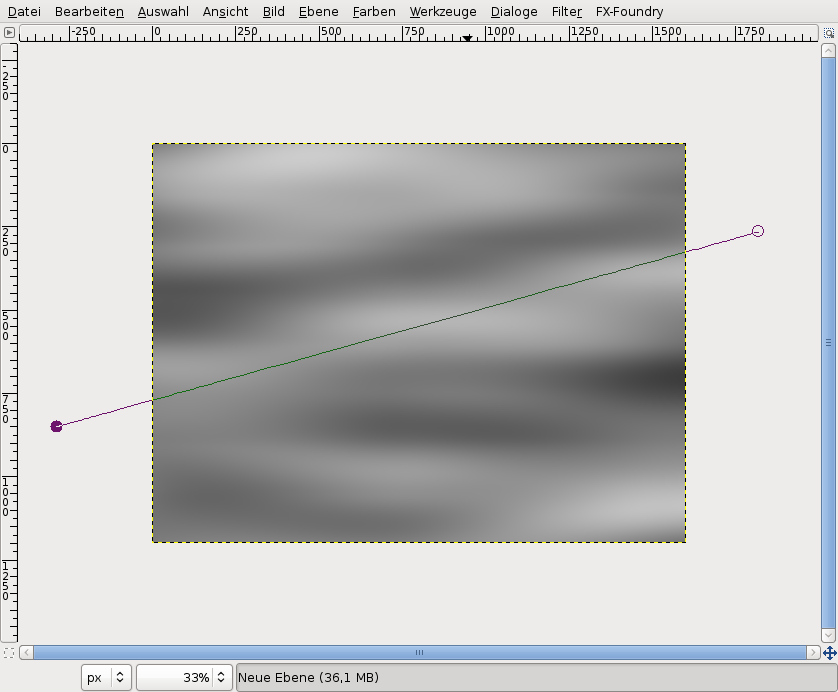
3
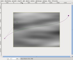
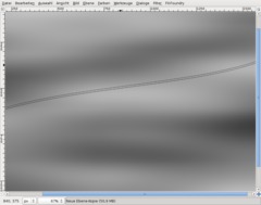
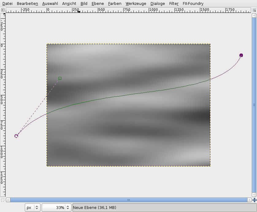
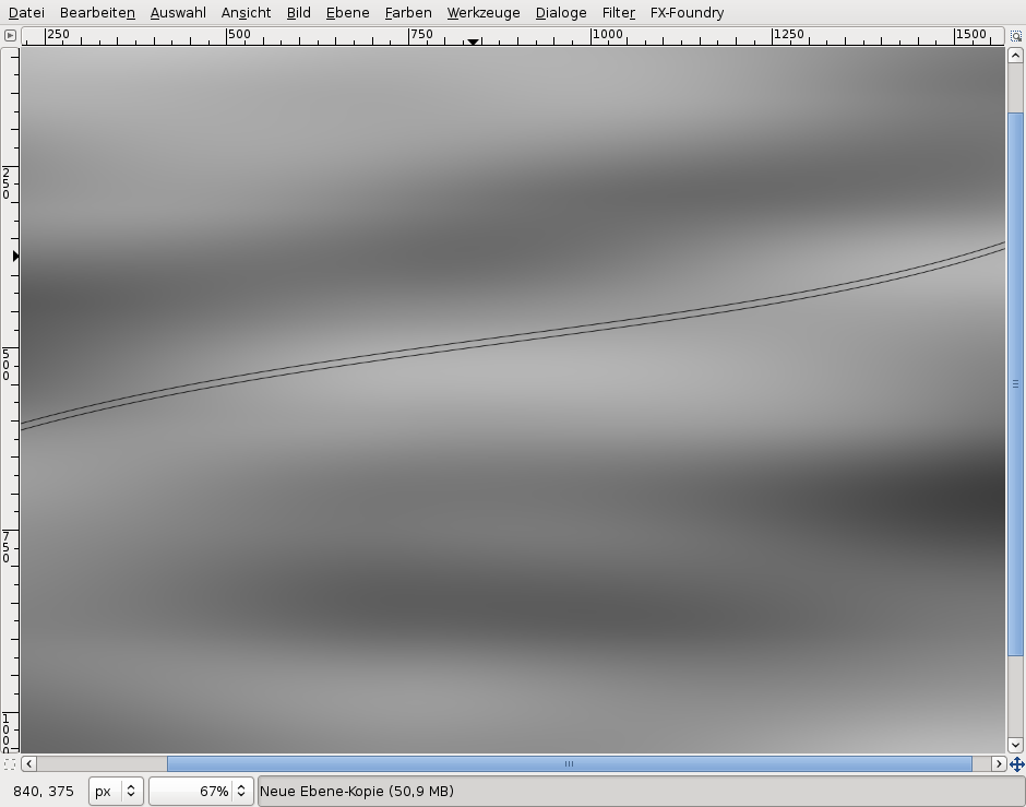
Now grab the line in its center and move it a bit to the bottom. Dashed adjustment lines appear. Drag the left line to the right top (have a look at the screenshot). Drag the right point in the opposite direction.
Then your curve should look like this:
-
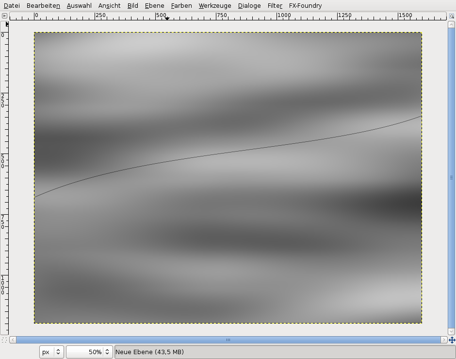
4
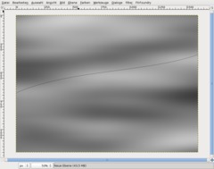
Press D to set the default colors. Bring the tool window to the foreground (press Ctrl+B). In the Paths tool settings, choose “Stroke Path”.
Line width 1px.
-
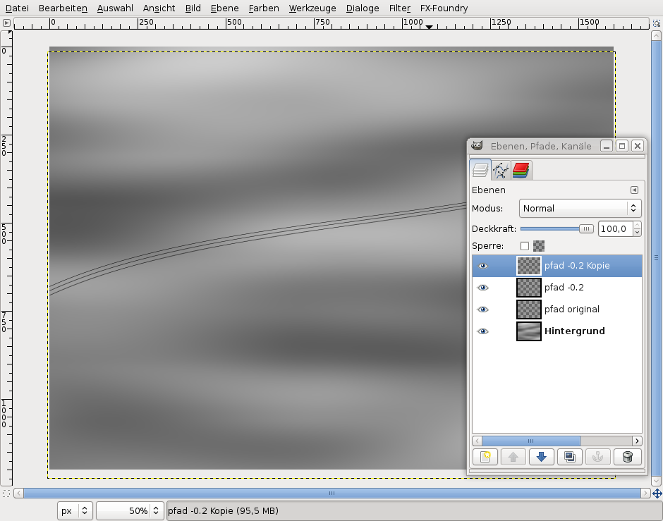
5
Duplicate the layer (Ctrl+Shift+D). Select the Move tool (M), click into the image area and hit the “Arrow down” key about 12 times to move the line to the bottom.
-
6
Use the Rotate tool (Shift+R) to rotate the duplicated layer by -0.2°.
Duplicate the rotated layer again and rotate the new layer. Move it down 12 pixels like before.
-
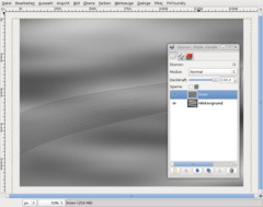
7
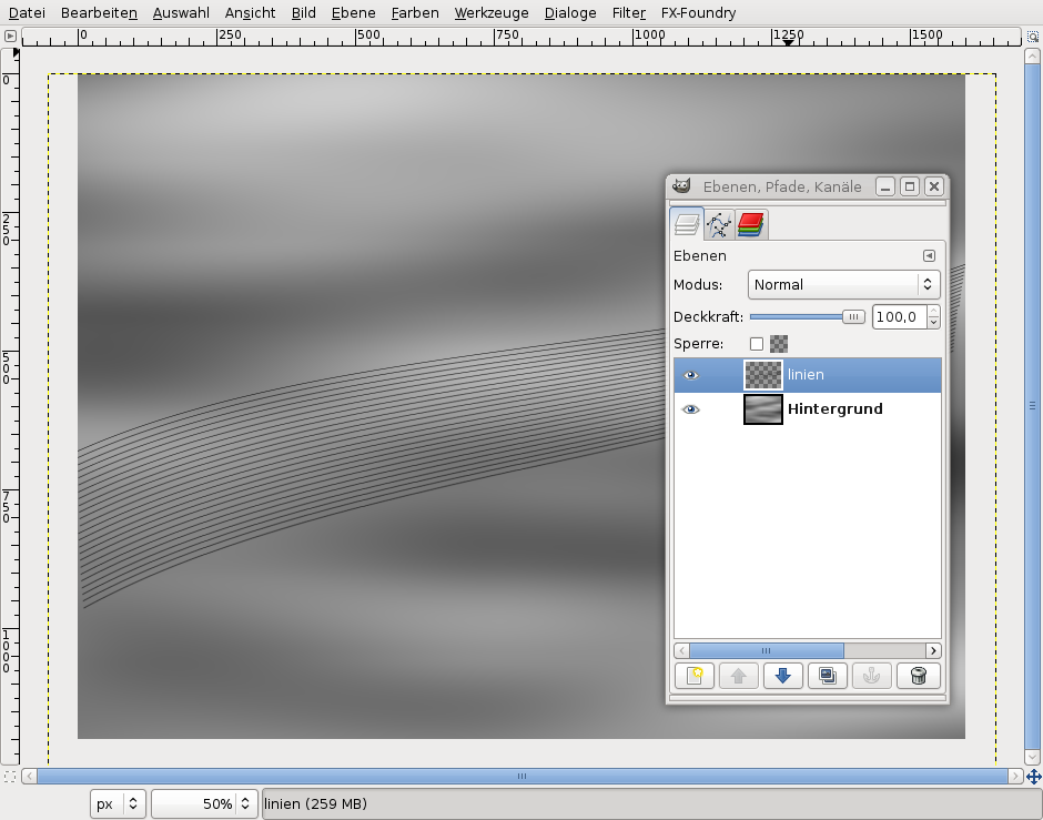
We need some more of these lines, so we group the line layers to accelerate the duplicate/rotate process. Make the background layer invisible (click on its eye in the layer window).
-
8
Press Ctrl+M or select Image / Merge visible layers in the menu and click on OK. Now we have 3 lines on one layer. (If you want to, you can make the background layer visible again using the eye symbol.)
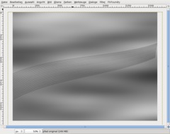
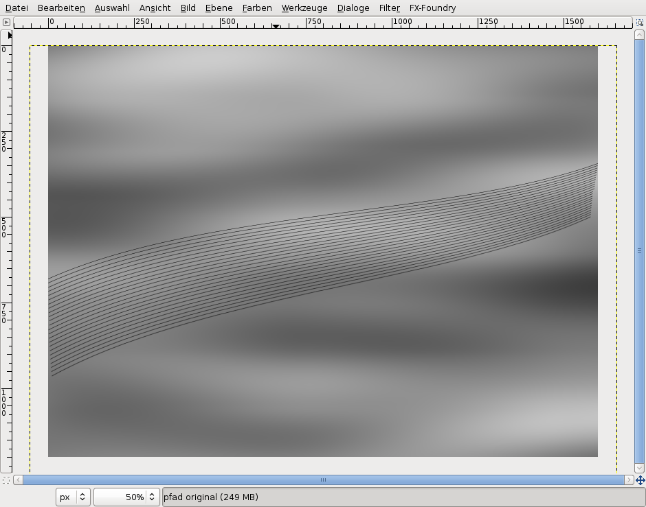
Now duplicate this layer again, rotate it by -0,6° (three lines to -0,2° each) and move it down.
Repeat this procedure until you have produced about 24 lines.
-
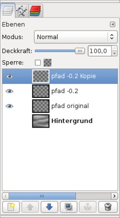
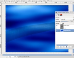
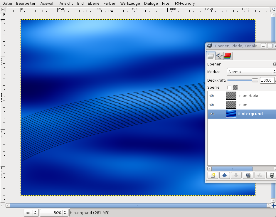
9
Merge all layers (make background layer invisible first). Now there should be only 2 layers remaining. Make the background layer visible again.
-
10
Duplicate the lines layer.
Switch to the background layer. Use Colors / Colorize: 210 / 100 / 20.
Then do Colors / Brightness-Contrast: 0 / +50.
Now use Filter / Blur / Gaussian Blur: 80 px two times.
-
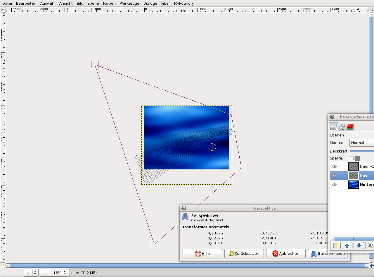
11

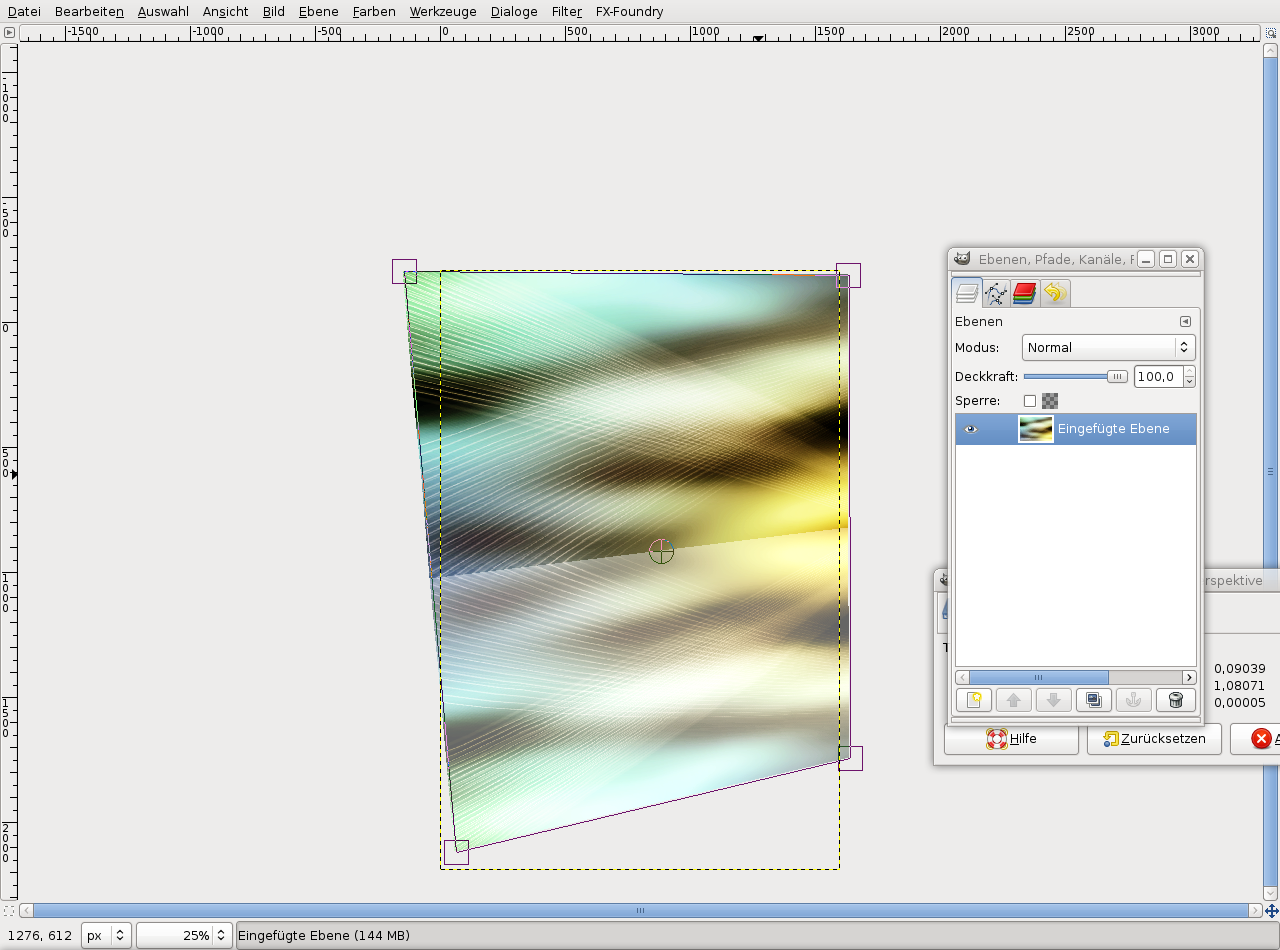
Zoom out far (for instance using Ctrl+mouse wheel). Select the Perspective tool or press Shift+P. Distort the layer like you can see on the screenshot.
-
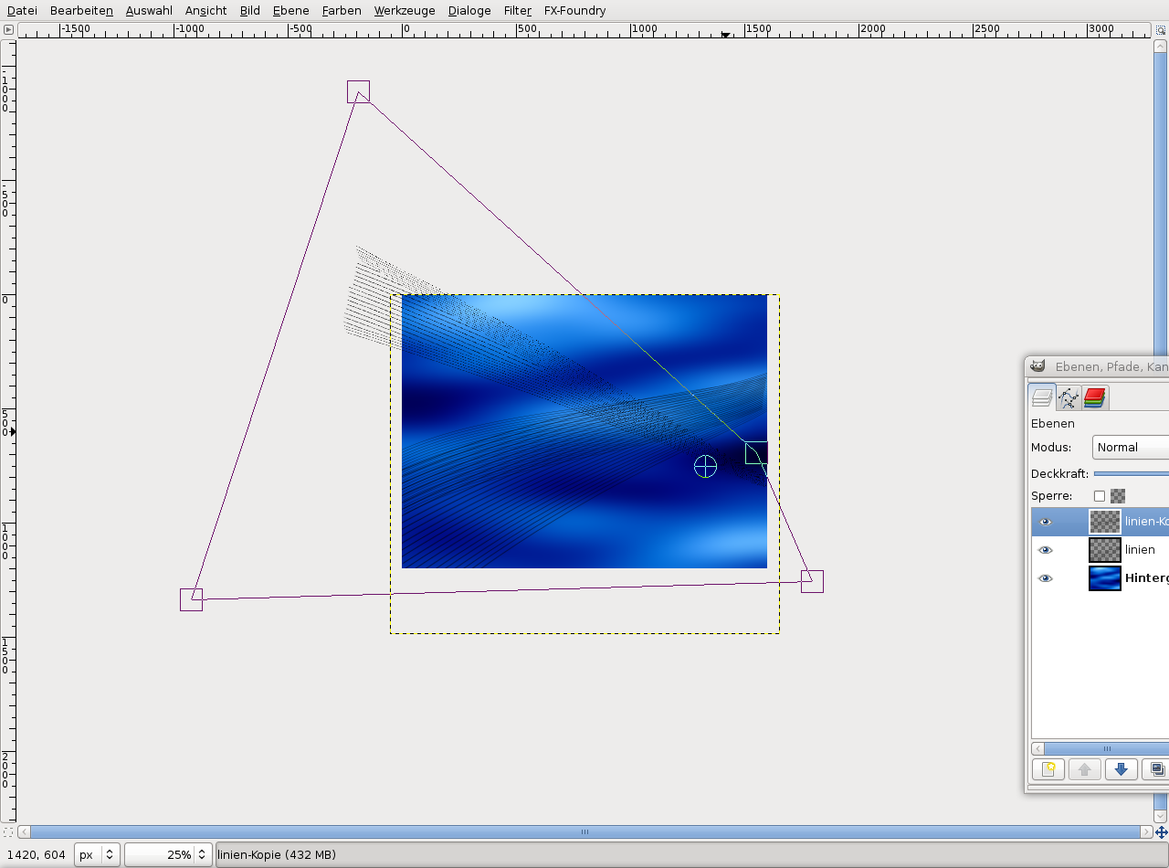
12

Select the line layer that you have duplicated before. Distort this layer, too (use the screenshot for reference).
-
13
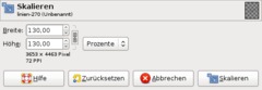
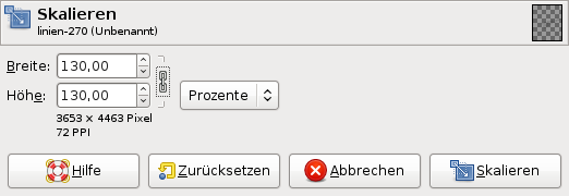
The next step is to enlarge the lines using the Scale tool (Shift+T).
In the dialog, set 130 percent.
Repeat this for the second layer.
-
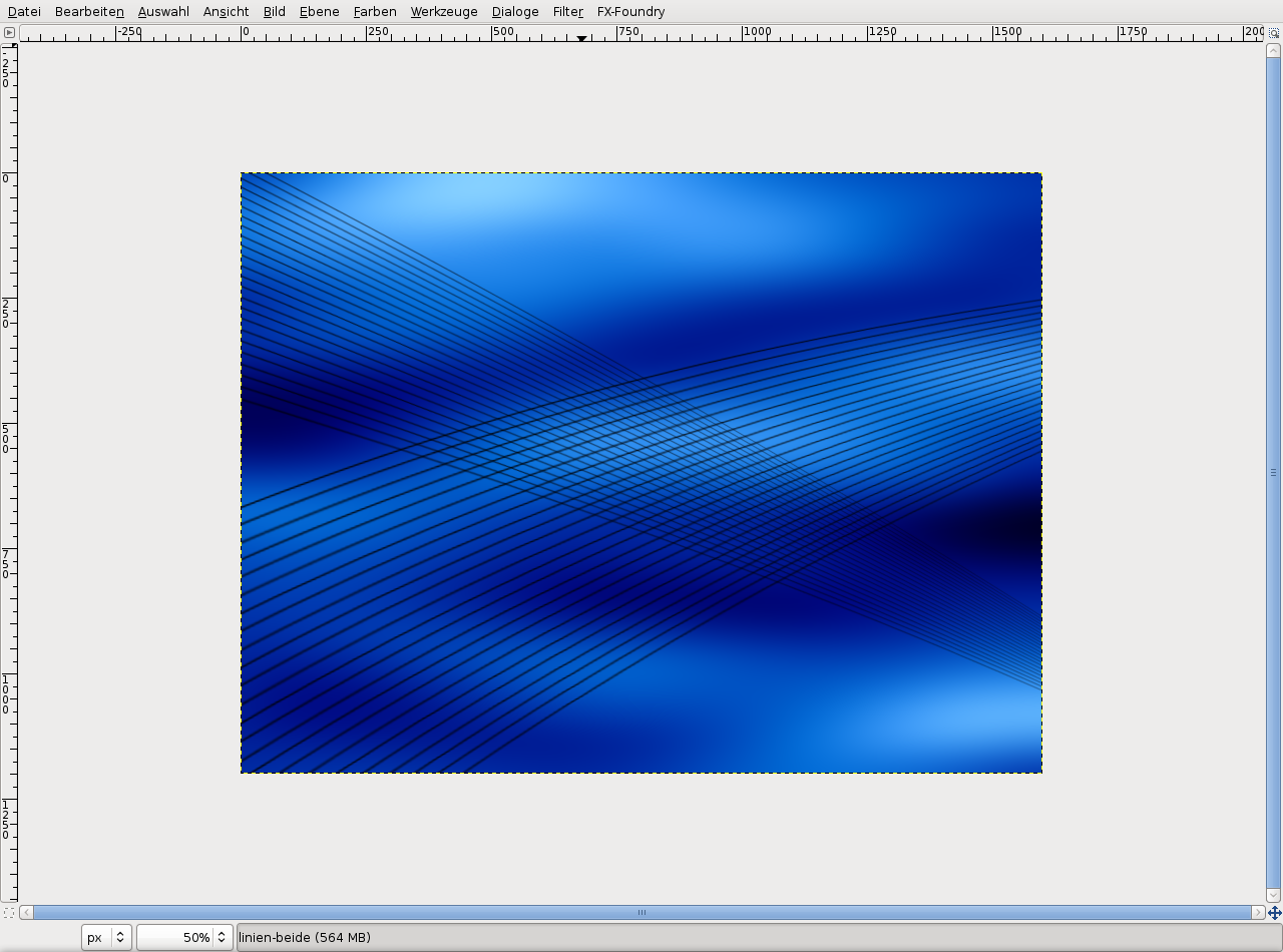
14
Now choose the Move tool (hold the Shift key to move the active layer only). Move both layers like I did (see the screenshot).
-
15
Make the background layer invisible using the eye symbol.
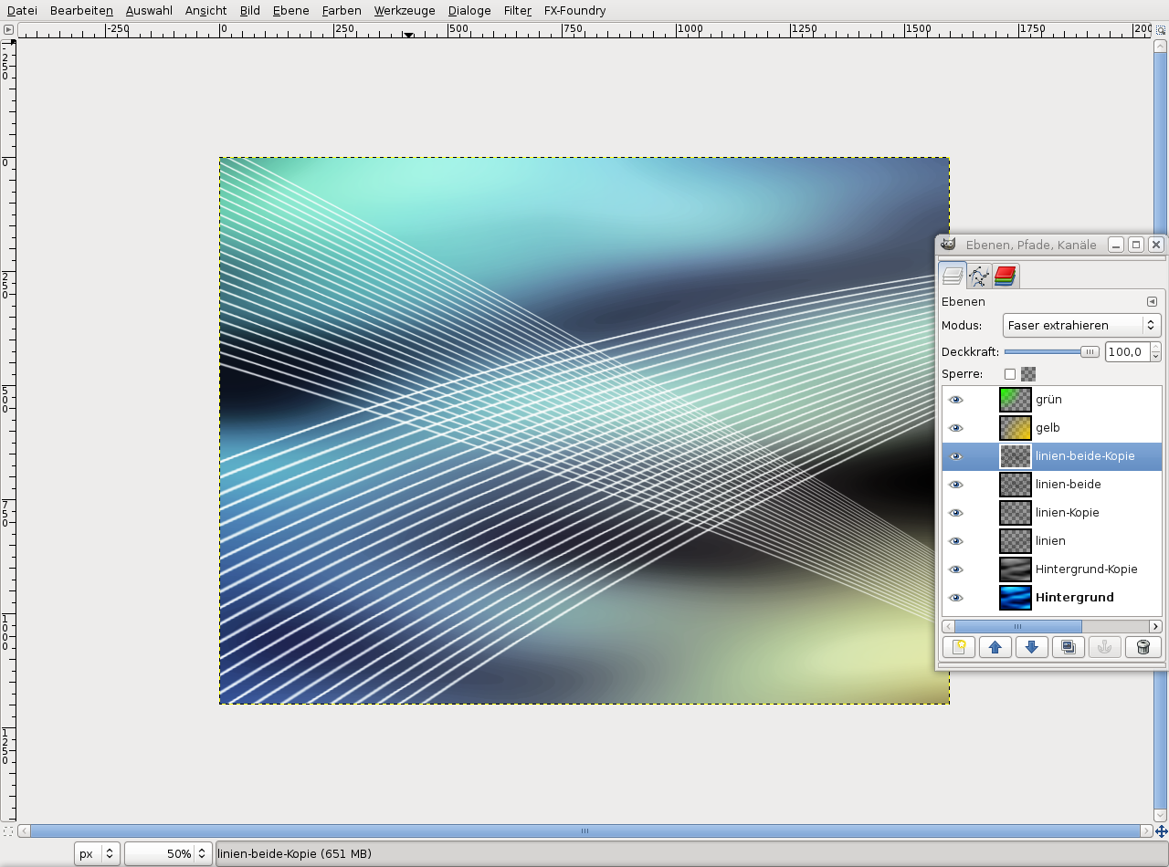
Select Edit / Copy visible, Edit / Paste as / New layer. I named the new layer “linien-beide” (“lines-both”). Click on the eye symbol for the pasted layer because we need it only later.
Make the background layer visible again.
-
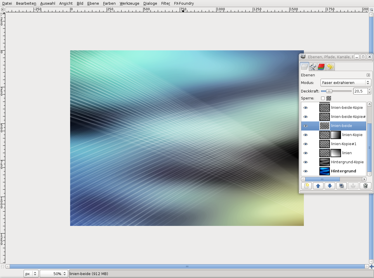
16

Set the modes of the two line layers to “Grain extract”.
-
17
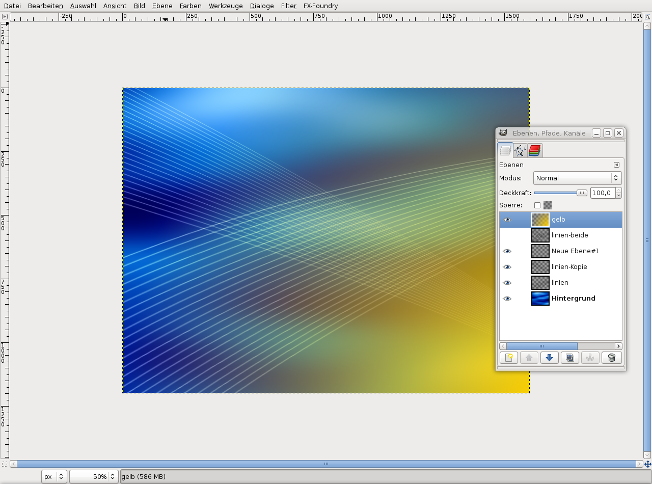
Create a new layer above all the others and name it “gelb” (“yellow”).
Select the new layer and choose the gradient tool (L key – no shift!). Select the 4th gradient
(foreground to transparent). Color: #ffd200, shape: radial. Then drag the gradient from the right bottom to the left top third of the image. -
18
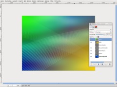
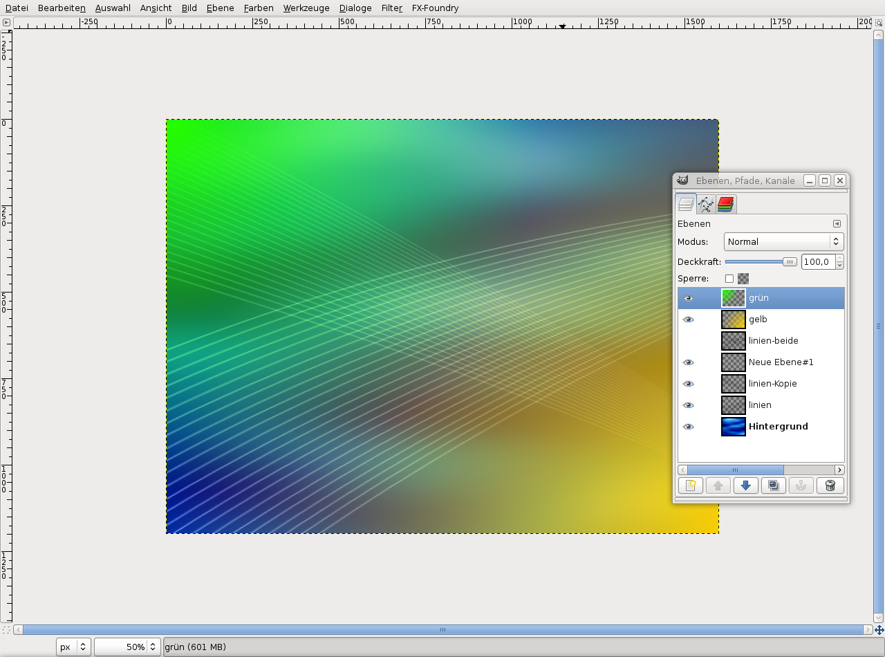
Create another new layer and do the same as in the previous step, but drag the gradient from the left to to the center and set the color: #24ff00.
-
19
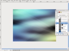
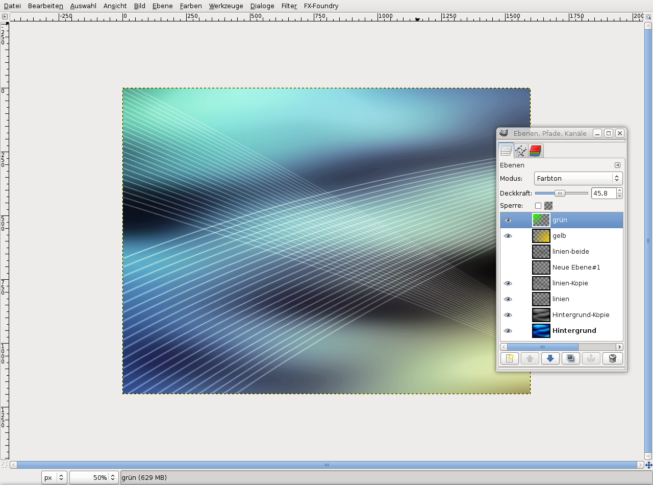
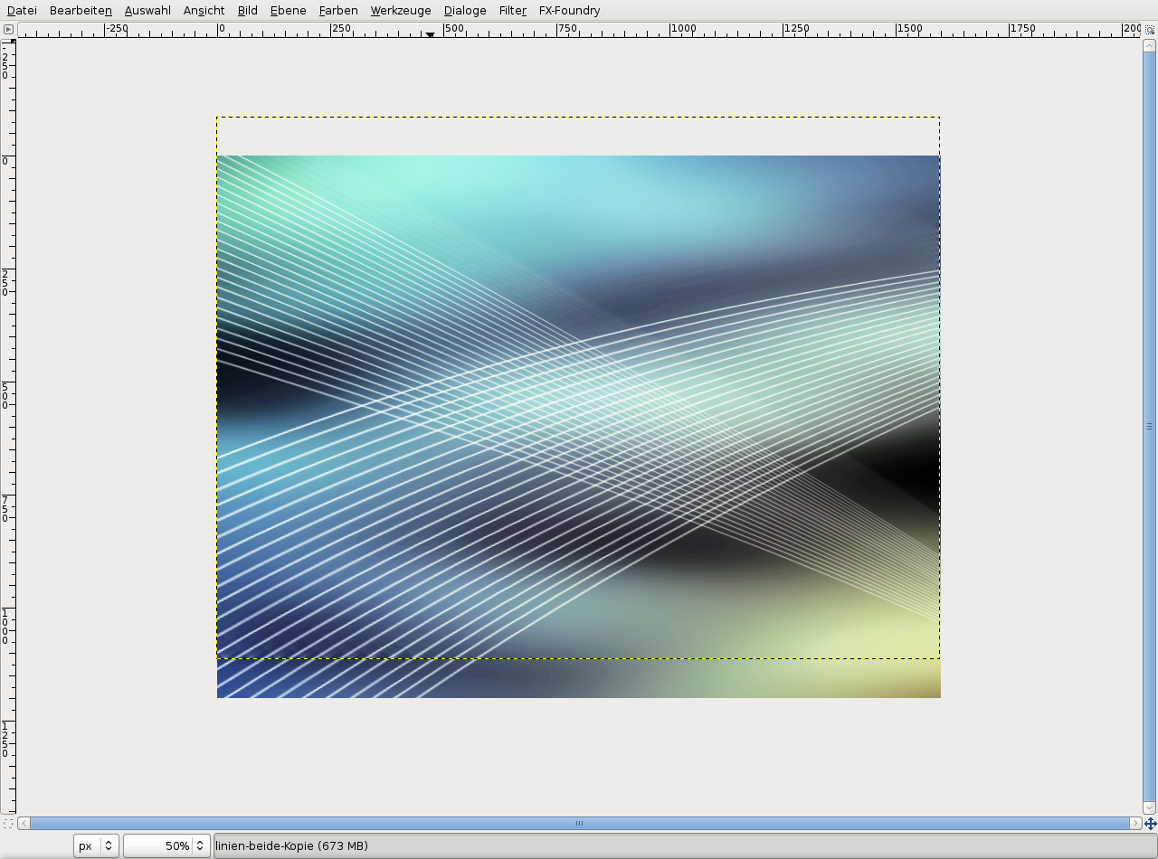
Set the modes of the previously created layers to “Hue”. Set “gelb” to opacity 100%, the green layer to 45%.
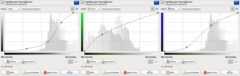
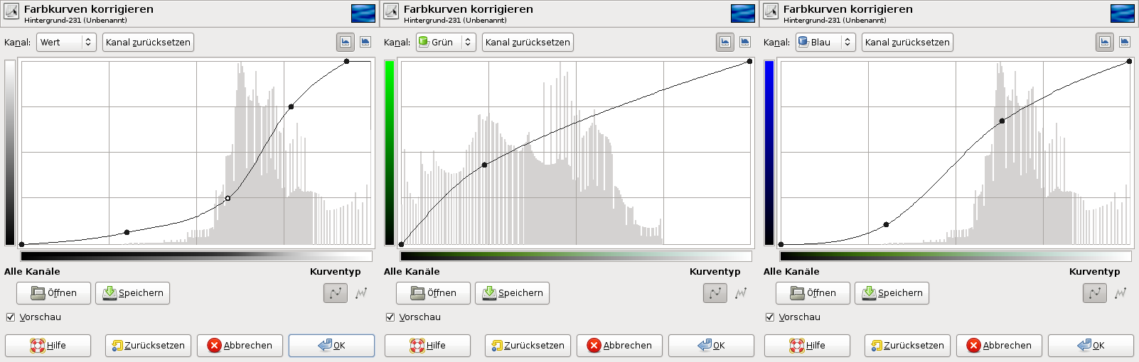
We have to do a color correction on the background layer yet. Select the background layer, choose Colors / Curves and apply the settings as you can see them on the screenshot. They make the dark blue tones more black. Don’t forget to adjust the green and blue values.
-
20
Duplicate the background layer, choose Colors / Desaturate, click on OK. Set the layer mode to “Screen” and its opacity to 85%.
-
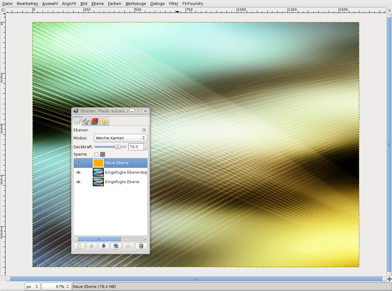
21
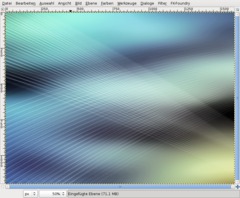
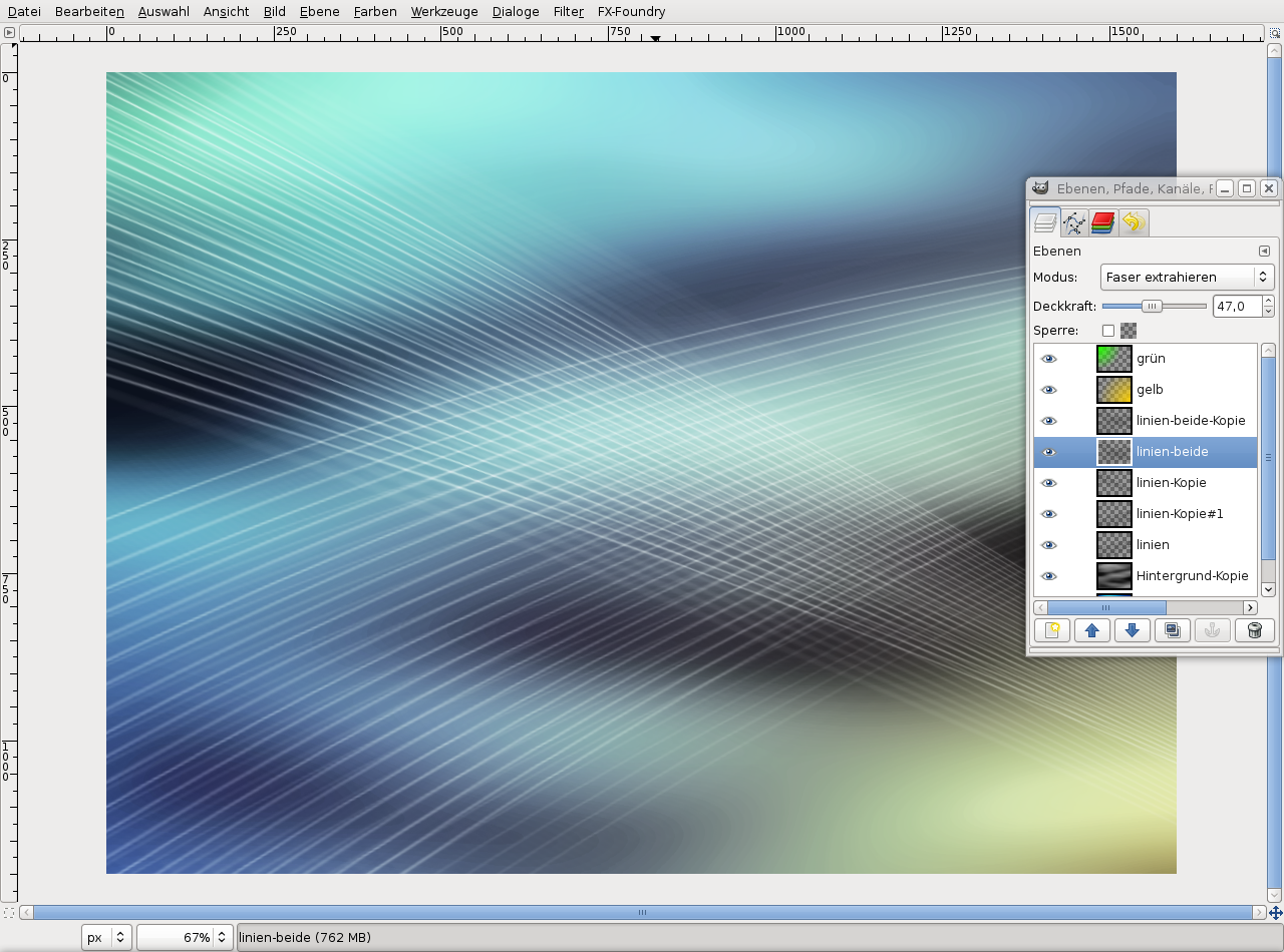
Now we need some more chaos.
Duplicate the “linien-beide” layer (that’s the one where all the lines are). Set the modes of both layers to “Grain extract”.
-
22
Apply Filter / Blur / Motion blur:
Type: linear
Length: 81
Angle: 39Move the layer a bit to the top.
-
23
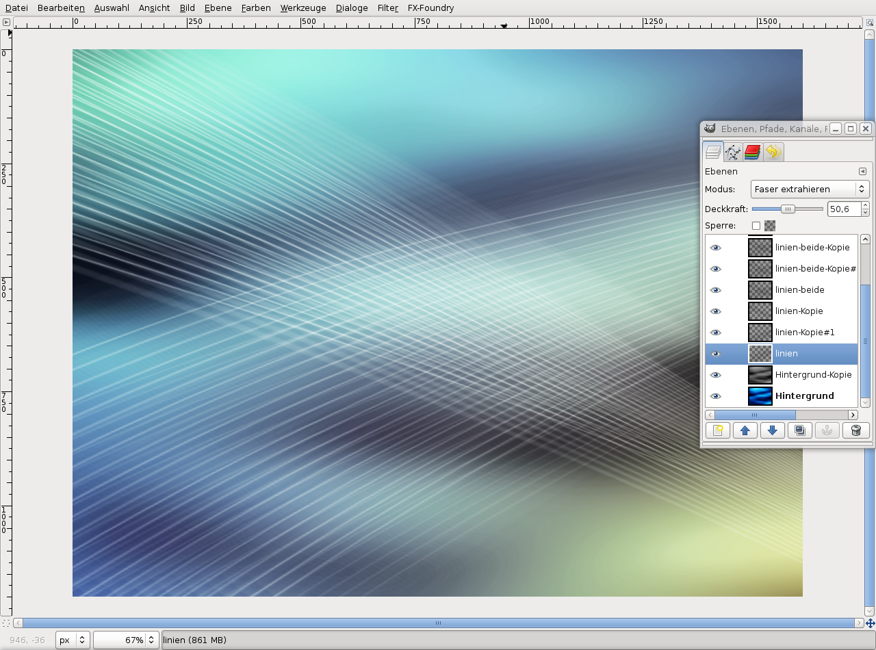
You can modify the next steps to your own liking, but here are some guidelines:
Switch to the copy of the layer. Apply the filter to this layer again, using the values:
Type: linear
Length: 79
Angle: 205Move the layer somewhat to the bottom.
-
24

Transform the two layers we have just blurred and make them larger (about 120%). Move them to positions that look good. Play around with the opacity, everything shouln’t be too visible.
-
25
Right-click on the lines layer in the layer window and create a new layer mask (white). Then select the gradient tool, press D to reset the colors and use the bi-linear gradient (you have to set the shape!). Select the first gradient in the dropdown field (black to white).
Also create a layer mask for the duplicated lines layer.
-
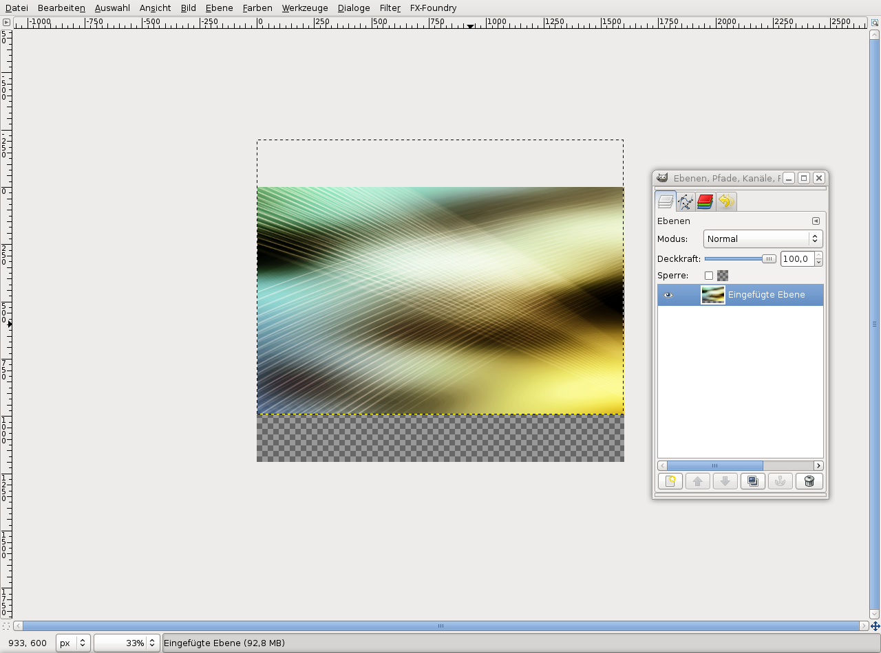
26
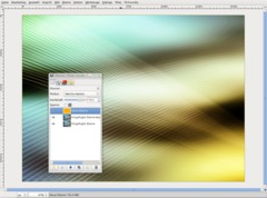
Save the result. Choose Edit / Copy visible, Edit / Paste as / New image.
-
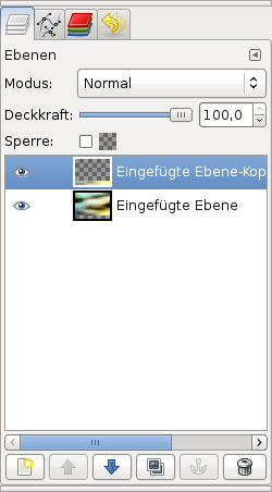
27
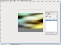
Duplicate the new layer and set the duplicate’s mode to “Soft light”.
Create a new layer and fill it with the color #ffae00. Set the layer mode to “Soft light” and the opacity to 80%. So the image looks warmer.
-
28
Now some final things:
Image / Merge visible layers. Move it a bit to the top.
-
29
Duplicate the layer, select the Flip tool and flip it vertically. Move the layer to the bottom to cover the transparent region.
Colors / Brightness-Contrast: +100 / +5
-
30

Ctrl+M to merge.
Select the Perspective tool and distort like this:
-
31

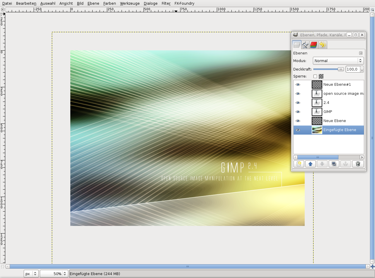
You can put some text into the image, for instance like this:
-
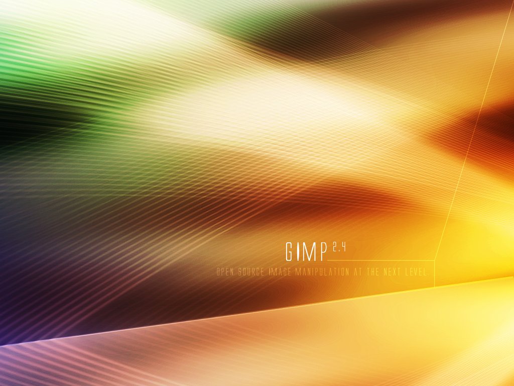
32
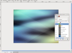
You can achieve good color combinations using Colors / Color Balance. Have fun when trying it out…
-
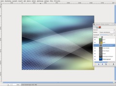
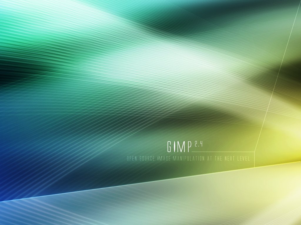
33
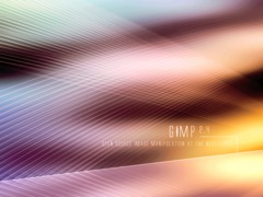
Another possibility:
-
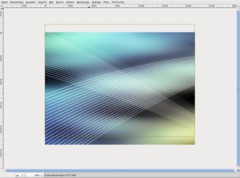
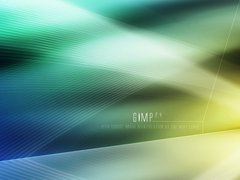
34

Yet another…
-
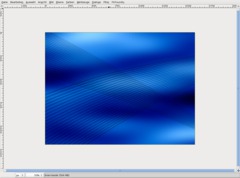
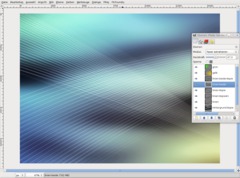
35
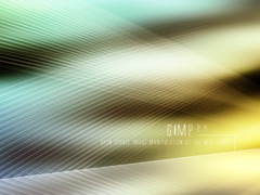
Or have it like this!


Comments
Post your own comments, questions or hints here. The author and other users will see your posting and can reply to it.
Of course, you can also ask in the chat.
Subscription management
Please log in to manage your subscriptions.
User rating
This topic (Creating a Vista-like wallpaper) has been rated 4.0/5.0.
New comments are disabled because of spam.