


Tutorial: Create soft glassy buttons
 is licensed under a Create Commons Attribution-Non Commercial 3.0 Unported license.")

Motivation
This tutorials shows you how to create a soft and glassy / glossy button.
Tutorial details
- Category: Buttons, icons, web
- Time to reproduce: ≈15.0 minutes

- Tested with GIMP 2.3.14
-
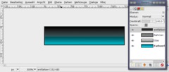
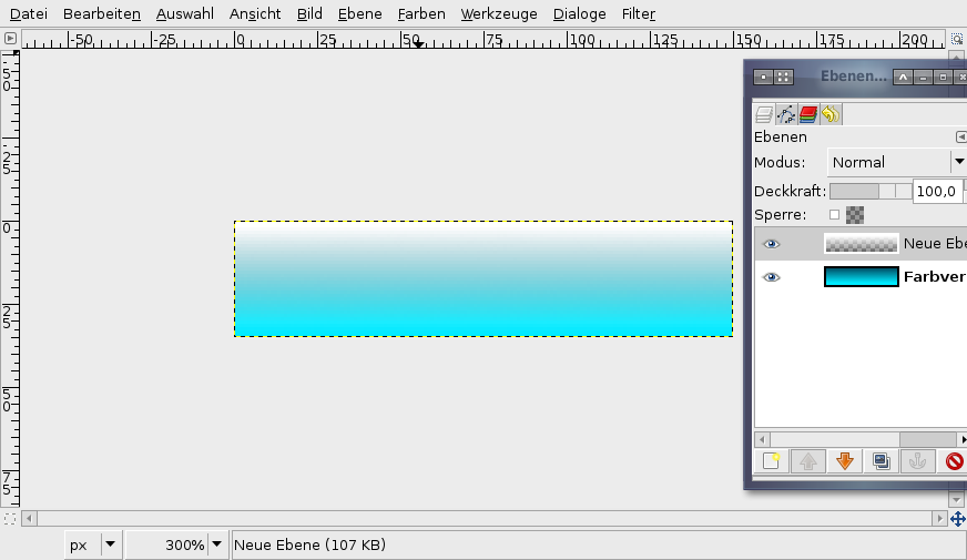
1
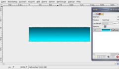
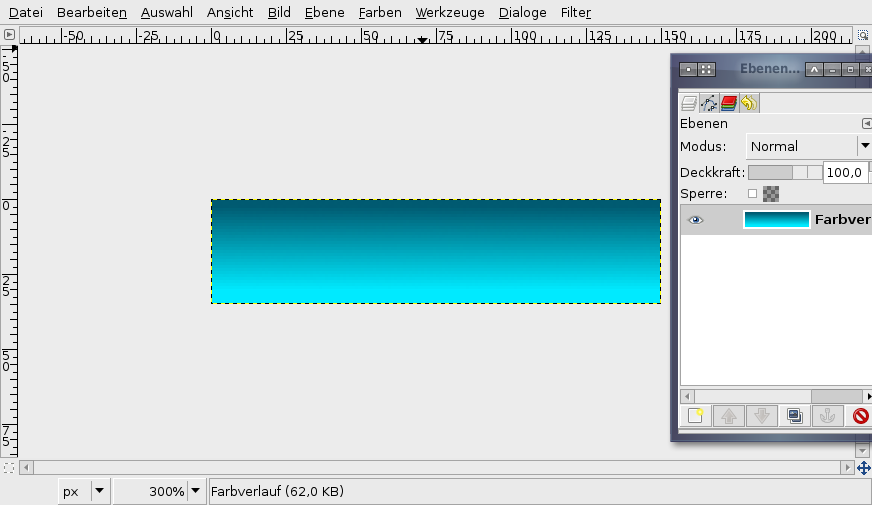
Create a new file: 150×35 px. White background. Activate the gradient-tool (L). Now choose #005a71 as primary (foreground) color. Use #00eaff as background-color. Drag the gradient from inside the upper edge of the image to the bottom: cname the layer: “Gradient”. I named it “Farbverlauf” which is the german word for gradient.
-
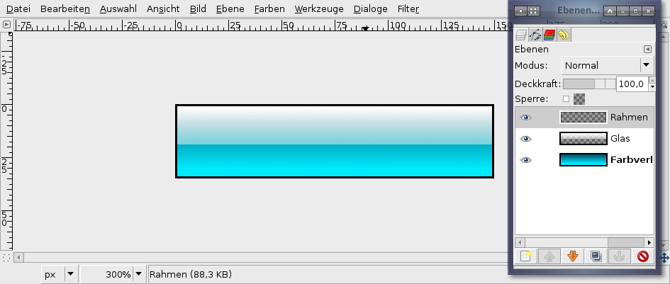
2
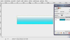
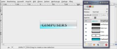
Create a new transparent layer. Name it “Glass”.
Choose white as foreground color. In the preferences of the gradient-tool use the drop-down and choose the “Foreground to Transparent”-gradient (the 4th one). Make a gradient again on this layer from top to bottom.
-
3
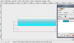
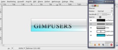
Take the Rectangle Selection-Tool and make a new selection starting from the bottom left as seen on the image below.
-
4
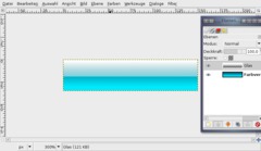
Cut this part by pressing DEL or (CTRL+K if you still use GIMP 2.2).
- Selection / None to deselect all.
-
5
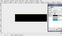
Next we create a small little border. Add a new layer, fill it totally black. Name it “Border” or “Rahmen” as i did in the picture.
-
6

Press CTRL+A to select all, then go to SELECTION / SHRINK: 1px.
Remove the selected part and a border should remain.
-
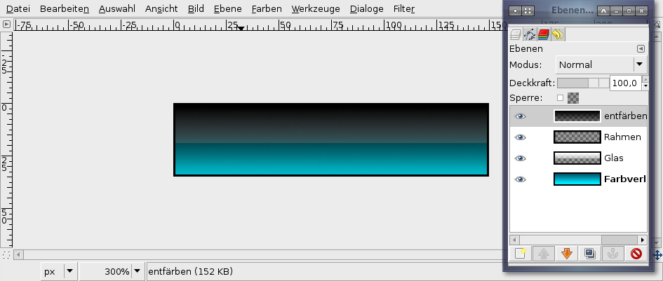
7
Add a new layer again (transparent). Name it “Desaturate” (i called it “entfärben”).
Now activate the Gradient-Tool again. Make sure the “Foreground to Transparent”-Option is still selected in the preferences.
Use black as foreground-color. Drag the gradient again from top to bottom, but this time a bit below the bottom edge/border of the image (into the gray space).
-
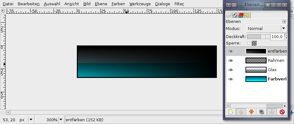
8
On the same layer do the same gradient but from right to left, again a little bit into the gray space of the left image border.
At the end only little blue to the bottom left should shine through.
-
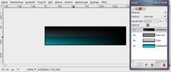
9

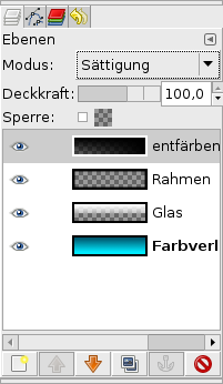
Now press CTRL+L to view the layers dialog or go to Dialog / Layers. Set the layers mode to “Saturate” – in the image its called “Sättigung”.
This mode makes all parts of the layers below gray (all parts that are filled with the black on this layer).
-
10
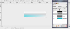
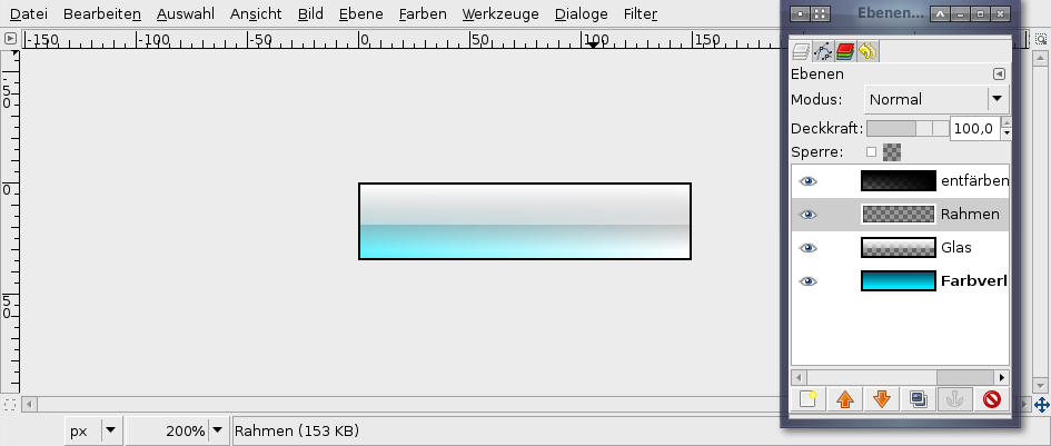
The button should look like this now:
-
11
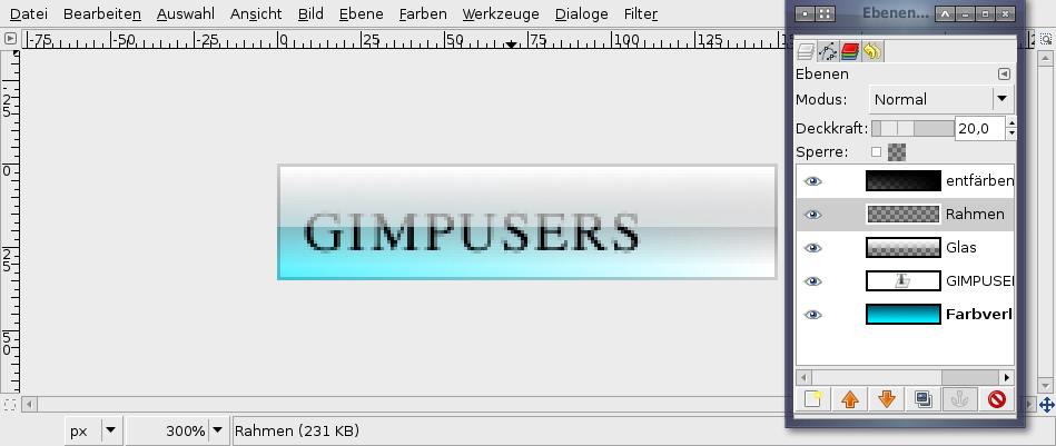
Now take the text-tool and write any text to the layer. Move the text to the left corner.
The text layer has to be below the black “Saturate”-layer.
Activate the “Border”-layer and set the transparency of this layer to 20%.
-
12
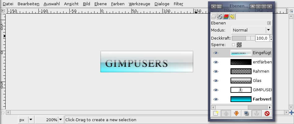
Now we’re making the whole button a little nicer.
- Edit / Copy visible
- Edit / PasteThen press the add layer button to get the pasted on a new layer.
-
13

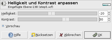
- Colors / Brightness & Contrast: -20 / +30
-
14
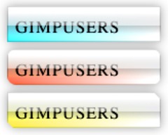
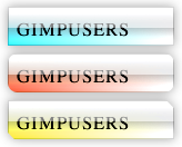
You’re done ;) If you want to test some other colors do it the fast way →
- Add layer
- Fill with your preferred color
- set Layer mode to “Color”.A little tip: The buttons look best on white background with a very slight black shadow.


Comments
Post your own comments, questions or hints here. The author and other users will see your posting and can reply to it.
Of course, you can also ask in the chat.
Subscription management
Please log in to manage your subscriptions.
User rating
This topic (Create soft glassy buttons) has been rated 4.3/5.0.
New comments are disabled because of spam.