


Tutorial: 2 Ways for designing soft backgrounds for product presentation
 is licensed under a Create Commons Attribution-Non Commercial 3.0 Unported license.")

Download GIMP workspace (.xcfbz2) (914 KB)
Motivation
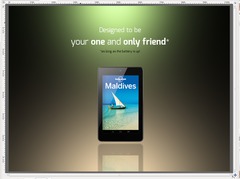
This is a good tutorial for beginners. I want to show you my personal 2 favorites that I use to present certain products or articles (masked objects). They're both not trivial. But they are still pretty easy to do and have a great impact since the object is really set in focus with a cool light in the background.
Tutorial details
- Category: Techniques
- Time to reproduce: ≈15.0 minutes

- Tested with GIMP 2.8
-
1

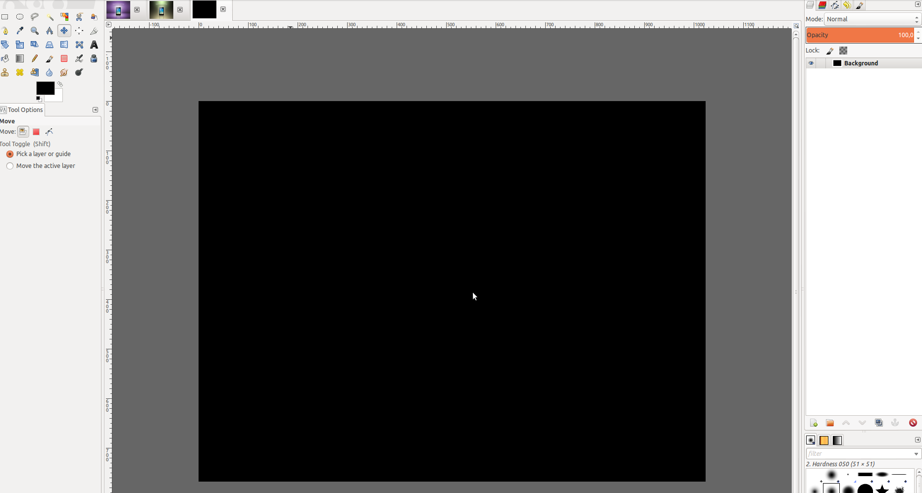
I’ll start with the easier one. Open up a new empty image: i.e. 1024×768 px with black background.
-
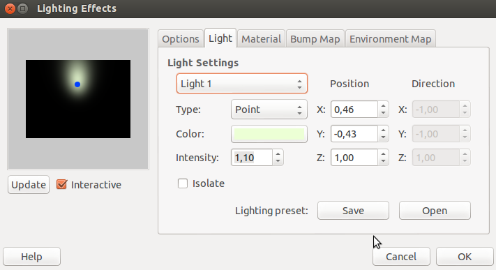
2
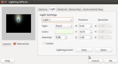
We will now create two soft lights using Filter / Lights & Shadows / Lighting effects.
Open this filter and go to the “Light” tab. Move the blue point in the preview window to the top middle as seen in the image. Set the intensity of the light to 1,1 and choose any color you like. I used a very bright yellow-green color.
-
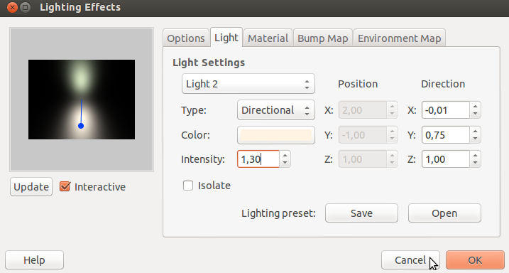
3
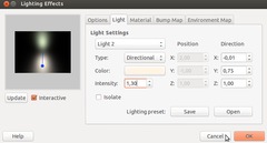
Leave the dialog open and choose “Light 2” in the drop down menu. For this light choose “directional” as type, an intensity of 1,3 and a yellow orange color.
-
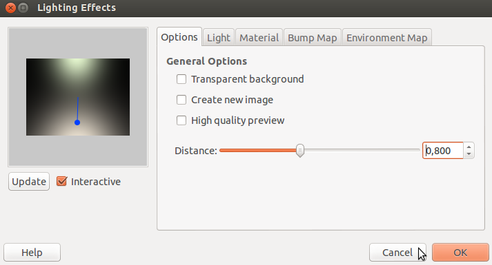
4
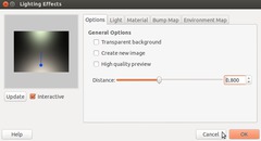
Now go to the “Options” tab and set the distance to ~0,8 – this will smoothen the lights into each other, mixing them pretty nice.
-
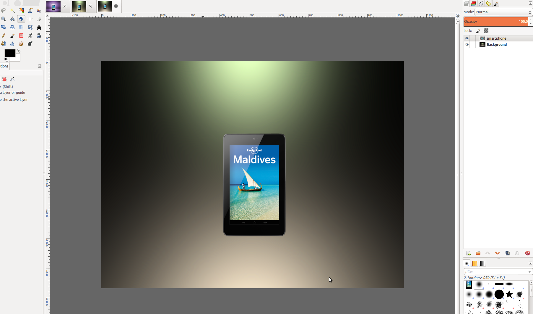
5

Now the background is basically done. In a new file mask any object you want to present and import it into our image (copy/paste it or open it via “File” → “Open as layer”).
-
6

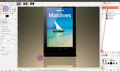
To make an easy mirroring effect duplicate the layer with the object and use the “Flip” tool vertically by just clicking the duplicated layer.
-
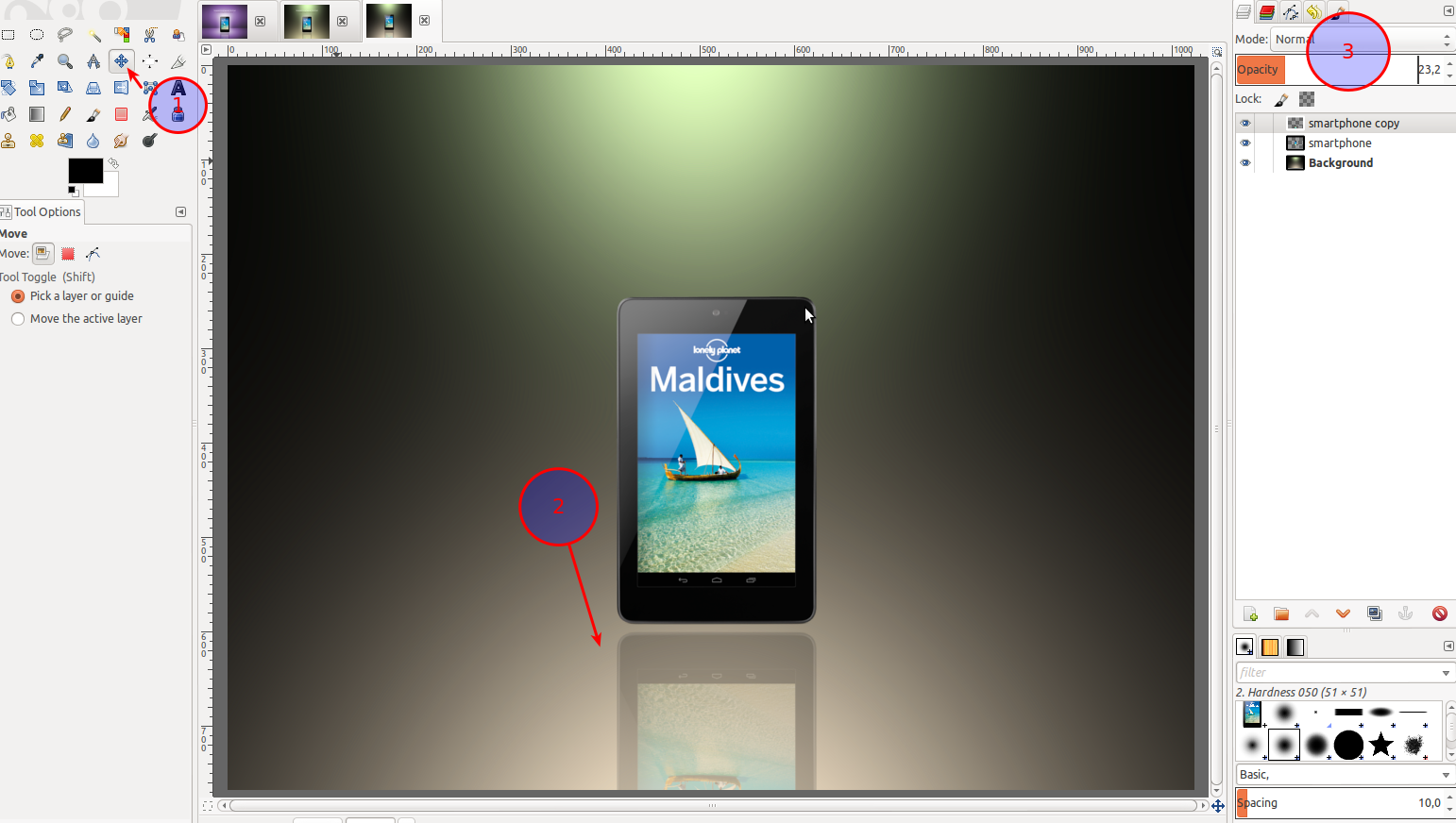
7
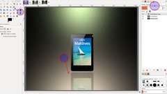
Use the “Move” tool (1) to move it below (2). Then use the opacity slider to lower the transparency of this object (3).
-
8

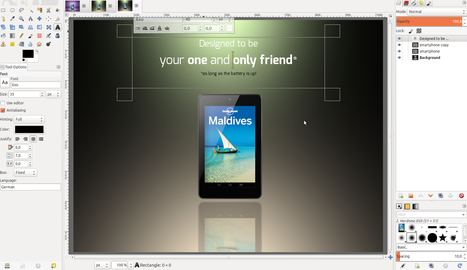
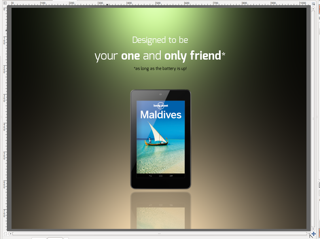
Now add some text using the text tool. I used the free “Exo” font.
-
9

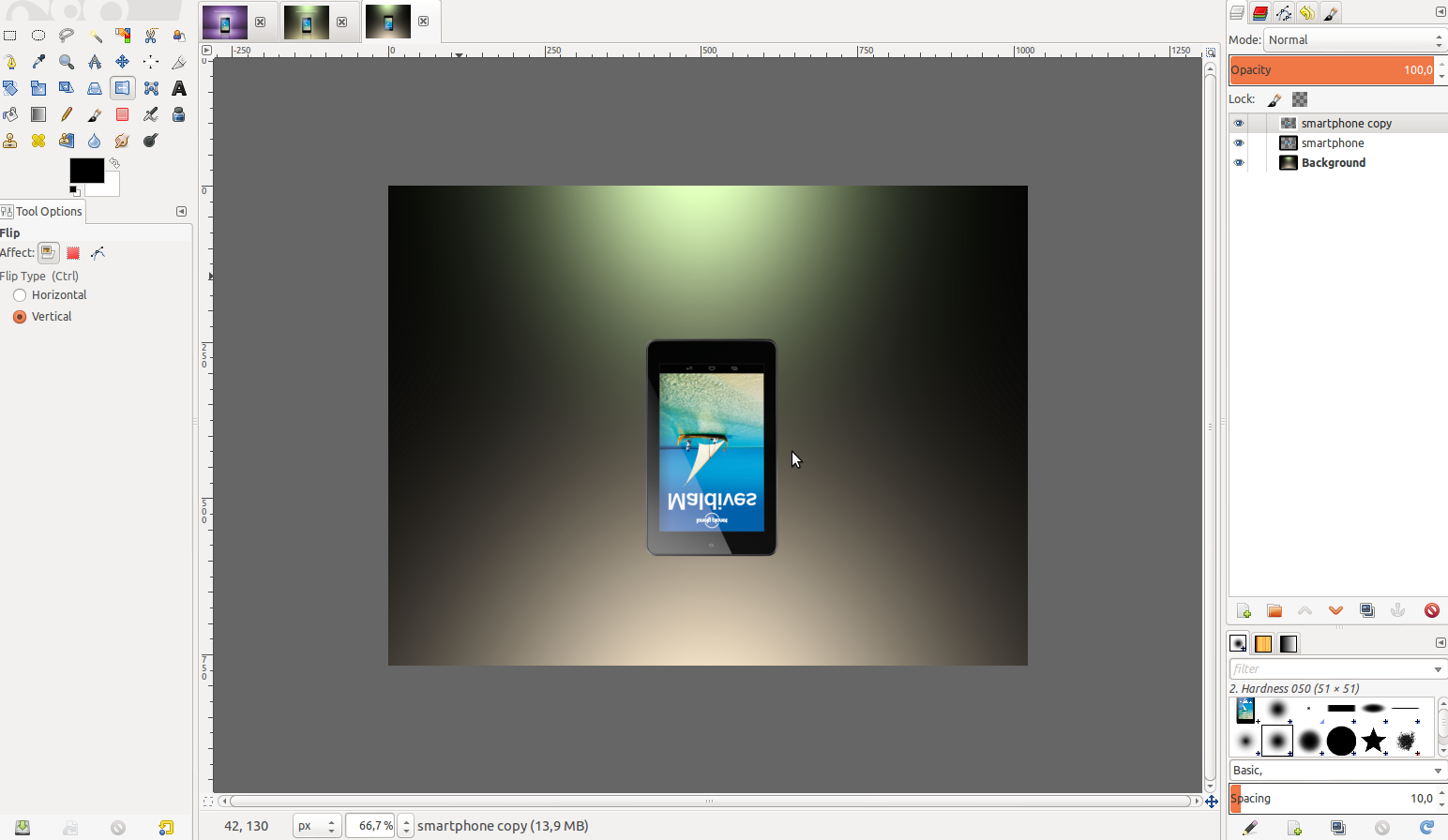
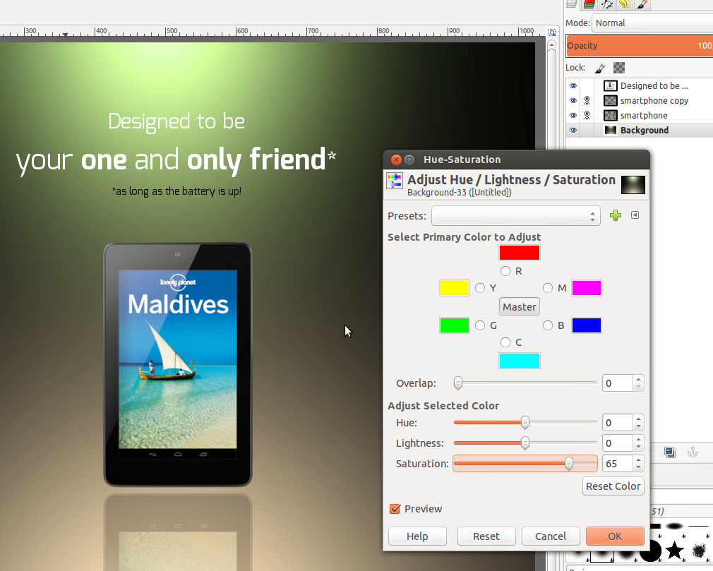
You can now make the background more saturated. Choose the bg-layer and go to Colors / Hue&Saturation – move the slider for hue to ~65.
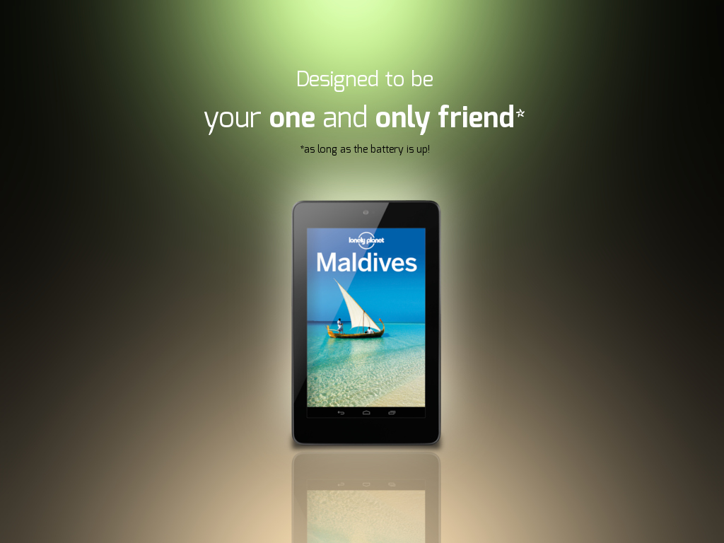
The background is now done. If you want to see the second one without doing text stuff and fine-tuning skip to step 13.
-
10
If you don’t like the noticable color steps in the gradient in the background you can just blur it with Filter / Gaussian Blur – use a value around ~150 pixels.
-
11
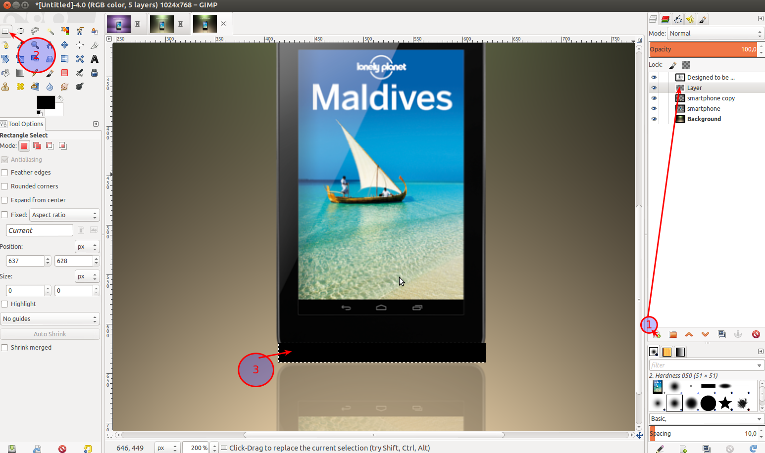
Some minor enhancments: Add a soft shadow on bottom of the smartphone:
- Make a new transparent layer. (1)
- Choose the rectangle selection tool (2)
- draw a selection as seen in the image and fill it with black. (3)
- Then de-select it (Select / None) and
- Filter / Gaussian Blur: 15px.
- Move that shadow layer below the layer where the smartphone is on (in the layers stack dialog). -
12
To make the background of the smartühone glow a little more:
Select the smartphone layer, go to Filter / Light & Shadow / Drop shadow: x: 0 / y: 0 / blur: 120px / opacity 100%. Then set the layers mode to Grain merge.
-
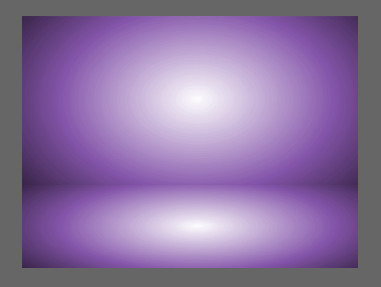
13
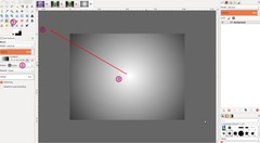
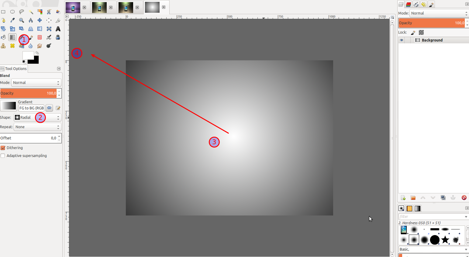
While the first background style was smooth and double colored the second one will have more focused light spots. For the second background start with the blend tool (1). Choose a radial form (2). Make sure white is your foreground color, black your bg color. Drag the gradient from the center (3) to outwards the image (4).
-
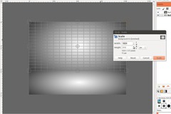
14
Duplicate the layer (1), choose the transformation tool (2) and shrink the duplicate as seen on the image from top to bottom (3).
-
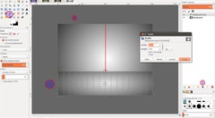
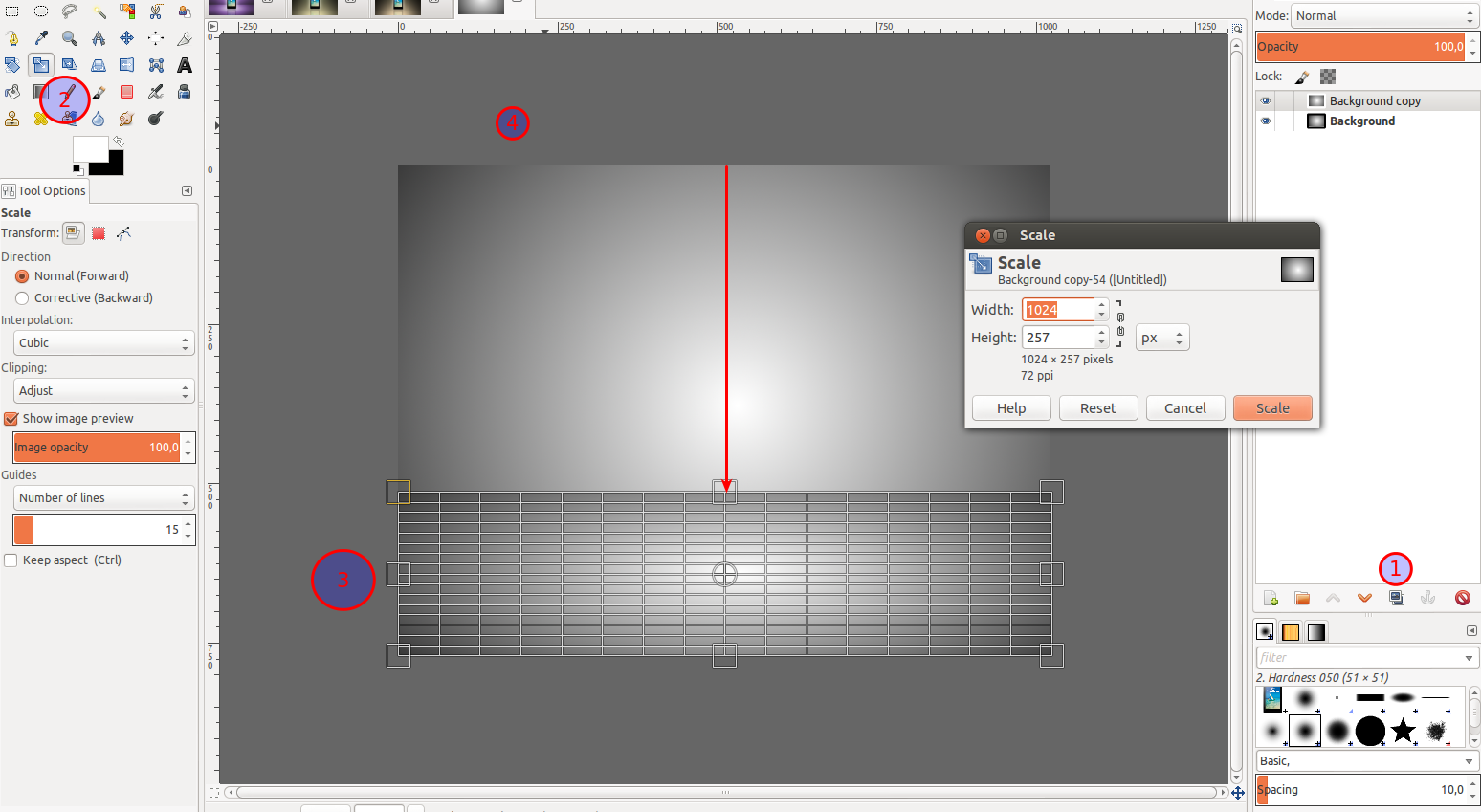
15
Now scale the original background layer as seen on the image.
The interesting stuff on this is that the two light spots we just created will enhance the mirroring effect we already did with the smartphone in step 6.
-
16

In the layers stack dialoge right click the layer and choose “new from visible”. Then go to Color / Colorize. Choose any color you like.
-
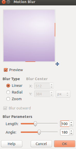
17
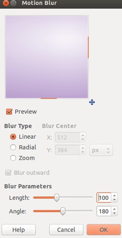
If you’re working in 8-Bit per channel mode (GIMP 2.8 does not yet have higher bit depths) you’ll notive some color steps which are not so nice. To get rid of them use the Filter / Blur / Motion blur filter (length: 100, angle: 180°). Repeat this once with a angle of 0°. After that you’ll have a very nice transition of the blur.
-
18
Now just put any object you want in the middle (as described above).
-
19
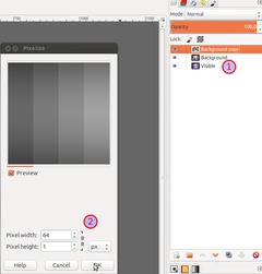
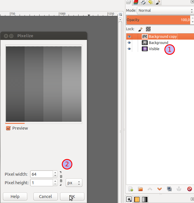
Another pretty nice variation it a soft structured background that gives a little more depth to the presentation scene. Some soft lines are added using the Filter / Blur / Pixelize filter. To do this continue at the end of step 17.
Move the colored layer to the bottom of the layer stack (1). On the two original layers apply the Pixelize filter with the shown settings (2)
-
20
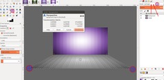
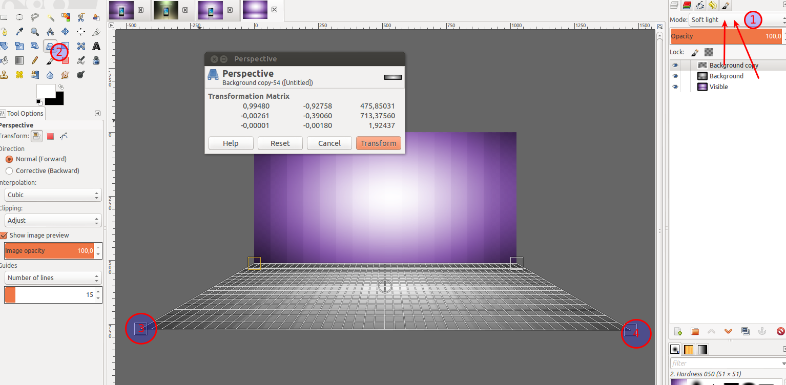
Set boths layers modes to soft light (1). After that to create the perspective choose the Perspective Scale tool (2). Click the layer with the bottom part and transform it as shown on the image (3 & 4). After that you can merge all layers and use it as structured new background.
-
21
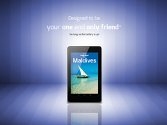
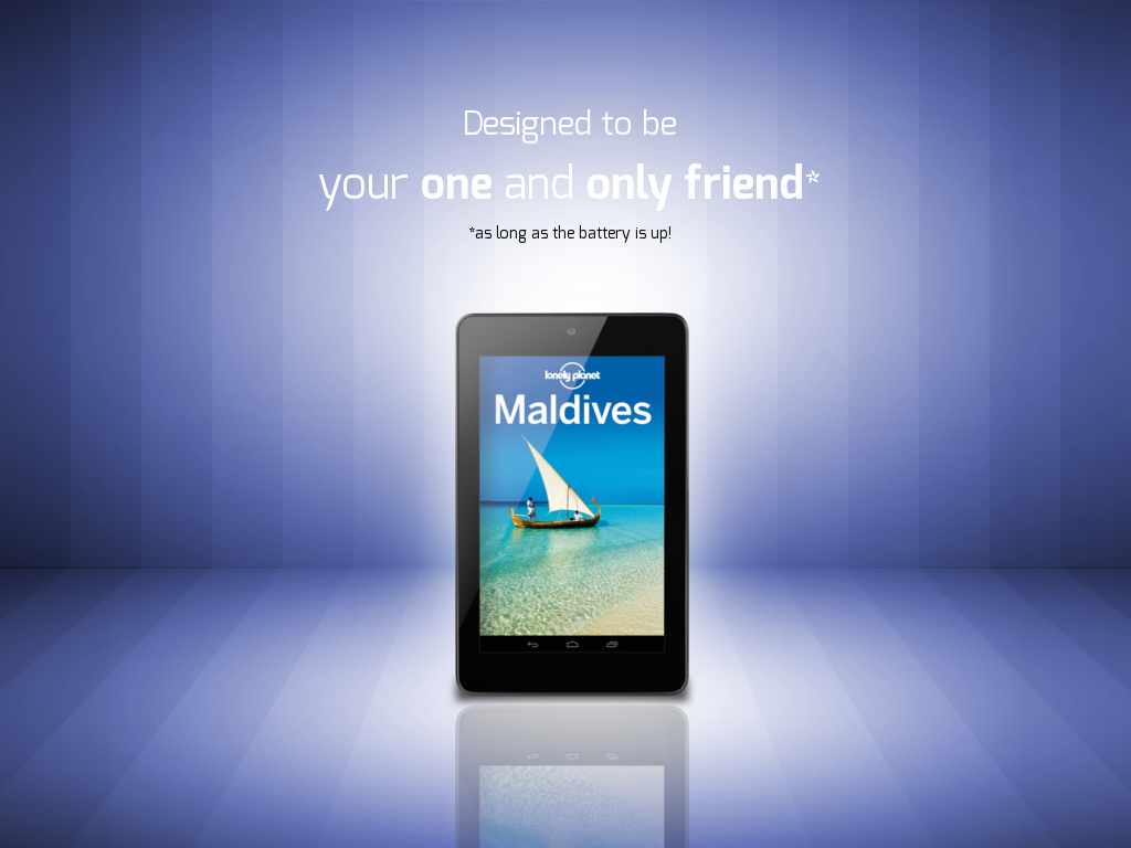
The final image with structured background.
-
22

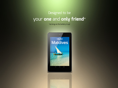
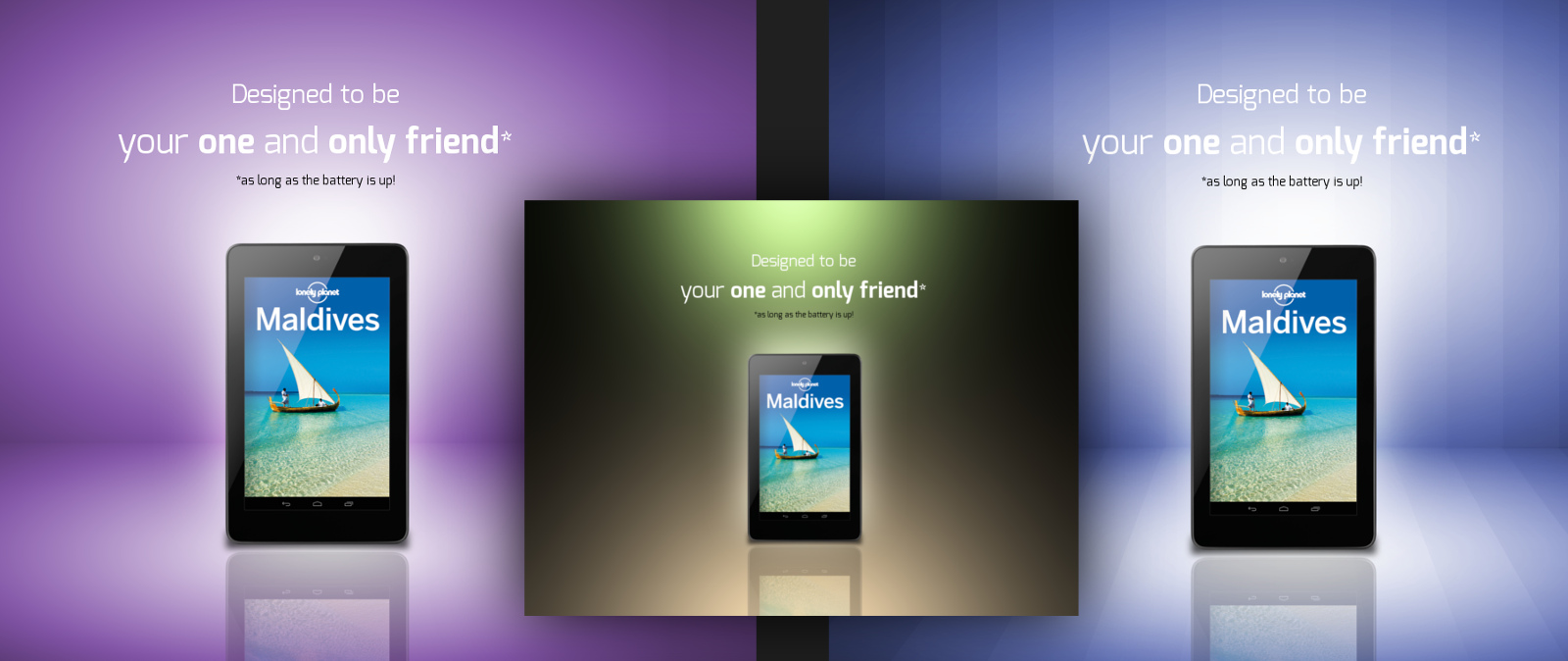
Finally – a collage of all the three background designs! I hope you enjoyed it ;)


Comments
Post your own comments, questions or hints here. The author and other users will see your posting and can reply to it.
Of course, you can also ask in the chat.
Subscription management
Please log in to manage your subscriptions.
User rating
This topic (2 Ways for designing soft backgrounds for product presentation) has been rated 4.5/5.0.
New comments are disabled because of spam.