RSS/Atom feed Twitter
Site is read-only, email is disabled

Tutorial: Neon Glow

Written by · Created on May 08, 2007, last updated about 13 years ago CC BY-NC License
Neon Glow

Motivation

In this simple tutorial I'm gonna show you how to create a cool neon glow text in only 5 very simple steps!

Tutorial details

  1. 1

    Create an empty file: 500×180 px. Choose black as background color. Choose the text-tool and write “neon text” in a size of 80. Move the text to the middle. Then do Layer / Layer to Picture size.

  2. 2

    Take the brush tool, choose a hard brush of a size of 13, now draw connections between the letters as seen on the picture. It doesn’t have to be too exactly… We need these connections because neon text is always connected.

  3. 3

    Now go to Filter / Blur / Gaussian blur: 15px.
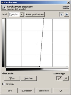
    After that choose (GIMP 2.2: Layer ) / Colors / Curves and select ALPHA in the top left corner as channel. Now move the bottom left point to the center, the to right one move to the left also to the center.

  4. 4

    - Filter / Alpha to Logo / Neon and enter these values:

    Effect size: 40
    Background color: black
    Glow color: choose any cool color you like

  5. 5

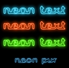
    Now we’re just adding a bit more glow to the text. You should have a layer named “Neon Tubes” and another named “Neon Glow” now. Activate the Glow layer and duplicate it. On the duplicate apply a Gaussian Blur: 35px. If you still don’t have enough glow (like me ;)) just duplicate the layer again!

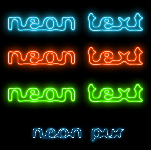
    The whole thing could look like this:

    Have fun!

Comments

Post your own comments, questions or hints here. The author and other users will see your posting and can reply to it.

Of course, you can also ask in the chat.

Subscription management

Please log in to manage your subscriptions.

User rating

This topic (Neon Glow) has been rated 4.0/5.0.

New comments are disabled because of spam.

eddycurrents
over 12 years ago

With experimentation I got this to work. I found the key here is Step 3. The blur makes the text "blobby" and the color curve makes the text edges sharp again. For the color curve, you need a line that is nearly vertical to get sharp edges. As you move the starting point to the right, you make the text thinner but lose detail, so you need to find a point that makes you happy. I also had to experiment with the amount of blur. The end result is fat curvy text with sharp-ish edges, all white. A picture of this in the tutorial would be really helpful. Once I figured that out I could apply the technique to text of different sizes. Then for step 4, I had to reduce the effect size to keep detail. Great article though.

staroad rated this topic with 4/5
over 13 years ago

Thank you. Very helpful :)

^_^ :D (: ;P
about 14 years ago

Hey, its cool! I could use this for making signs.. :D

kaiden
over 14 years ago

oh and as for makeing it clear..once ur done doing the neon and all that go to the alpha curve thing and grab the top right dot and drag it horizontaly left do the oposite for the bottom left dot untill u get the desired effect. (you might have to duplicate the layer again too)

kaiden
over 14 years ago

i figured out how to fix it all you have to do is lower or raise the gausian blur and then when u change the alpha curve just make sure you have the outline of text as you want it in the final neon version if its not right then go back and twek gausian blur untill its good. it worked for me.

Max Farr
over 14 years ago

When I did the Neon part, my text disappeared, rather than turning neon.

Christian
over 14 years ago

A lot of comment about this tut not working and it's not. I tried different textsizes, different Gaussian Blur, different alpha curves, different eveything. Still not near the same "clear-iness" as shown in the tut. Can someone who actually understood the tutorial tell the rest of us how to do?

Danny
almost 15 years ago

To make it appear outlined, you either

A) Start with a bigger canvas and use a bigger font size
or
B) Reduce the neon effect size

I had the same problem but this sorted it out ^^

Alan
about 15 years ago

After i use Neon the inside is white, not black.What do I do???

John
about 15 years ago

I have the same problem as a previous comment. When I chose the black background in the Alpha to Logo >> Neon filter the image background is black but the inside of the writing is not black it is white, so it doesn't look outlined. Help much appreciated ! Thanks.

TheFlashWizrad
about 15 years ago

This is a very effective technique, I create forum signatures for people and this has just been added to my inventory list

Thanks

TheFlashWizard

Dan
over 15 years ago

Am I missing something here? Mine works, but it not anyway near as clear as the example.

I can get neon effect but it is not coming out as an outline like the tutorial.

Blast
over 16 years ago

Cool...very simple. HEY!!! MAYBE THIS IS WHY MY NEON NEVER WORKED!!!

Rayy is Naked
over 16 years ago

just figured it out...its in script fu

Rayy is Naked
over 16 years ago

yea i dont have the Alpha to Logo in filters...

MeteeOzguz
over 16 years ago

I dont have Alpha to Logo segment in Filter and I couldnt find it...How can I add it? Thanks...

snipermony member for over 16 years snipermony 1 comment
over 16 years ago

good job

manu
over 16 years ago

Awesome!! I was looking at some signage for my new resort n this really helped!
Manu