


Tutorial: Infrared / Monochrome Effect
 is licensed under a Create Commons Attribution-Non Commercial 3.0 Unported license.")

Motivation
Black/White or Monochrome effects on pictures are evergreens in image manipulation and picture presentation. Also some speak of the so called infrared-effect which is just a special adjustment of the graytones.
Tutorial details
- Category: Techniques
- Time to reproduce: ≈15.0 minutes

- Tested with GIMP 2.3.16
-
1
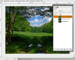
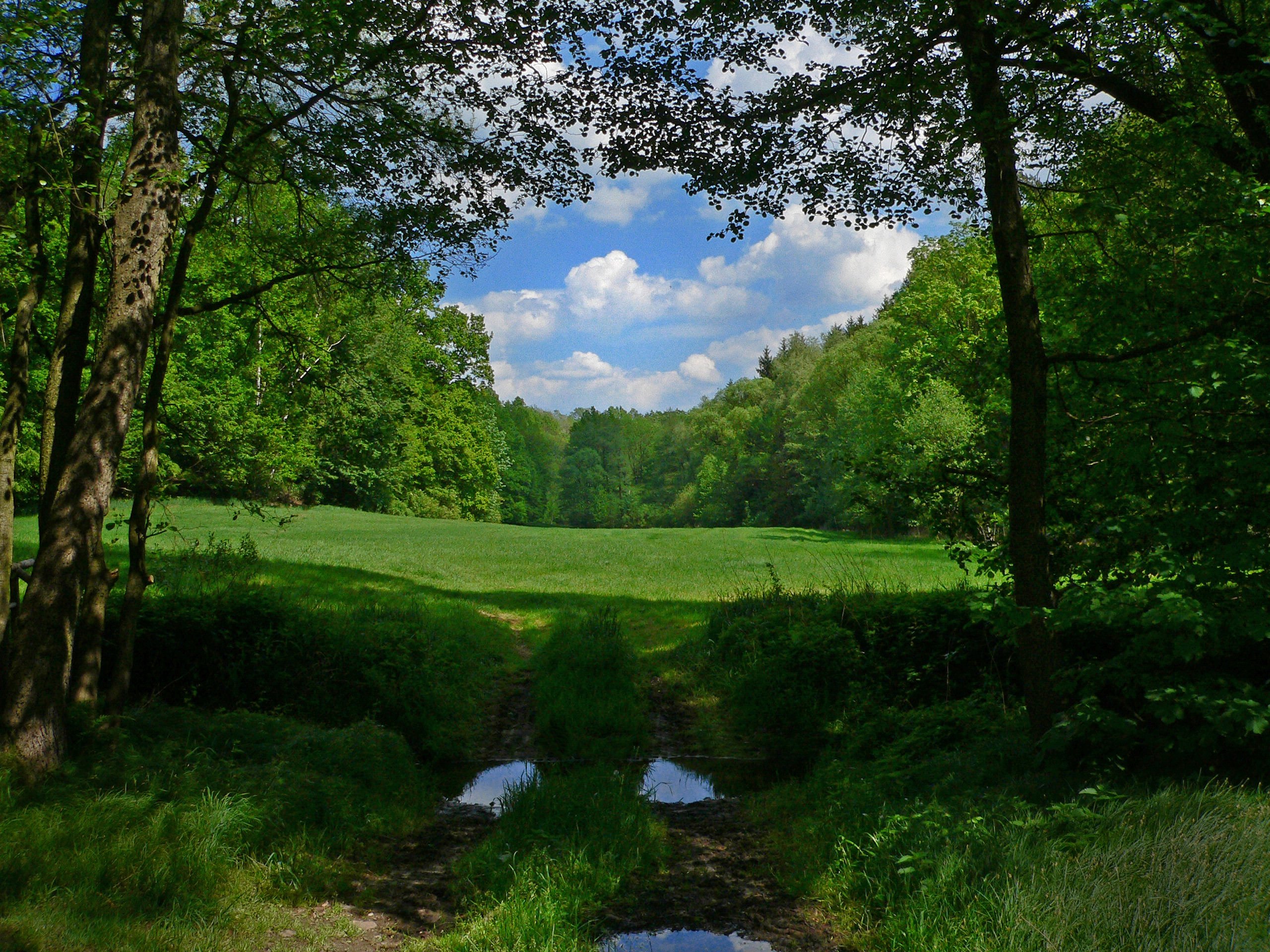
Before you start: Because all pictures look different you can not use this tutorial 1:1 for any picture in the same way. You can only do it ecxactly like me when using my picture (download from the right).
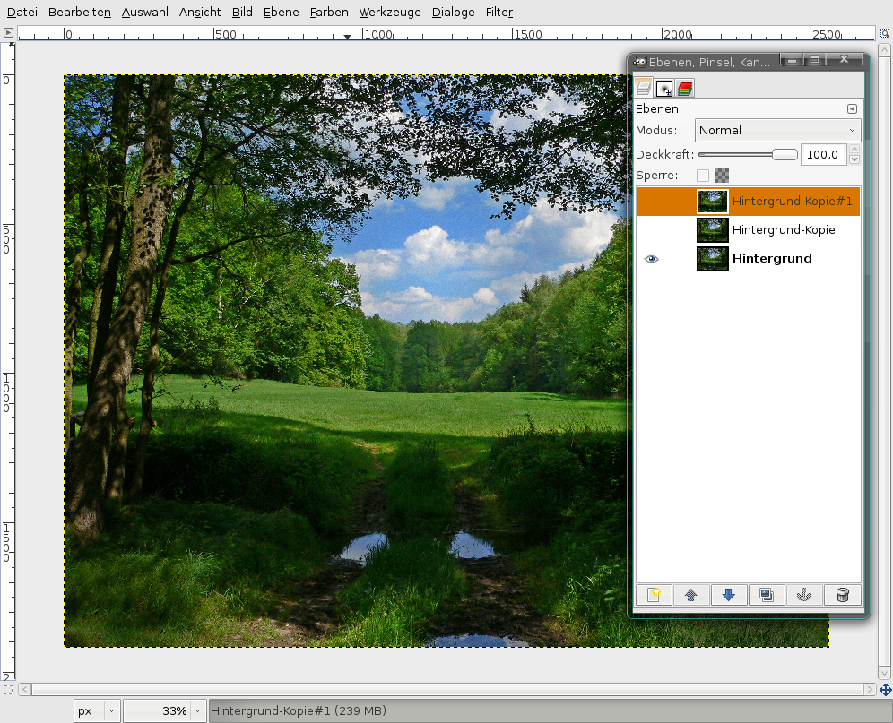
Ok, let’s go. Open up your image in GIMP. Duplicate the background layer 2 times and click the eye symbol of the duplicates to make them invisible. If something goes wrong you still have the original image.
-
2
The effect that I’m trying to do now is also commonly known as the “infrared effect”.
Why infrared you ask? In the past and in the analog photography times the photographer put an infrared filter before the camera. The picture then got an extraordinary contrast of the blacks and whites and the photo looked somehow surreal. Why surreal? Thats because the infrared filter sees and records colors that cannot be seen by the human eye.
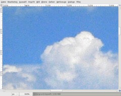
Ok lets continue with the effect. Click the visible background layer in the layers dialog to activate it. First we have to better the quality of the picture. You don’t have to do this when you have a good picture. But if you zoom into my picture at 300% and look at the clouds you can see the noise. Thats what we eliminate now.
-
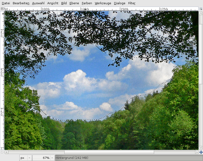
3
Use the free selection tool and make a selection around the clouds in the middle. After that go to Selection / Feather: 75px.
-
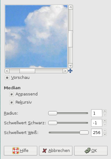
4

Next go to Filter / Enhance / Despeckle. (1 / -1 / 256). Check both checkboxes.
We’ve get rid of the most noise now.
-
5
Next we further enahance the picture quality by using Filter / Blur / Selective Gaussian Blur: 10px / MAx.Delta: 13. That should be enough to get a smooth transition / fading.
Selective Gaussian Blur maintains contures and sharpness while blurring only areas of very similar color. So thats perfect for clouds.
-
6
Selection / None.
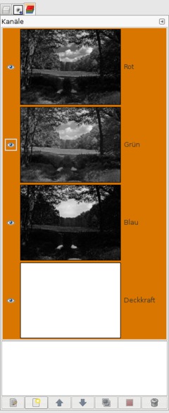
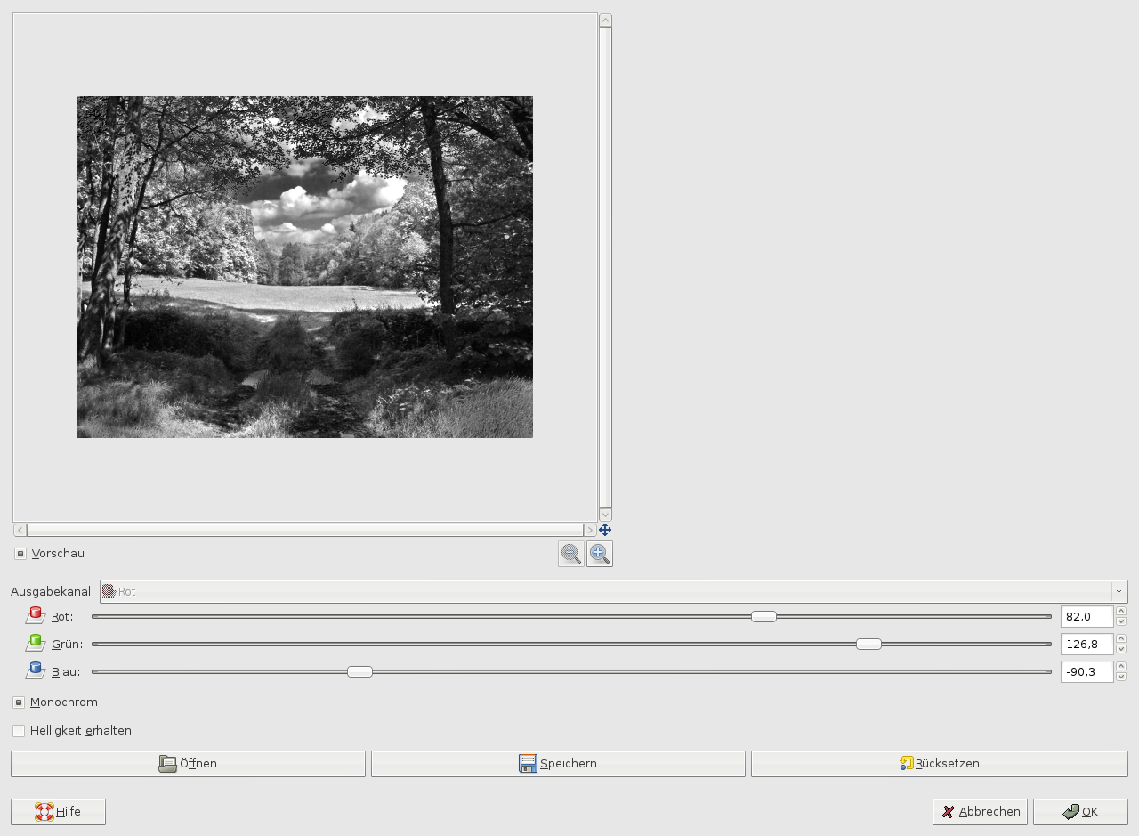
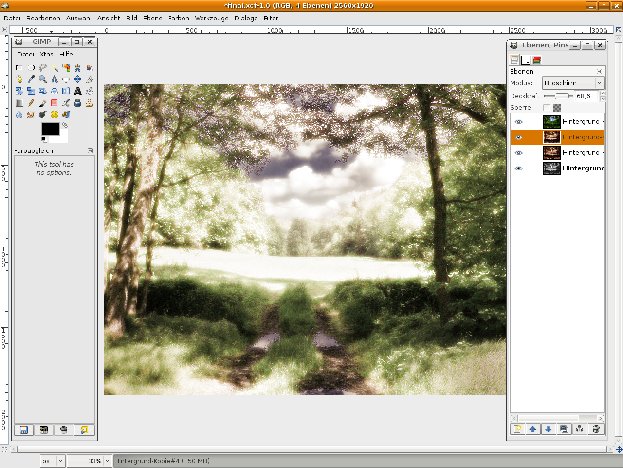
All preparations are done, no we’re going to simulate the infrared-effect. There are LOTS of ways to get different grayscale images. So it is not always clear which one to use. If you really want nice and aesthetic looking images you should consider the most comfortable method: the channel mixer.
basic things so that you understand how that all works: Every picture in the RGB-Color-Model consists of 3 colors: Red, Green and Blue. These together result in the final color image. You can see these 3 colors by looking into the Channels-Tab (Dialogs / Channels).To do very good image enhancements and editing many professionals just only work on one of these channels to not affect the others. For removing noise you would i.e. work on the green or blue channel, to adjust contrast you would work mostly in the red channel. We are editing these channels now by using the Channel Mixer.[/i]
Change back to the layers dialog now.
-
7
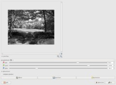
Pretty well hidden, the channel mixer can be found under Colors / Components / Channel Mixer. Click the “Monochrome”-Button to the bottom of the dialog.
Look at my screenshot to see the values i used. Important: Try it yourself! Have the information I told you in the last step in your mind while you move the sliders of each channel.
Note that you normally should not get plain white or black areas. When doing this you would loose detail (and image/pixel information) in your picture.
-
8
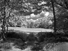
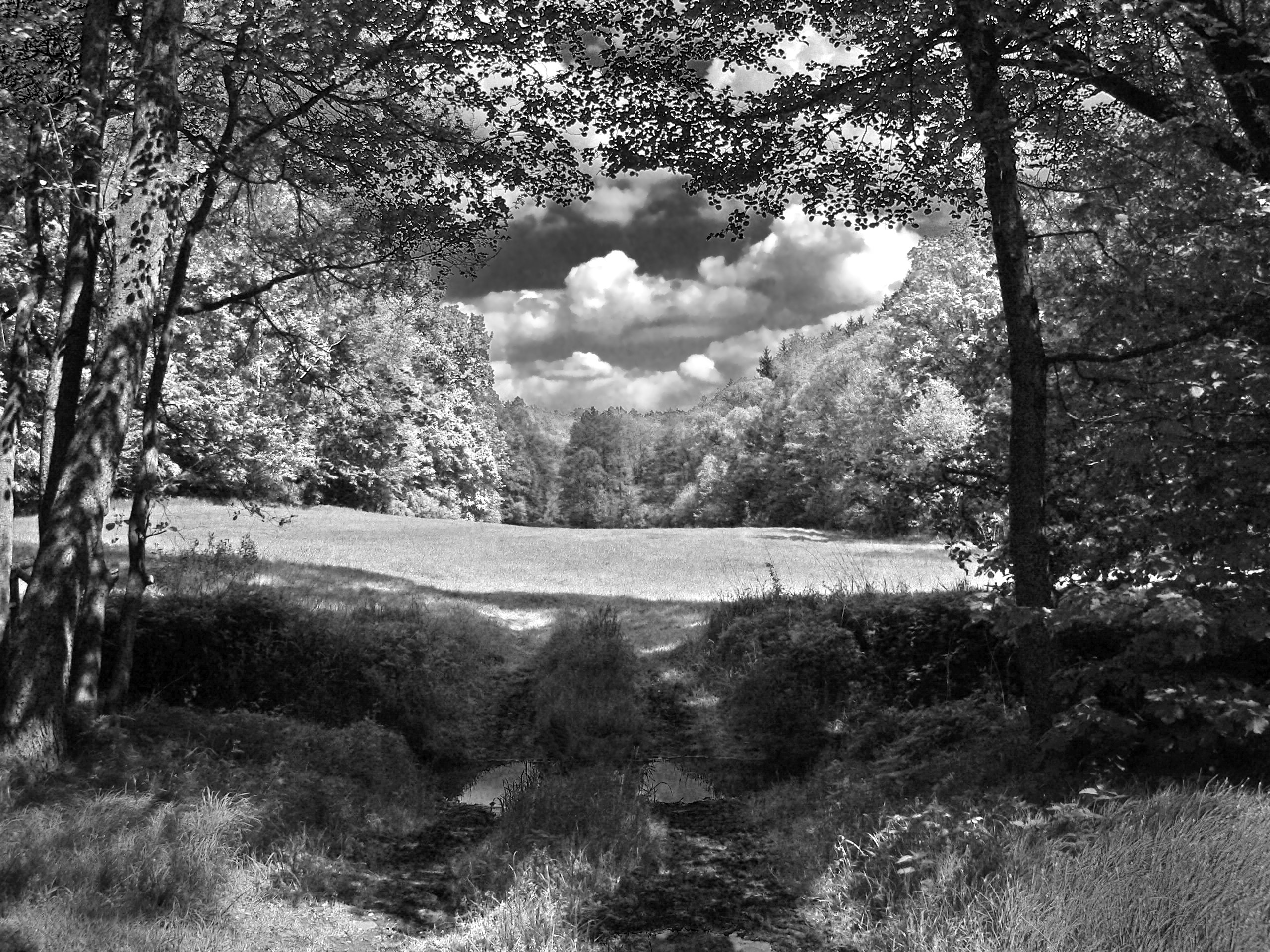
Our infrared-like image is done now ;) That was easy!
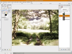
Now if you’re interested: Comprae our created grayscale image with another one you only applied the Colors / Desaturate-Filter on. The difference looks pretty cool!
-
9
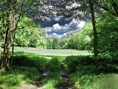
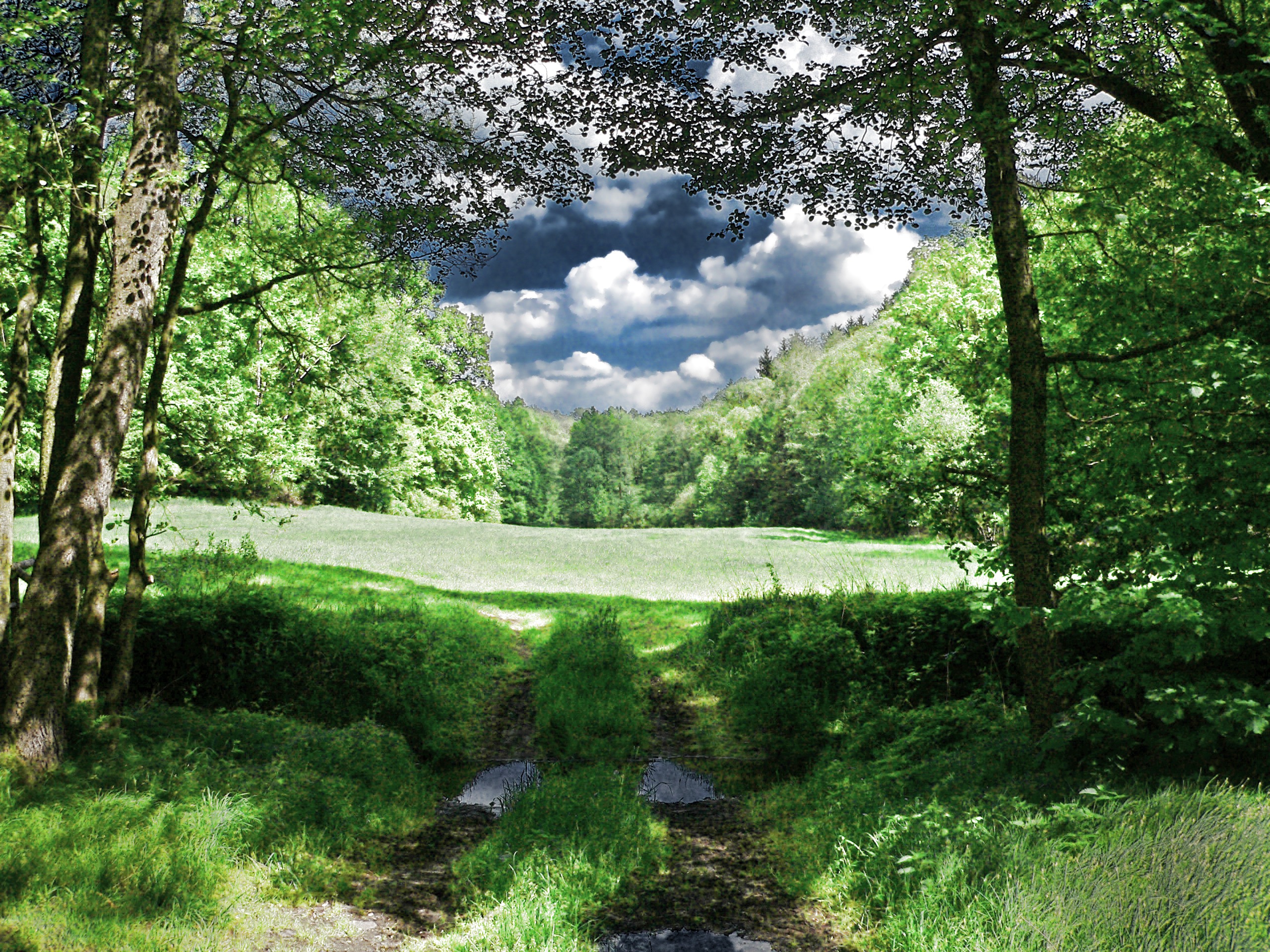
Ah, another thing: You can easily get colors back into play – that looks cool too!
In the shot below I made a copy of the original background visible, set the opacity/transparency slider to 35% and the layers mode (in the layers dialog at the very top) to Color.
-
10
And here we go with the well known “dream”-effect for which the infrared-effect is also a very good basis:
From step 9: duplicate the gray layer, apply Filter / Gaussian Blur to it (between 20px – 40px. this varies and depends on the size of your picture). then go to Colors / Color Balance and choose a color of your choice – this is the dreamy color – then set the layers mode to “Screen”.
Optional: you can duplicate this layer again to strengthen the effect.
I used these color balance values:
Shadows: 40 / -10 / -30
Mids: 30 / 15 / -30
Highlights: -30 / -30 / -30Done!
-
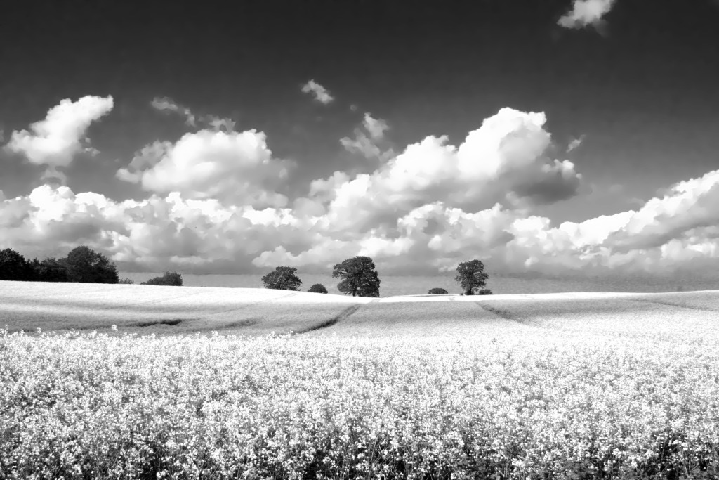
11
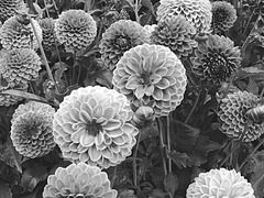
Here’s another grayscale image with this technique.
-
12
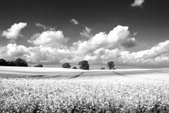
… and a last one! Hope you enjoied the tutorial!
-
13
Clouds give the the effect a very nice depth! Have fun by doing this on your own.


Comments
Post your own comments, questions or hints here. The author and other users will see your posting and can reply to it.
Of course, you can also ask in the chat.
Subscription management
Please log in to manage your subscriptions.
New comments are disabled because of spam.