


Tutorial: Creating an industrial-style wallpaper
 is licensed under a Create Commons Attribution-Non Commercial 3.0 Unported license.")

Motivation
This tutorial shows how to create a good-looking high-contrast industrial wallpaper. You can reproduce the tutorial with other images to bring your own style into it.
Tutorial details
- Category: Photos / wallpapers
- Time to reproduce: ≈25.0 minutes

- Tested with GIMP 2.6
-
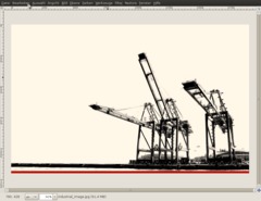
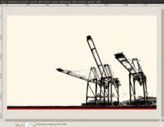
1
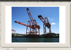
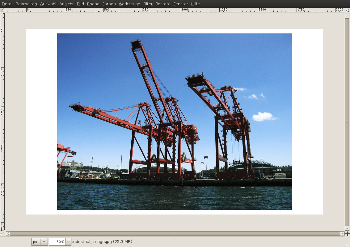
In my case, I want to create the wallpaper for full HD resolution (1920×1200). So I create a new image with this size. If your screen has another resolution, use this one.
When you have created the empty image, load the original image into the new one as a new layer: File / Open as layer
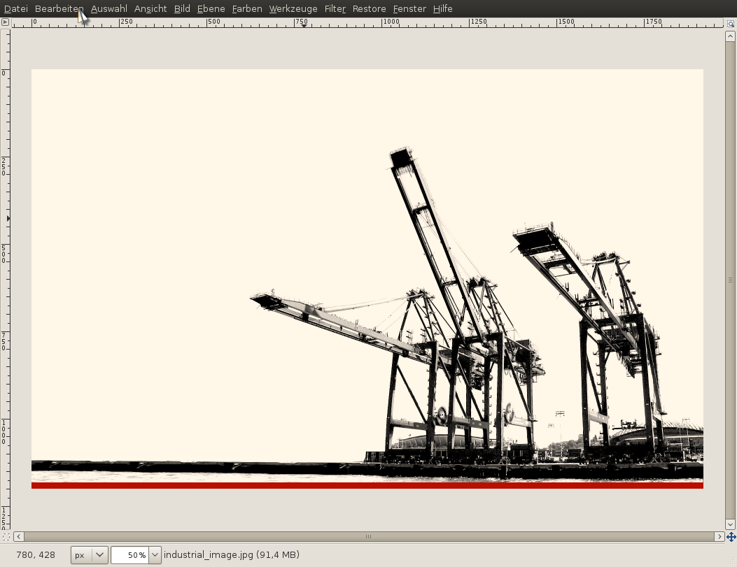
Now the photo is on a new layer. In this example, I use the image “industrial_image.jpg” (see downloads above)
-
2
(if the layer in the layers dialog is printed in bold font it indicates that the layer does not have an transparency channel – right click in the layers dialog and add one if needed)
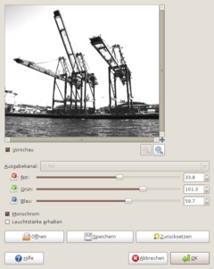
The aim of this step is to get a very nice high contrast black/white image of the cranes on my photo. We can do that using:
- Colors / Components / Channel mixer
We want to get a white background (which will be easily removed later), while our cranes on the picture shall be almost dark gray and black.
First I checked “Monochrome” in the channel mixer. Next step is to play around with the red/green/blue channel values so that you get a walmost white background. The sky shall be white, and because it is blue in the original image I raise the values of the Blue channel until it is completely white.
-
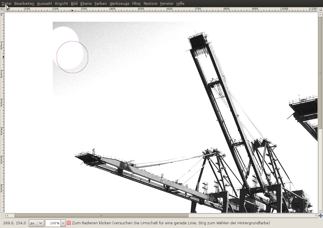
3
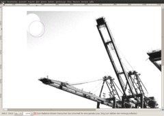
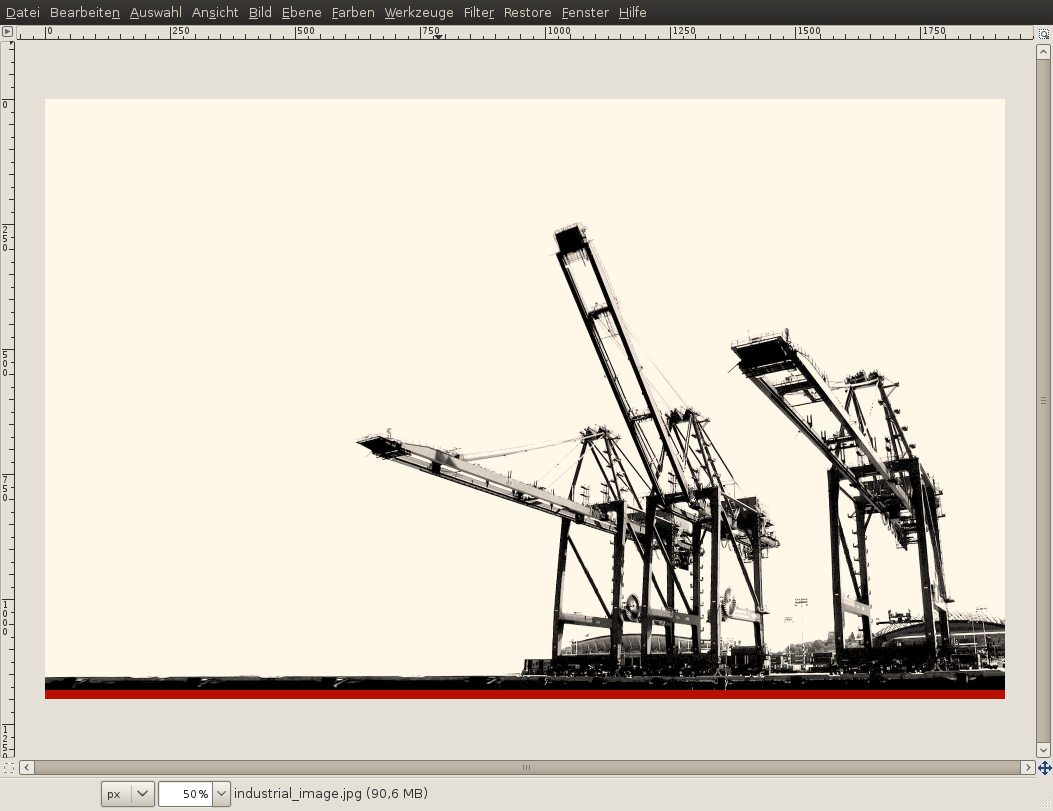
After applying the filter we have to manually remove some white parts (top left part of the image) that are still gray.
- Use the eraser tool. Select a big brush (use the scale ruler in the preferences of the tool. max it!).
- After that remove the remaining gray tones in the image. -
4
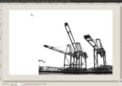
Next I move the parts of the photo to the right and to the bottom of the canvas.
-
5
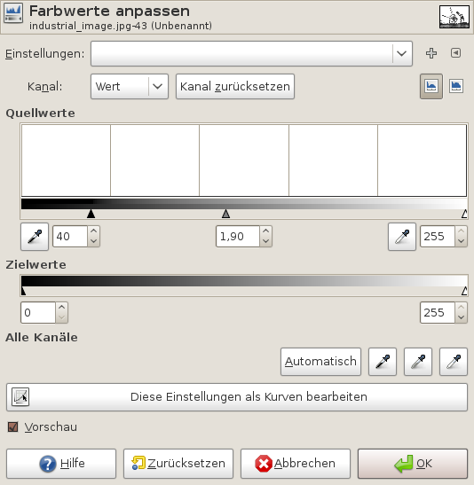
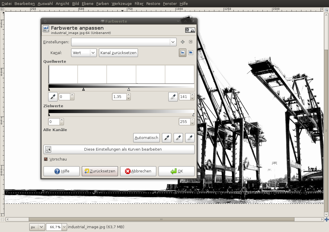
If you take a closer look to the image you’ll see that there are still lots of different gray tones in the picture.
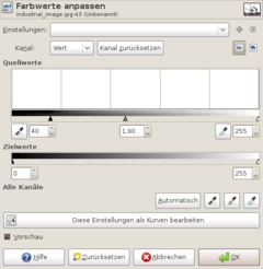
The ULTIMATE tool to handle fine gray tones in an image is the “Levels” filter found in the “Colors” menu.
- Colors / Levels
In this filter you can see 3 little triangles. With these you can affect the light and dark tones of an image – in our case the bright and dark gray tones.
Now I want to make the dark gray areas (of the cranes) even darker. To do that I move the left triangle a bit to the right. I also want to to affect the middle gray tones so that the become a bit brighter (move the mittle triangle to the left).
the values should be: 40 | 1,9 | 255
-
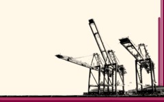
6
Now we’ve finalized the contrast. We created a high contrast black/white image.
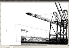
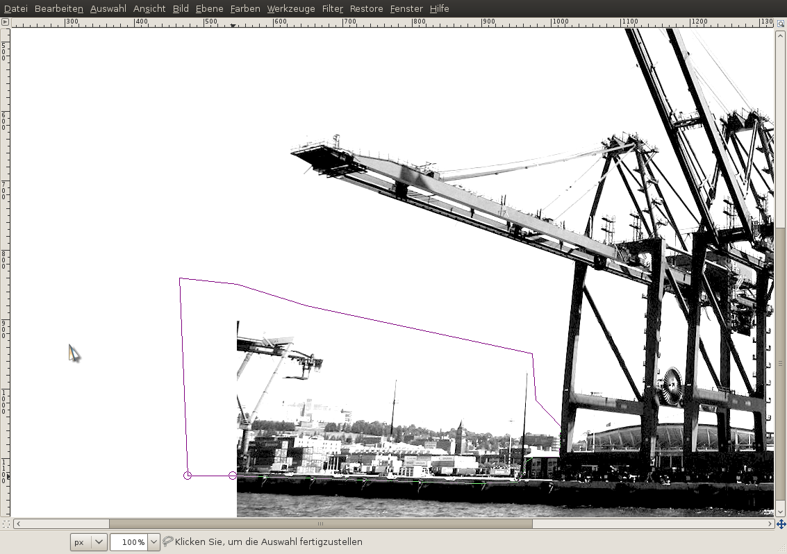
Next comes some more finetuning. We want to give the image a look more like a desktop wallpaper. So we’ve to remove some parts and enlarge the with a bit.
- Use the free select tool (press F to select it). Now begin clicking to select the parts shown on the screenshot below. After reaching the first point click in it to complete the selection. After that press DEL on your keyboard to remove the selected parts.
- Selection / None
-
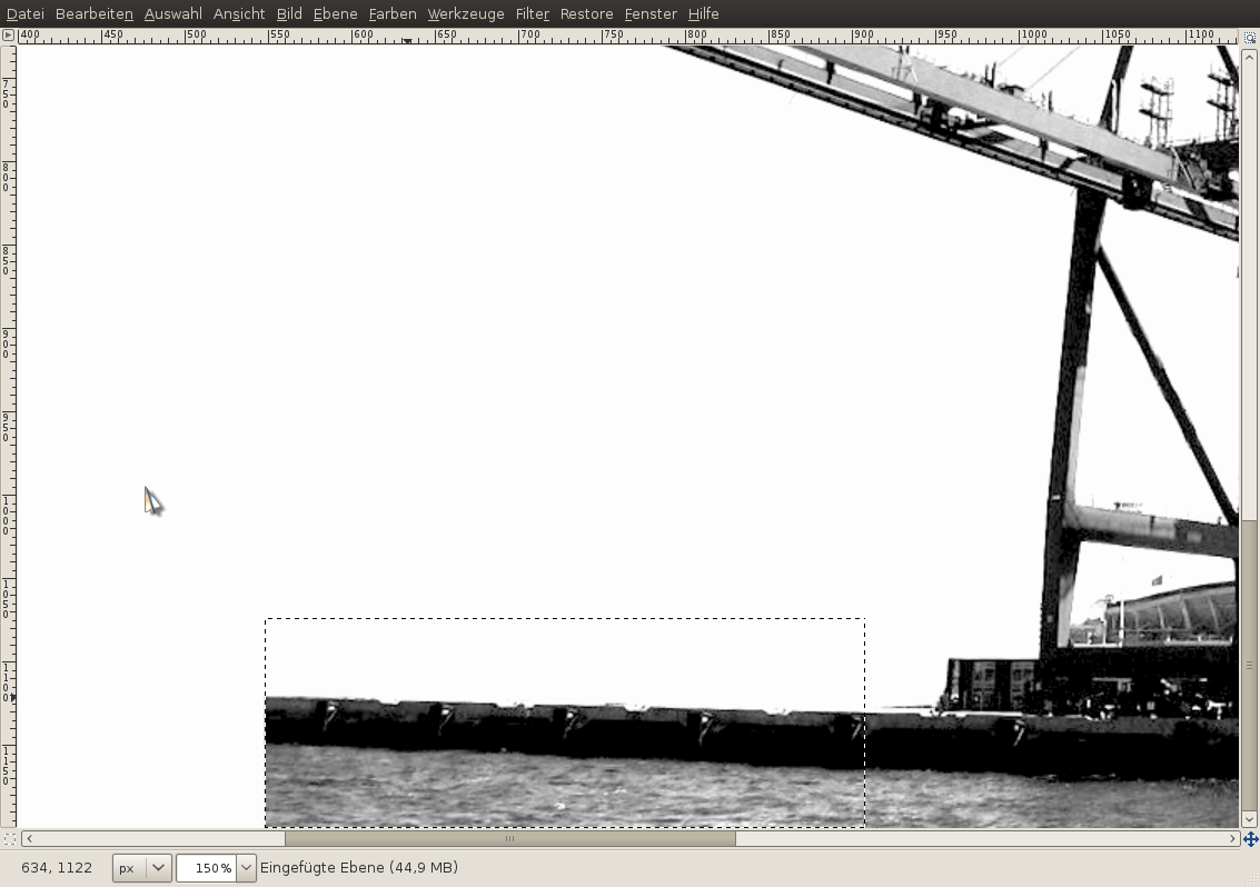
7
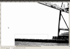
- Use the rectangle selection tool and select the part shown below.
- Edit / Cut
- Edit / PasteThen click the “New layer”-button in the layers dialog. Then the selected part will be on a separate layer but still at the same position as before.
-
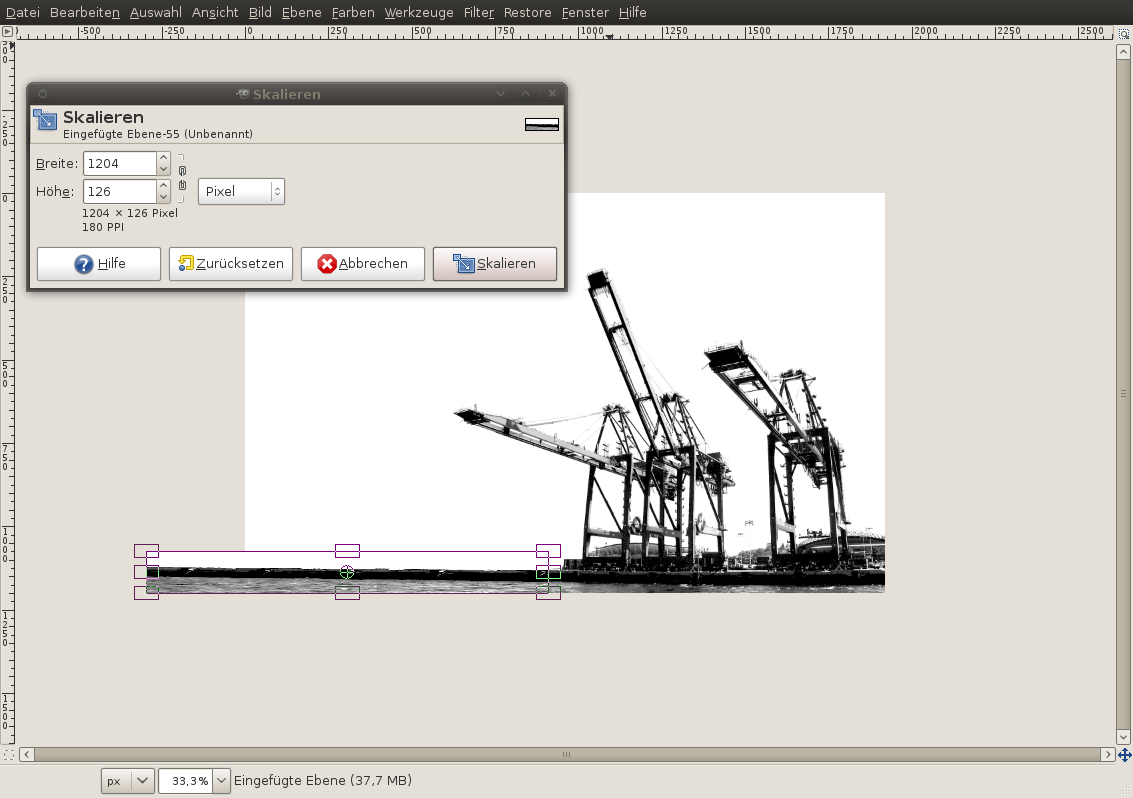
8
- use the Scale tool (use SHIFT+T to select the tool via hotkey). Click the part you just pasted on the canvas and move the left border to the very left of the canvas. That action scales the pasted part so that it fills the whole width of the image.
-
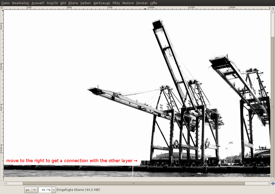
9
Now move the part a bit to the right so that it fits with the layer below. There shoul’nt be a white room/line between these two layers. They need to fit perfectly.
Right click this layer in the layers dialog: “Merge down”. After that the pasted part is merged with the cranes-layers.
-
10
- Now select the whole “water” part in the image using the rectangle select tool.
- Colors / Levels: 0 | 1,35 | 140
That action highers the contrast of the water part and makes the selected parts a bit brighter.
- Selection / None
-
11
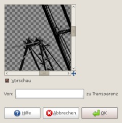
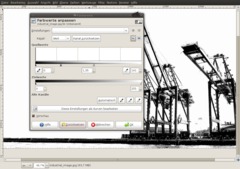
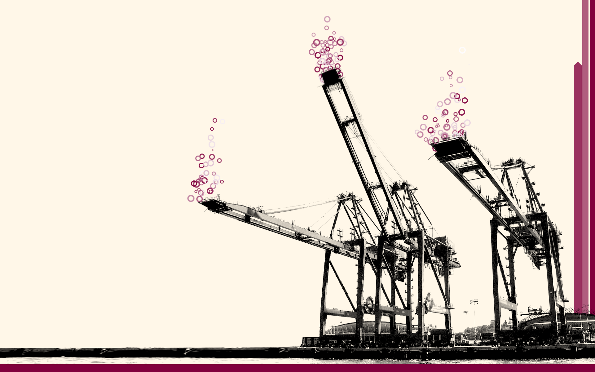
In the next steps we’re going to add a new very bright color to the background.
- Colors / Color to transparency
-
12
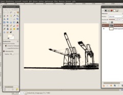
Choose fff7e8 as foreground color. Switch back to the background layer and select it in the layers dialog.
- Edit / Fill FG-Color
-
13
Now use the rectangle selection tool and choose a thin rectangle selection on the bottom of the canvas.
- Add a new, transparent layer
- FG-Color: 81003d.
- Edit / Fill FG color (hotkey: CTRL+,) -
14
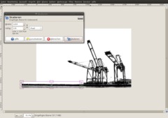
You can leave the line as it is. It overlaps the water area of the picture. But as you can see the whole thing is not too asthetically pleasing because the line is not in parallel with the water.
To change it:- select the cranes layer. Use the rotate tool (CTRL+R). Use -0,6° or -0,7° and apply it.
-
15
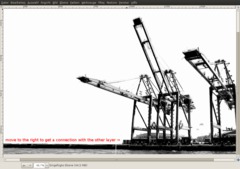
Now the whole thing looks much better. As a next step I add some more colored lines to the right of the screen. That should be easy using the rectangle tool and some more new layers).
I’ve also tried to make one of these line connected with a small arrow. I’ve simply used the free select tool to cut the upper part of the line so that an arrow remains in the picture.
-
16
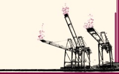
I’ve been experimenting myself a bit longer and used the brush dynamics to paint some circles into the picture. I’m not sure which one is looking better but you can post a comment on this issue below if you want ;)
My initial image with the cranes is a free image from sxc.hu.
I hope you enjoy the technique and you find it useful.
tip on the circles: I created one circle on a sepearate layer, copied it and used this copy as a brush. Then I used a random size and a random opacity in the brush dynamics of the paintbrush tool together with a high jitter value to paint lots of the circle at once.


Comments
Post your own comments, questions or hints here. The author and other users will see your posting and can reply to it.
Of course, you can also ask in the chat.
Subscription management
Please log in to manage your subscriptions.
User rating
This topic (Creating an industrial-style wallpaper) has been rated 5.0/5.0.
New comments are disabled because of spam.