


Why is lettering not clearer?
This discussion is connected to the gimp-user-list.gnome.org mailing list which is provided by the GIMP developers and not related to gimpusers.com.
This is a read-only list on gimpusers.com so this discussion thread is read-only, too.
| Why is lettering not clearer? | chrisj | 04 Aug 21:50 |
| Why is lettering not clearer? | rich2005 | 05 Aug 07:40 |
| Why is lettering not clearer? | rich2005 | 05 Aug 07:59 |
| Why is lettering not clearer? | Rick Strong | 07 Aug 19:57 |
| Why is lettering not clearer | chrisj | 08 Nov 23:52 |
| Why is lettering not clearer? | chrisj | 16 Nov 17:43 |
| Why is lettering not clearer? | chrisj | 16 Nov 17:47 |

- postings
- 16
Why is lettering not clearer?
Hi,
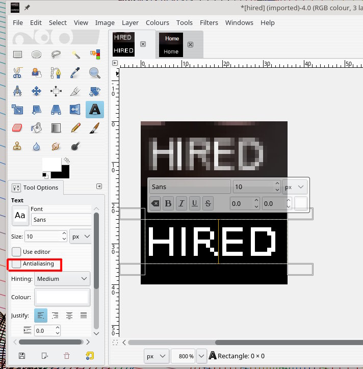
I created a logo and uploaded to a web page, as you can see by the attached image "HIRED", the lettering/text doesn't look clear. It is Arial 11 on a transparent background. Gimp 2.8
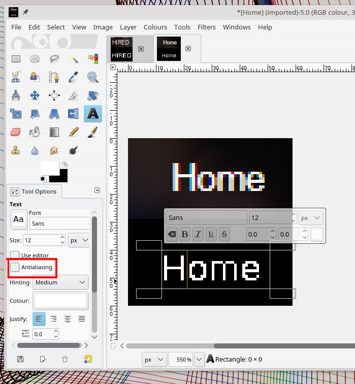
The link to the home page "Home" is attached. it is not part of the logo, but looks much clearer on the web page.
Is there something I can do to help make the logo text sharper/clearer?
Any help will be appreciated.


Why is lettering not clearer?
Hi,
I created a logo and uploaded to a web page, as you can see by the attached image "HIRED", the lettering/text doesn't look clear. It is Arial 11 on a transparent background. Gimp 2.8
The link to the home page "Home" is attached. it is not part of the logo, but looks much clearer on the web page.
Is there something I can do to help make the logo text sharper/clearer?
Any help will be appreciated.
Not a guess this time.
The size and weight of the font is too small. By default Gimp applies anti-aliasing, hence those semi-transparent pixels. Because of the small size they dominate.
You can turn off anti-aliasing for text in the tool options and get the results shown. Not wonderful but then one is 7 pixels high and the other 9 (with lower case smaller).
The typeface (font) also makes a difference, some will look even worse, Arial for example.
Why is lettering not clearer?
Looking at it again, since you are putting these on a webpage, What format are you using for the upload?
It might not be Gimp, it might be the website applying the anti-aliasing.
Why is lettering not clearer?
It may be my eye, but the word Home looks to be a tiny bit larger than the word Hired. Is the type the same size? Try making Hired 1 pt bigger.
You might also try widening the kerning (spacing) between the letters in HIRED. There are a lot of close together verticals in HIRED compared to Home.
HIRED is all Caps while Home is U/lc (Upper and lower case). Should they not be the same?
Try also making small pixel words at 600 to 1200 dpi.
Good luck.
Rick S
-----Original Message-----
From: chrisj
Sent: Friday, August 04, 2017 5:50 PM
To: gimp-user-list@gnome.org
Cc: notifications@gimpusers.com
Subject: [Gimp-user] Why is lettering not clearer?
Hi,
I created a logo and uploaded to a web page, as you can see by the attached
image "HIRED", the lettering/text doesn't look clear. It is Arial 11 on a
transparent background.
Gimp 2.8
The link to the home page "Home" is attached. it is not part of the logo,
but
looks much clearer on the web page.
Is there something I can do to help make the logo text sharper/clearer?
Any help will be appreciated.
Attachments: * http://www.gimpusers.com/system/attachments/642/original/hired.png * http://www.gimpusers.com/system/attachments/643/original/Home.png
chrisj (via www.gimpusers.com/forums)
- postings
- 16
Why is lettering not clearer
Thanks for your replies.
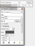
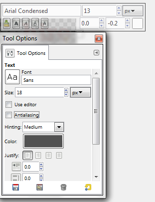
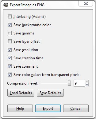
I'm trying to make the text, in the layer in question, clearer, but when I pull up the .xcf and select the text layer, the horizontal dialog box pops up, and I don't see how to apply anti-alias with this box. But, I also pulled up the "Tools Options" (see attached image), and I see where to uncheck anti-alias, but I don't see how that effects the selected layer, because it seems the horizontal dialog box dominates here.
Also, it was mentioned about dpi, how/where can I improve dpi with gimp?
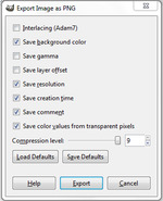
Lastly, upon exporting the image, there seems to several choices (see attached image) what would be best?
I look forward to your reply Much thanks
It may be my eye, but the word Home looks to be a tiny bit larger than the
word Hired. Is the type the same size? Try making Hired 1 pt bigger.You might also try widening the kerning (spacing) between the letters in
HIRED. There are a lot of close together verticals in HIRED compared to
Home.HIRED is all Caps while Home is U/lc (Upper and lower case). Should they
not be the same?Try also making small pixel words at 600 to 1200 dpi.
Good luck.
Rick S
-----Original Message----- From: chrisj
Sent: Friday, August 04, 2017 5:50 PM To: gimp-user-list@gnome.org
Cc: notifications@gimpusers.com
Subject: [Gimp-user] Why is lettering not clearer?Hi,
I created a logo and uploaded to a web page, as you can see by the attached
image "HIRED", the lettering/text doesn't look clear. It is Arial 11 on a
transparent background.
Gimp 2.8The link to the home page "Home" is attached. it is not part of the logo,
but
looks much clearer on the web page.Is there something I can do to help make the logo text sharper/clearer?
Any help will be appreciated.
Attachments: * http://www.gimpusers.com/system/attachments/642/original/hired.png * http://www.gimpusers.com/system/attachments/643/original/Home.png
-
 anti alias
antiAlias.png (26.1 KB) -
 exporting
export.png (12.9 KB)


- postings
- 16
Why is lettering not clearer?
Thanks for your replies.
I'm trying to make the text, in the layer in question, clearer, but when I pull up the .xcf and select the text layer, the horizontal dialog box pops up, and I don't see how to apply anti-alias with this box. But, I also pulled up the "Tools Options" (see attached image), and I see where to uncheck anti-alias, but I don't see how that effects the selected layer, because it seems the horizontal dialog box dominates here.Also, it was mentioned about dpi, how/where can I improve dpi with gimp?
Lastly, upon exporting the image, there seems to several choices (see attached image) what would be best?
I look forward to your reply Much thanks
- postings
- 16
Why is lettering not clearer?
here are the attachments
-
 antiAlias
antiAlias.png (26.1 KB) -
 export
export.png (12.9 KB)


