


Tutorial: Smelting text / Creating blood text
 is licensed under a Create Commons Attribution-Non Commercial 3.0 Unported license.")

Motivation
In this tutorial I show you how you can liquify / smelt text or other graphical objects. I'm going to demonstrate this by creating a blood text.
Tutorial details
- Category: Techniques
- Time to reproduce: ≈20.0 minutes

- Tested with GIMP 2.4 rc2
-
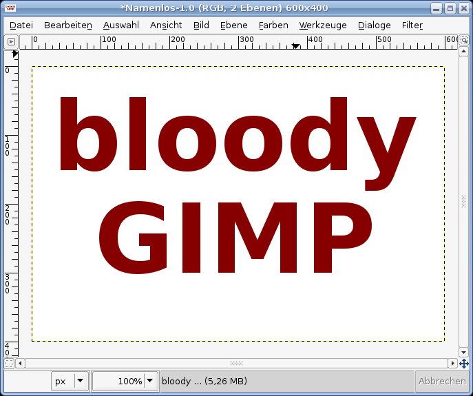
1
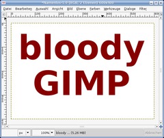
Make a new file: 600×400 px. White background. Write one or two words with a sans-serif-font (i.e. “bloody GIMP” ;)).
Size: 140px.
Line height: ca. -15
Color of text: #870000 (a dark red)Layer / Layer to Image size. After this the text cannot be changed because it is rendered.
-
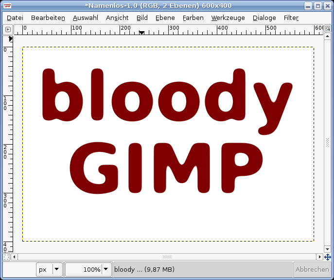
2
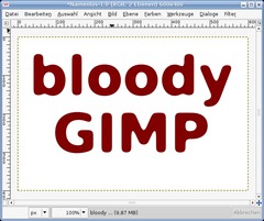
The next technique is optional. The blood looks simply better when your text has rounded corners. We’ve a seperate tutorial for the rounded corners-technique. The technique is very useful. Have a look at it.
These are the quick steps to get rounded corners on this text:
- Apply Filter / Gaussian Blur
- 10px
- Repeat the filter by Pressing CTRL+F
- Repeat it again
- Choose Colors / Curves, top left choose Alpha as channel. Move the point at the bottom to the middle, do so with the point that is at the top right. You’ll see immideate changes in the picture. Do this until you have nice rounded off corners. -
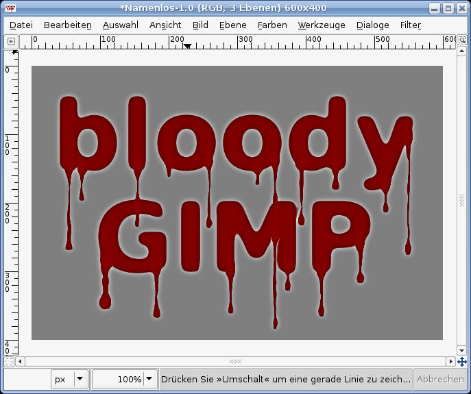
3
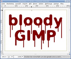
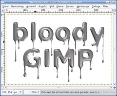
Create a new layer and choose the pencil-tool. Make sure the color is the same as before #870000.
Paint even vertical lines down now. (You get exact lines when clicking a single dot someqhere into the text – this is the starting point – then hold SHIFT and set the endpoint). Do this a few times as seen on the image below.
The strength of the pencil should be 7.
-
4
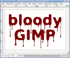
After being satisfied with the lines click “Merge down” by clicking right in the layers dialog. The Text and the lines should then be on a single layer.
To make the lines look like a part of the text we use the Liquify-Filter. Filters / Distorts / IWarp. Choose “grow”.
Deform radius: 9
Deform amount: 0.26All Work is done in the preview-window of this filter: Now first work on the area where the ‘blood’ is coming out of the text and running down. Click and hold your mouse down at the exitpoint of the blood of the text and make small circular movements. The hard edges look more as they would have been a part of the text. Repeat this for every line.
The next step are the endings of the lines. They should look like drops in the end, do this with the same teqchnique as with the exitpoints.
After that use “shrink”. Now shrink the middle parts of the lines so that they become much thinner. To do this move the mouse (while holding down the mousebutton) from top to bottom until you find it thin enough. It should be uneven to look real!
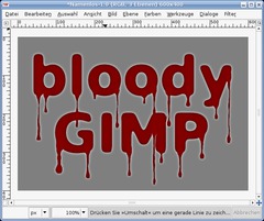
You should the have a result of something like that:
-
5
If your satisfied with the result you’re done ;)
If you want to look the text even more like blood follow these steps:
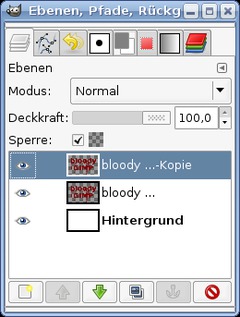
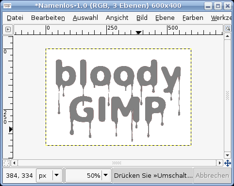
Duplicate the layer with the blood and click the “Lock”-Button in the layers dialog (it is found above the layers). It’s called “Sperre” in the image below.
-
6
Rightclick in the layers dialog “Selection from Alpha”. Then click the Channels dialog (Dialogs / Channels). Add a new channel: “Initialize from selection”.
Click the channel in the channels dialog, then go to Select / None. Filter / Gaussian Blur 4 times with these values: 10px, 6px, 3 and finally 1 px.
-
7
Click the visibility (eye icon) of the channel to make it invisible.
Change to the layers dialog, click the duplicated blood layer. Choose #818181 as new foreground color.
- Edit / Fill FG-Color. The duplicated layer should now be all gray. -
8
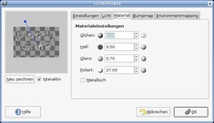
Filters / Lights and Shadow / Lighing Effects. As bumpmap choose the channel we just created. Max. height: 0,05
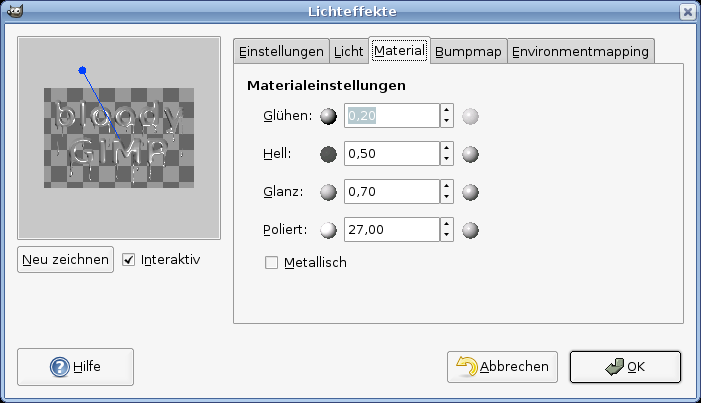
For the Materials tab choose the values of the picture (they are in the same order in the english version of Gimp)
-
9
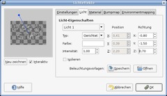
Then we need 2 lights.
For the first light use these values:
Light 1
Type: Directional
Color White
Intensity: 1Direction:
X Y Z: -0.9 / -1.5 / 0.7 -
10
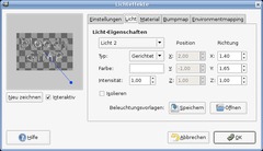
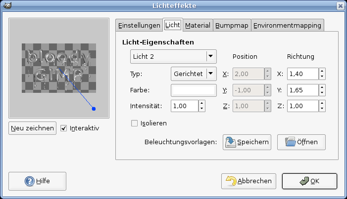
For the second light use these values:
Light 2
Type: Directional
Color White
Intensity: 1Direction:
X Y Z: 1.4 / 1.65 / 1.0 -
11
The layer is still alpha locked. Now apply the Gaussian Blur again. 3 times. every time use 2px for the blur.
-
12
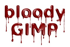
Set the layers mode to “Hard light” and you get nice dark blood ;)
Have fun by making your own blood!


Comments
Post your own comments, questions or hints here. The author and other users will see your posting and can reply to it.
Of course, you can also ask in the chat.
Subscription management
Please log in to manage your subscriptions.
User rating
This topic (Smelting text / Creating blood text) has been rated 3.9/5.0.
New comments are disabled because of spam.