


Tutorial: Create a nice oilpainting from a photo
 is licensed under a Create Commons Attribution-Non Commercial 3.0 Unported license.")

Motivation
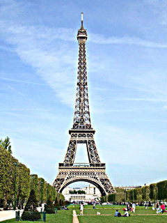
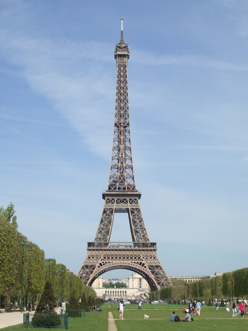
In this tutorial our user t0bias shows you how to create a fantastic looking oilpainting from a photo. Enjoy!
Tutorial details
- Category: Photos / wallpapers
- Time to reproduce: ≈15.0 minutes

- Tested with GIMP 2.4.7
-
1

To get a usable size to apply on the tools used, I am going to use a factor “x”. x can easily be calculated on an image with a 4:3 aspect by
just taking 1% of the longer side of the image. E.g. if your image has a size of 800*600 pixels, x would have a value of 8. -
2
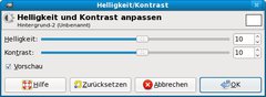
First, we are going to slightly adjust brightness and contrast be 10% “Colors” → “Brightness / Contrast”
Brightness: +10%
Contrast: + 10% -
3
Now let’s make the colors a bit more intense
“Filter” → “Increase” → “Unsharp Mask”Radius: 1x
Amount: 1
Threshhold: 0 -
4
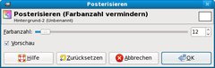
In order to get the best possible effect on the image, we’re going to reduce the amount of colors
“Colors” → “Posterize”: Colors: 3 or 4 (prior to GIMP 2.8: Colors: 12)
-
5
If the name of the layer in the “Layer”-Dialogue should be printed in
bold, do“Layer” → “Transparency” → “Add alphachannel”
-
6
Now go back to the “Layer”-Dialogue, duplicate the layer by right-clicking on the active layer and choosing “duplicate Layer”. Then hide the upper of the two layers by clicking on the “eye”-symbol on the left. Before proceeding, make sure the lower layer is active again!
-
7

Use the Blur-filter to make the colors merge at the edges.
“Filter” → “Blur” → “Gaussian Blur”:
Radius: 1x
Method: RLE -
8
Next choose
“Filter” → “Artistic” → “Gimpressionist”
and use the following settings:Presets
→ FeathersPaper
→ Scale: 1xOrientation
→ Directions: 6
→ Start Angle: 0
→ Angle Span: 120
→ Orientation: AdaptiveSize
→ Sizes: 4
→ Minimum Size: 3x
→ Maximum Size: 8x
→ Size: AdaptivePlacement
→ Placement: Randomly
→ Stroke Density: 36 -
9
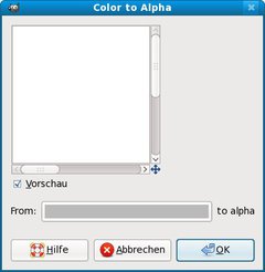
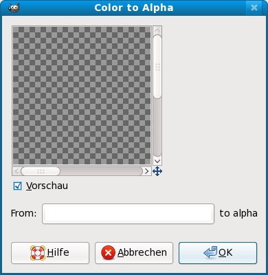
The contours of the strokes are a bit hard, so reduce them by doing “Colors” → “Color to Transparency”: Color: #bababa
-
10
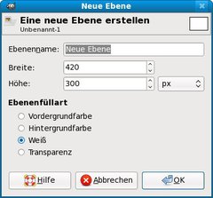
In the “Layer”-Dialogue, add a new layer and choose “Filling” → “White”, next move the newly created layer to the very bottom.
-
11
Now unhide the hidden layer in the “Layer”-Dialogue.
-
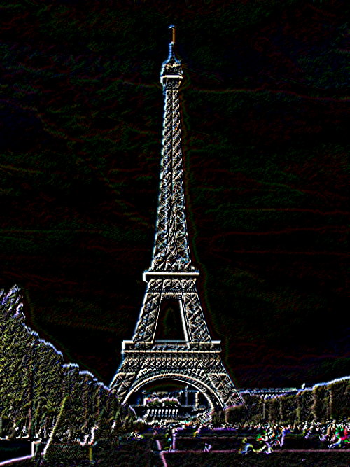
12

Now draw the outlines of the shape by doing
“Filter” → “Find edges” → “Neon”Radius: 0.5x
Intensity: 0% -
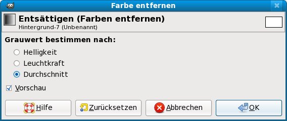
13
We don’t want any colored lines, so choose
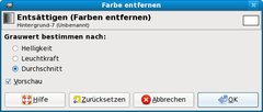
“Colors” → “Desaturate”: Grauwert: Average
to remove the colors. -
14
Next, we invert the colors in order to make the white lines become black “Colors” → “Invert”
-
15
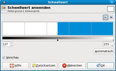
We don’t want any gray tones, but black and white ones, so do “Colors” → “Threshold”: Move the handle about in the center of the color-bar or wherever you think the shape is clearly drawn by the lines or just leave the default
settings. -
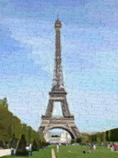
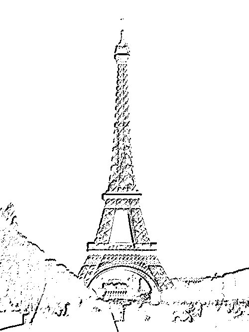
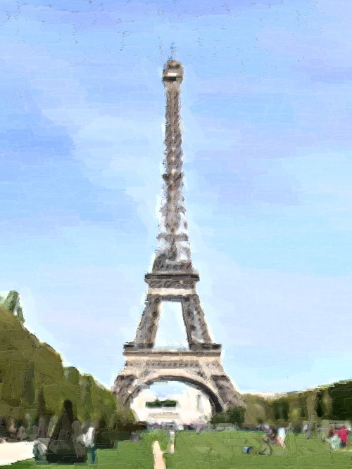
16

It should look like this now:
-
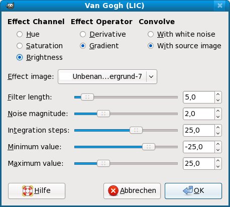
17
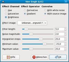
Next we are going to make the lines “pencil-like”.
“Filter” → “Artistic” → “Van Gogh (LIC)”
leave any settings at the default values -
18
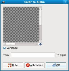
Remove the white background-color “Color” → “Color to transparency”: Color: #ffffff
-
19
Now use the rubber-tool to remove artefacts, just keep the “pretty” lines.
-
20
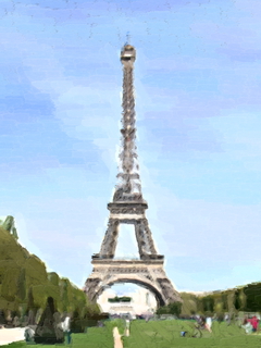
Finish the painting by choosing “Overlay” for the active layer in the “Layer”-Dialogue.


Comments
Post your own comments, questions or hints here. The author and other users will see your posting and can reply to it.
Of course, you can also ask in the chat.
Subscription management
Please log in to manage your subscriptions.
User rating
This topic (Create a nice oilpainting from a photo) has been rated 5.0/5.0.
New comments are disabled because of spam.