


Tutorial: Stylish buttons
 is licensed under a Create Commons Attribution-Non Commercial 3.0 Unported license.")

Motivation
Buttons are pretty nice for many things in the web. As long as you dont use them too much they can give your website a good look. In the following tutorial, we're going to make some cool and stylish looking buttons. At the end you can colorize them with a very simple technique.
Tutorial details
- Category: Buttons, icons, web
- Time to reproduce: ≈10.0 minutes

- Tested with GIMP 2.3.13
-
1
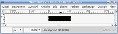
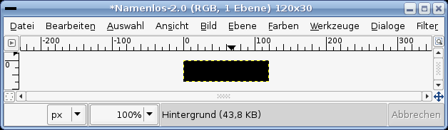
Open a new file. 120×30px. Black background.
-
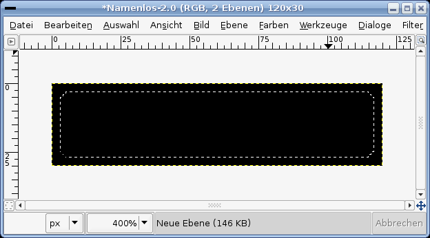
2
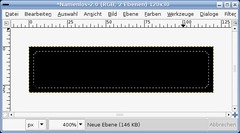
Create a new transparent layer.
- Selection / All (or just press CTRL A)
- Selection / Shrink: 3px.
- Selection / Rounded Rectangle. -
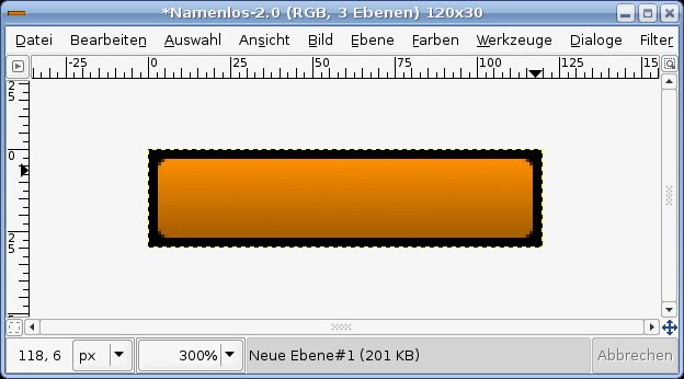
3
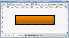
Now choose any fore- and background-color you like. i.e.: FG #ab6000 and BG: #f88c00. Fill this new layer with the standard gradient. (Take the Gradient-Tool and draw a gradient from top to bottom), so that the brighter color is seen at the top.
-
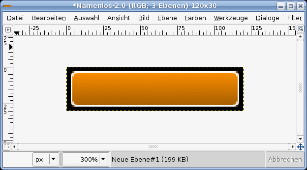
4
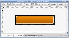
Still let the selection active! Create a new layer, fill it totally white. Go to Selection / Shrink: 1px and remove the selected part. A 1px border should remain.
-Selection / None
-
5
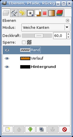
In the layers dialog set the layers mode to “Soft light”. Transparency / Opacity to 60%. The layers look like this now.
-
6
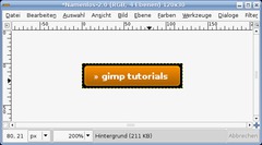
Now choose the Text-Tool (T). Write any text you like, choose white as color for this text.
-
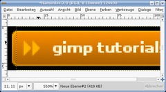
7
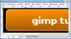
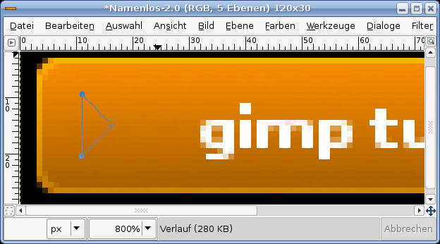
Move the text a little to the right and choose the paths-tool (B).
- Add a new empty layer.
- Do a path as seen in the picture.
You can end the path while holdig CTRL down and clicking the point of your beginning. -
8
After that press ENTER to become a selection out of the path. Fill this selection with any color brighter that your background. I.e.:##ffcb4b.
- Selection / None to get rid of the selection.
-
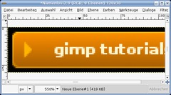
9
Duplicate the layer and move the duplicate a little bit to the right.
-
10
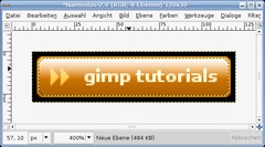
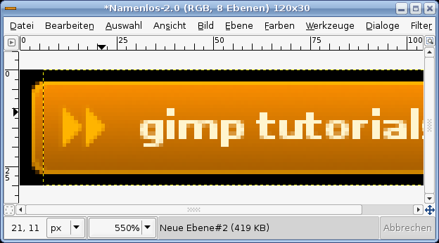
Now we’re doing the glossy part of the button.
Activate the colored gradient layer. Right click it in the layers dialog and choose “Selection from Alpha”. Click the layer at the most top – then add a new layer on top of it.
- Selection / Shrink: 1px.
- Press L to active the Gradient-Tool.As gradient choose the 4. one from the drop down menu (named “Color to transparent”). Click in the top are of the button and move your mouse a little to the bottom. When holding CTRL while drawing the gradient it helps you to get an exact horizontal gradient.
-
11
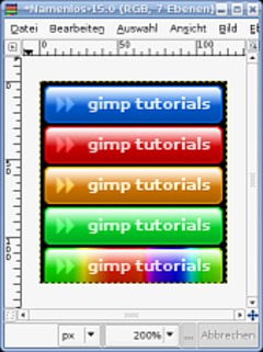
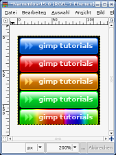
Now if you want you button in any other color do the tutorial again, haha. Damn no, I’m just joking ;) If you want to test some other colors do this:
Above all layers create a new empty one, fill this layer with the color you want to test. Select “Color” in the layers mode drop down. And instantly your buttons color has changed. You can also try gradients!
Tip: You can only use the base color tones. Fades to grey don’t have any effect.
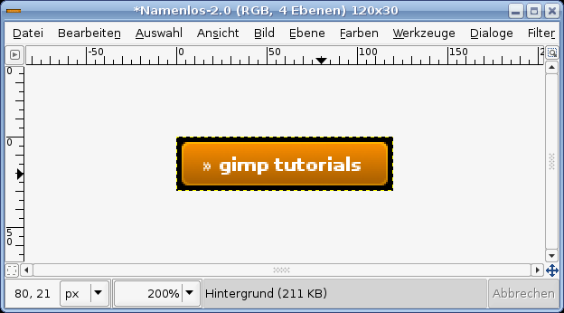
Your buttons could look like this:


Comments
Post your own comments, questions or hints here. The author and other users will see your posting and can reply to it.
Of course, you can also ask in the chat.
Subscription management
Please log in to manage your subscriptions.
User rating
This topic (Stylish buttons) has been rated 5.0/5.0.
New comments are disabled because of spam.