Titelbild gimpusers.de

German version of this page English version of this page

Not logged in
Sign up
Login

Last online: gilby908130, Vadi0, myke6, JNormann0, FadingDecember0, Nils0, Lupinius2, Wolverine1, winlang0, bilbo1, stephanma0, ranger670

The GIMP
» All GIMP shortcuts / hotkeys
» GIMP changelog
» What's new in GIMP 2.6
» GIMP manual
» Books about GIMP

new tutorials

First Windows build for GIMP 2.5 available! GIMP 2.5.3 development snapshot released GIMP 2.4.7 released Dev version: GIMP 2.5.2 available Preview: What's new in GIMP 2.6? GIMP 2.6 nears

random tutorials

Create futuristic looking tech pattern How to change a boring sky to a cool cloudy sky Create a cool starfield Spicing up black/white images Old Parchment Paper Simple Scanlines

[show all tutorials]

» email archive

Join the GIMP chat!

tutorial details

Difficulty: difficulty 1/5

GIMP version: 2.3.15

Category: Buttons, icons, web

Author: devvv

Steps: 10

Needed time: ca. 15 min

Hits: 28917

Downloads for this tutorial:

Others from this category:

» 15 comments

Miscellaneous

Facts and numbers
Current version: 2.4.7
Dev. version: 2.5.3

39 tutorials with
39 downloads,
185 news and 11861 list messages

Feedburner

Umfrage

Would you use the GIMP mailing lists if you could use them like a forum?

Yes

I don't know what mailing lists are, but I would use a forum

No


→ Poll results

Tutorial: Creating a simple Company Logo

Written by devvv (26 Apr 2007 08:12 PM)

Today we want to create a simple logo, which is pretty neutral so you can use it for many different things. We're first drawing some text and then decorate it with a nice colored and curved path!

  1. If you want to use my font download it from the right side (tutorial details), install it in your OS and restart GIMP.
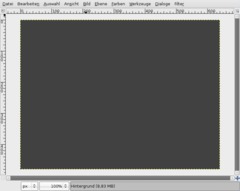
    Create a new file. I've used a small size, just for demonstration purpose, you can use any size you want.
    screenshot of step 1
    click to enlarge
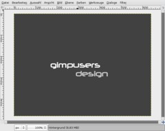
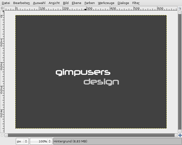
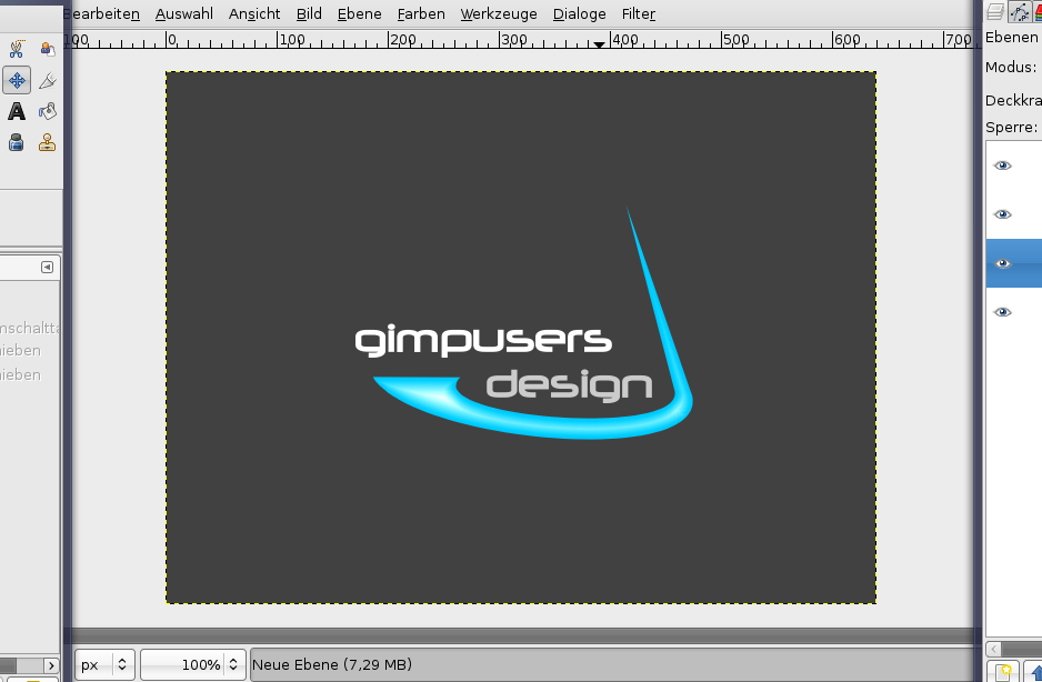
  2. Now write two text-pieces on the layer. I've user "gimpusers" (white color) and "design" (#cbcbcb as color). Font size: 40px. Deactivate the "hinting"-option, since it is only useful for small fonts. We've relatively big ones here ;)

    Take the Move-Tool and put the text to the position shown on the picture below.
    screenshot of step 2
    click to enlarge
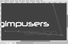
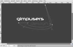
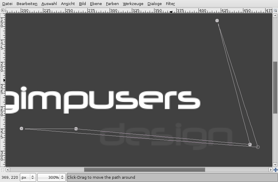
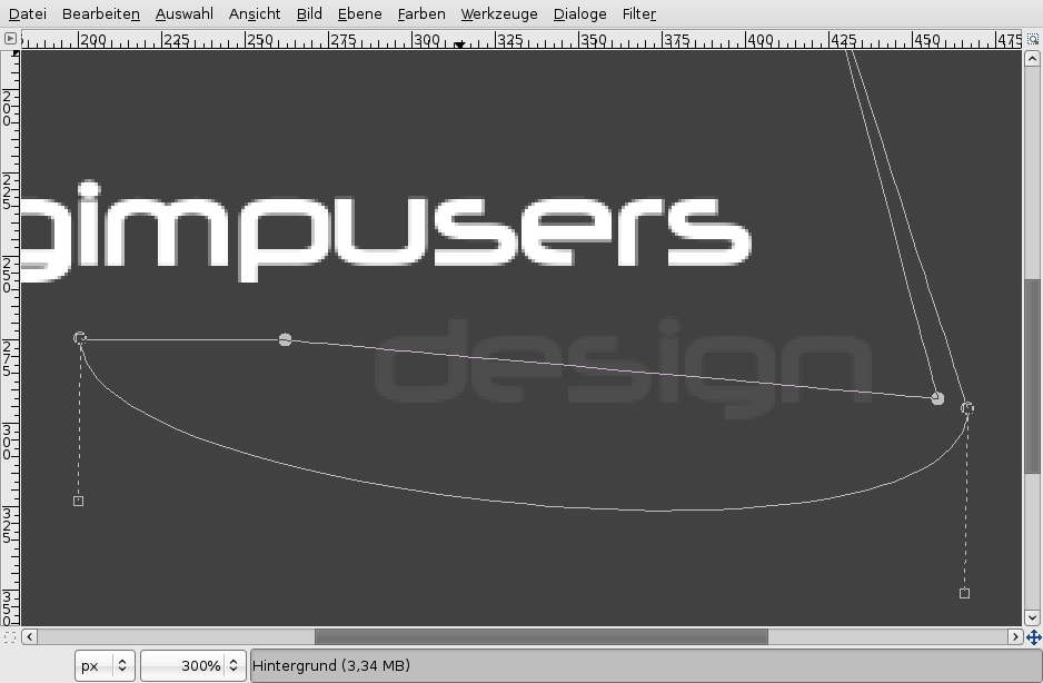
  3. The next step is to create a path, so that our text more becomes a real logo. We will draw a nice curved "thing" ;) around our text.

    To do this please take the paths-tool (B). Start clicking in the bottom left until you have the same points as seen on the picture. I have set the opacity for "design" very low to better show you the points I made.
    screenshot of step 3
    click to enlarge
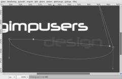
  4. When reaching the first point, holt CTRL to unify the last point with the first. You should then have a fully closed path. You can still move points around if you're not satisfied with your path.

    After completion move the bottom edge downwards (click in the middle of the edge and drag it to the bottom). It should be a curve now!
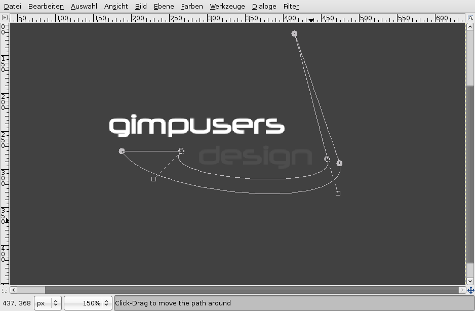
    screenshot of step 4
    click to enlarge
  5. With the two dashed lines appearing now you can affect the curve. Drag the left dashed line a little more to the middle, it should become more even. The right dahed line move a bit to the right. If you look at the line above the dashed line should become one long even line.

    After that take the edge thats above the line we just adjusted. Move the dashed lines as seen in the picture!
    screenshot of step 5
    click to enlarge
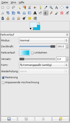
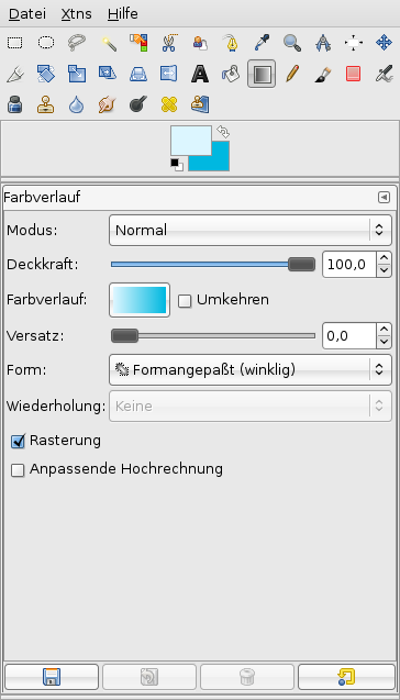
  6. Click ENTER now and you should get a selection of the path.
    - create a new, empty layer
    - set #dcf6ff and #00b8e0 as BG-color.
    - take the gradient-tool or just press L

    Look at the settings on the picture!
    screenshot of step 6
    click to enlarge
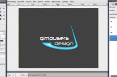
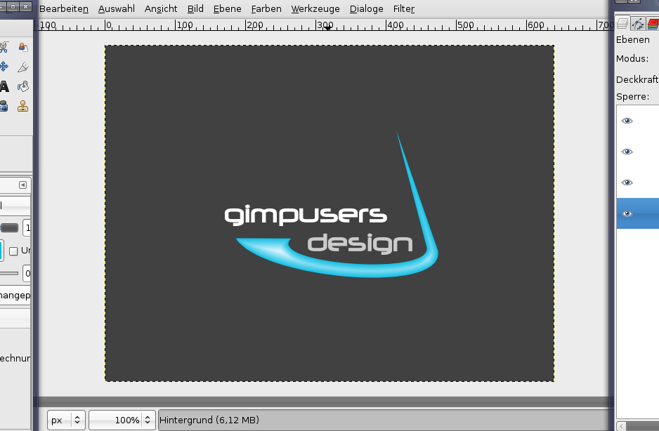
  7. Now draw the gradient anywhere on the layer, doesn't matter where. The selection is then filled with the gradient.

    Press CTRL SHIFT A or go to Selection / None to deselect all.
    screenshot of step 7
    click to enlarge
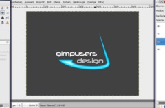
  8. Colors / Brightness & Contrast: -25/+35.
    screenshot of step 8
    click to enlarge
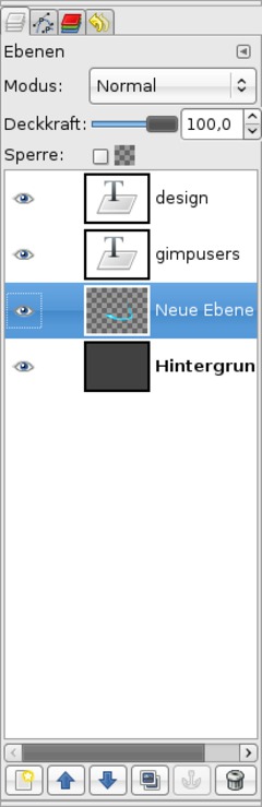
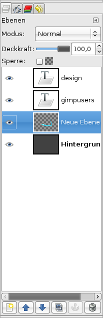
  9. My layers look like this at the moment:
    screenshot of step 9
    click to enlarge
  10. Now we add a small shadow to give the logo more depth.

    - rightclick the layer with the colored form in the layers-dialog.
    - "Alpha to Selection"
    - add a new layer below the form-layer.
    - fill the selection with black and set the opacity of this layer to 25%.
    - take the Move-Tool now, in the settings select "Move the active layer" and then move the layer a bit to the bottom!

    Thats it! I hope you like it!

    screenshot of step 10
    click to enlarge
Creative Commons Attribution-NonCommercial 2.0 Austria
This work is licensed under the following license: Creative Commons Attribution-NonCommercial 2.0 Austria.

Discussion / comment this tutorial

Post your own comments, questions or hints here. The author and other users will see your posting and can answer to it. Of course, you can also ask in the chat.

Newer comments are displayed first!

From: tek (27 Mar 2008 02:16 PM)

Friend ship is not collection of hearts ...
but it is a selection of hearts...

From: samid (07 Feb 2008 12:40 PM)

What a cool Tutorial, by the way what kinds font type you used in this tutorial. thanks

From: eHobayyeb (15 Nov 2007 09:21 PM) – Send a private message

Nice tutorial, I really liked it.
I dropped a shadow by blurred the other black shape and move it a bit to the right and to the bottom

From: halozmatt (11 Sep 2007 02:50 AM) – Send a private message

srry here is pic!

From: halozmatt (11 Sep 2007 02:47 AM) – Send a private message

teeheee i tried this after looking at the results of yours and when iwas done did the same i'm like :p suck...~ lol, i'll get good at it
...


P.S.-HOPEFULLY XD!

From: devvv (11 Jul 2007 10:42 AM) – Send a private message

It's called Neuropolitical - I added it now! Sorry.

From: Julian (11 Jul 2007 10:19 AM)

Where can I find this font? What is it called? I can't find it in the Tutorial Details!

From: devvv (15 Jun 2007 05:14 PM) – Send a private message

the easiest way is to copy the sign from any website and the use the text tool to paste it.

From: Makyver (15 Jun 2007 02:45 AM)

How to you put the trademark circle r or cirlce tm in the image ... Is there an easy way or do I have to creat it by had ...

From: M.rSnow (14 Jun 2007 11:49 AM)

Nice tut realy help full when makeing a homepage.
Btw pablo the image sucked whats has it to do whit this tut anyway?

From: devvv (21 May 2007 10:48 PM) – Send a private message

In my opinion there is too much happening in the logo. I also think that it would be better not to have the text blurred! For a logo in general you should not have a detailed background unless it is clearly visible what the background is.

If it is intended to be a signature, thats ok and good ;) But why don't you try the bezier curves tool - it's so nice for something like this!

From: Peter Grosse (21 May 2007 10:36 PM)

Oops , try this....
http://i187.photobucket.com/albums/x235/PETER_BZFlag/halo3s_sig.png

From: Peter Grosse (21 May 2007 10:35 PM)

I didnt realy follow the tutorial , but this I was asked to make a signiture/logo for a game desighner on a game called bzflag , this is it , tell me what you think....
[IMG]http://i187.photobucket.com/albums/x235/PETER_BZFlag/halo3s_sig.png[/IMG]
?

From: devvv (19 May 2007 06:32 PM) – Send a private message

hey pablo, it is hard to understand - i don't speak spanish - but GIMP is free software, it is gratis and you can download ih here: http://www.gimp.org/windows/

From: pablo (19 May 2007 06:27 PM)

me parece fantastica esa herramienta. yo trabajo en www.coralweb.com.ar y podria serme de mucha utilidad. donde puedo conseguir una demo gratis?

Registered users can log in to use their profile name to post comments, request email notification on new comments and attach images (e.g. their versionen of the effect) to their postings.

Post a comment:

Your name:
Not logged in yet? Register at gimpusers.com or log in if you already have an account!
Email address: (optional, wird nicht angezeigt!)
Comment:
Security code:

Adobe® Photoshop® is a registered trademark of Adobe Systems, Inc. Linux is a trademark of Linus Torvalds. Ubuntu and Canonical are registered trademarks of Canonical Ltd. | Imprint | powered by bitfire.at