


Tutorial: Create a Pop art photo effect (like Andy Warhol)
 is licensed under a Create Commons Attribution-Non Commercial 3.0 Unported license.")
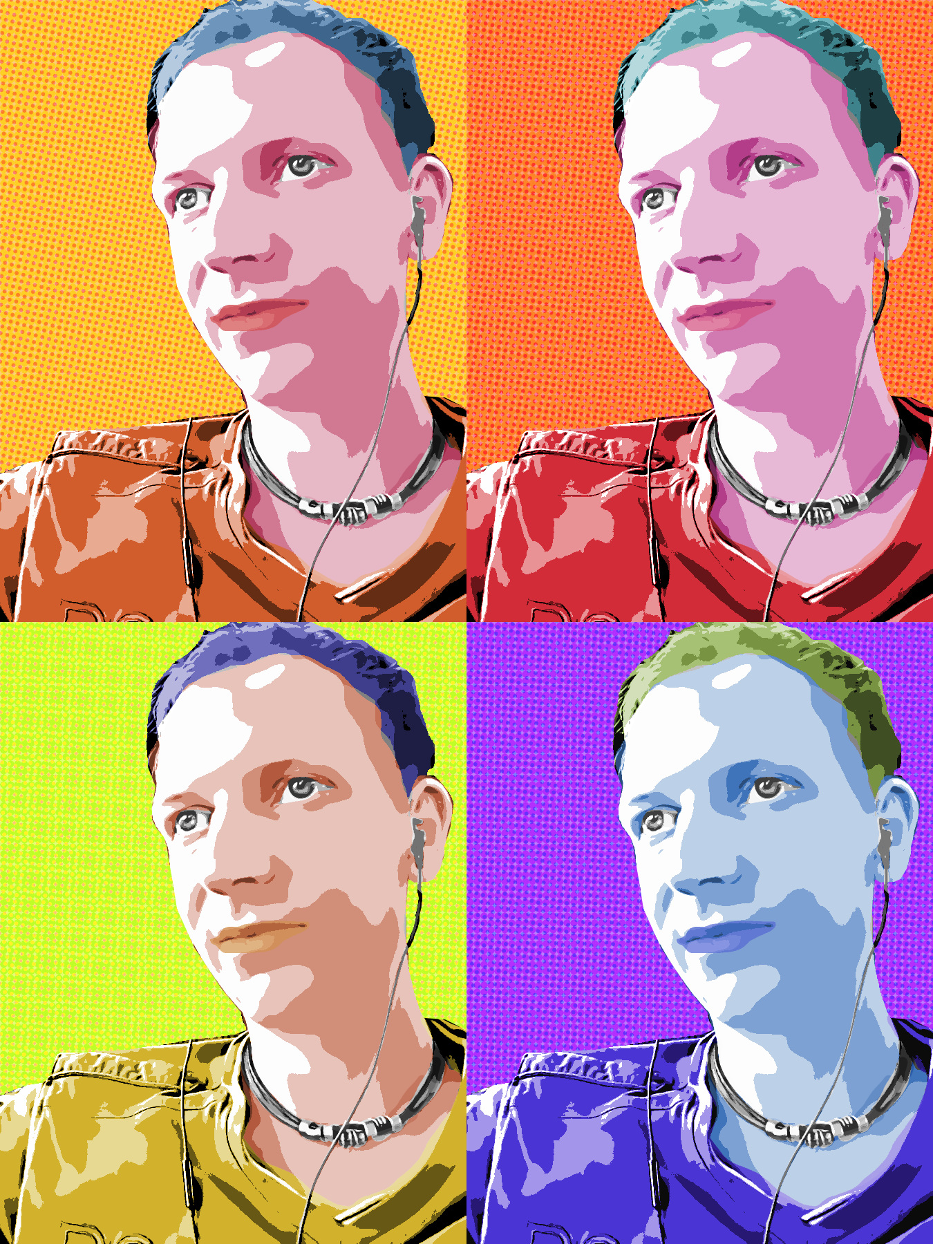
 — Result")
Download GIMP workspace (.xcfbz2) (1.29 MB)
Motivation
Many tutorials on the Web cover the special style of artist Andy Warhol and try to reproduce it. In this tutorial I'm showing you _one_ way to create such a photo effect. The effect lives from a special contrast combined with different soft colorings that are shown alltogether.
Tutorial details
- Category: Photos / wallpapers
- Time to reproduce: ≈30.0 minutes

- Tested with GIMP 2.8
-
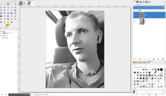
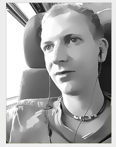
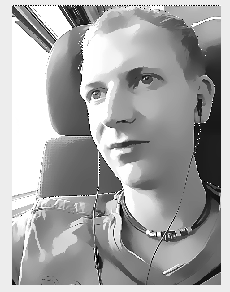
1
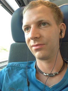
This is the base photo. The first step is to create a nice black/white/gray image out of this. But before that we need to get rid of the fine details in the photo.
-
2
There are two steps I did for this. Install the G’MIC plug-in for GIMP, then go to Enhancements / Anisotropic smooth. This will smear the fine dots and details in the photo to become more equal.
-
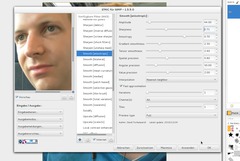
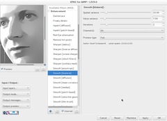
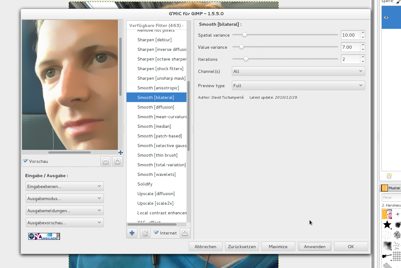
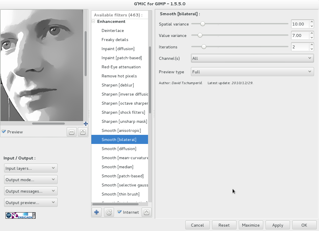
3
Another good way is to combine equal-looking parts of the image is the bilateral filter. I have applied it too. Please find the values on the image beside.
-
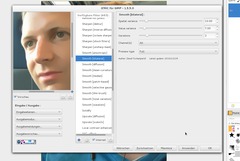
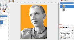
4

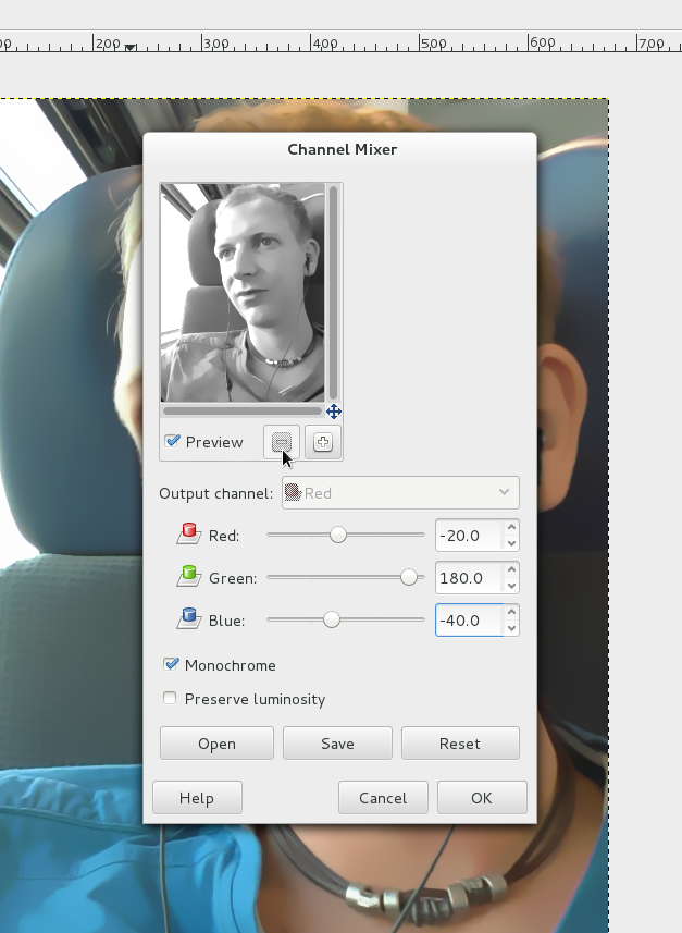
Next I got rid of the colors using the channel mixer (Color / Components / Channel mixer). Check the monochrome option for this. I lowered the red and blue channel but dragged the green one to the right. (Hint: moving the green channel will bring up more contrast in the image, you generally get more “detail” than when you move the red/blue channel to the right.
-
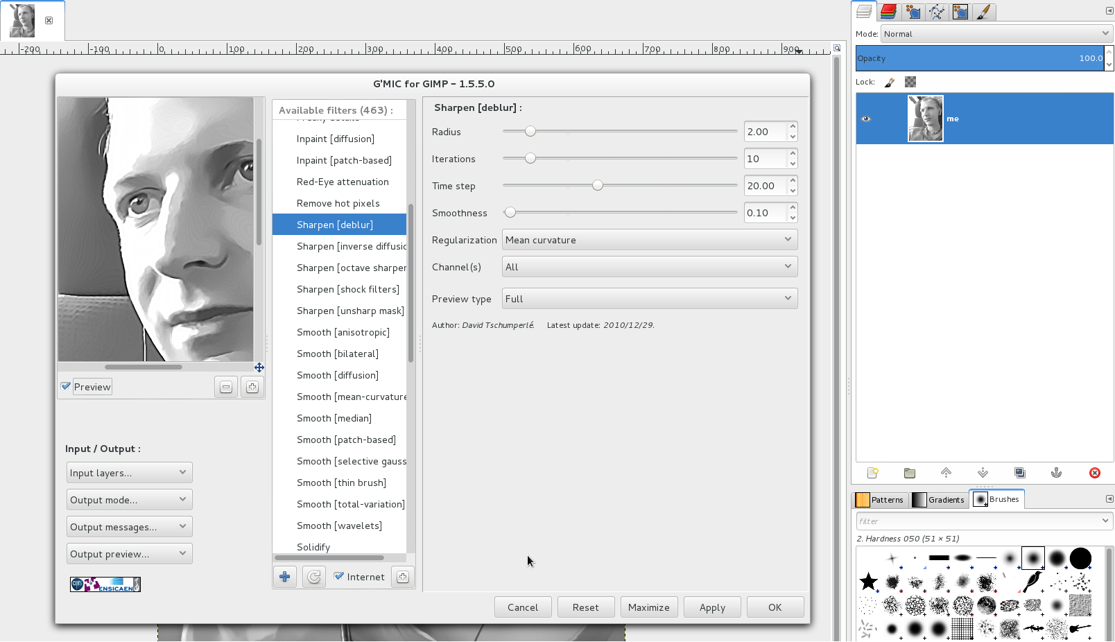
5
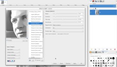
Next I thought that the areas in the face are still too realistic, so I first applied a “DeBlur” sharpening filter (found in Filters / GMIC / Enhancements, use default values). Click apply and leave the GMIC dialog open.
-
6
Now, to further reduce the photo-like look I used the bilateral filter (also in GMIC → Enhancements). Reset the values and use the default values (10/7/2).
-
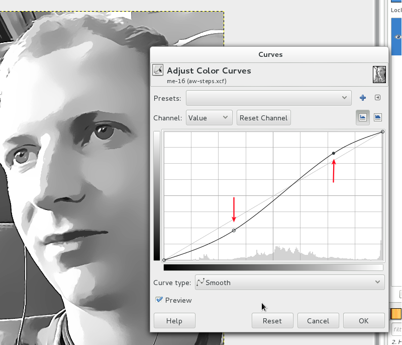
7
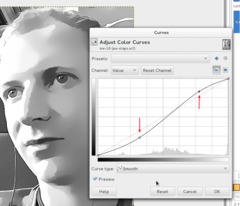
To higher the contrast a bit, apply a slight S-curve via Colors / Curves.
-
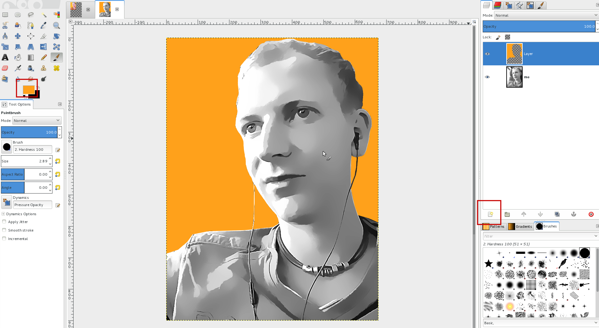
8
I then made a rough (not too detailed) selection around my head to fill the background with a plain color later. Best use the free select tool for this.
-
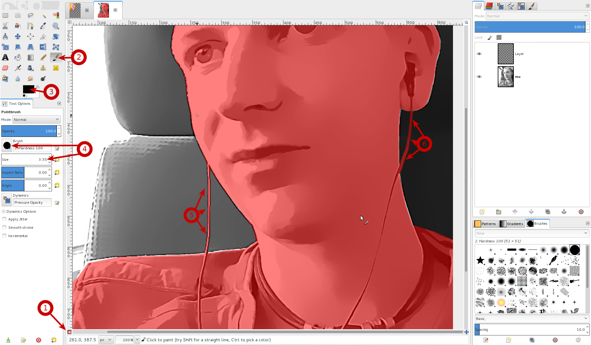
9
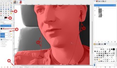
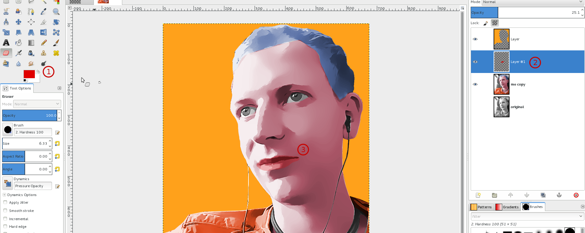
This step is optional if you don’t have to adjust your selection. Before filling the selection with a color I needed to adjust the selection a little bit since the cables of my ear-plugs should not be overpainted later.
I switched to the quick mask for this (in image: 1) – this is an alternative way to select stuff in GIMP. You can paint white or black (or gray of course) to make something be selected or not. Black paint means that you want to have something not selected. The button to get the quickmask is found to the very bottom left in the corner (1). After pressing it everything
- Press the quickmask button (1)
- Choose the paintbrush tool (2)
- Select black as FG color (3)
- Choose a hard brush (4) and set the size to a value that you can paint the correct selection you want – I needed a very small size since the cables are pretty thin.
- Paint the stuff on the image you dont want to be selected anymore. (5+6 in my case)
-
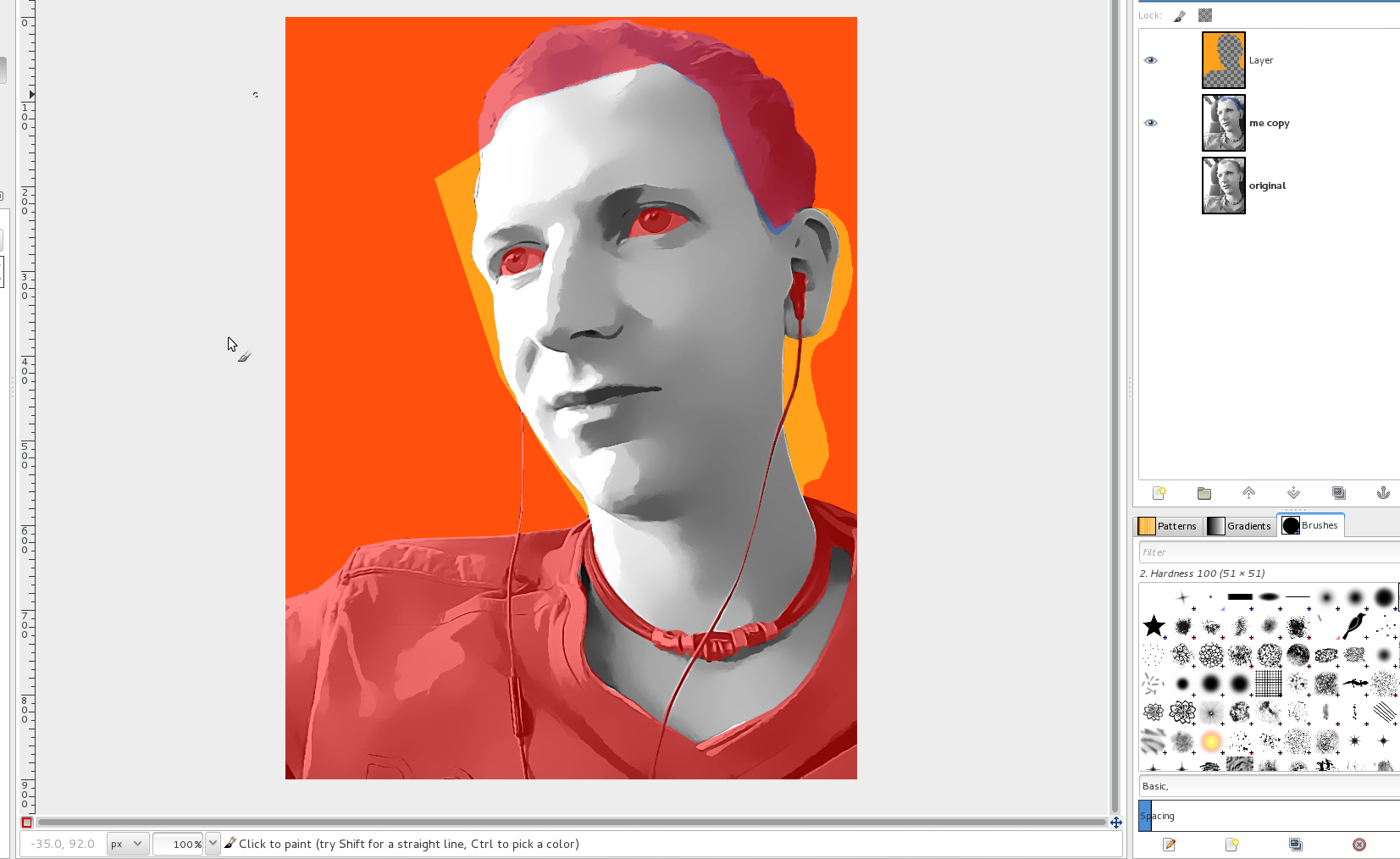
10
Then press the quick mask icon again and you should have a nice selection.
-
11
Add a new transparent layer (1) and fill it with the color #ffa11b (2). De-select all after it. You may use every color if you want, however I find soft (creamy) colors without too much saturation look better in this case.
-
12
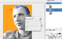
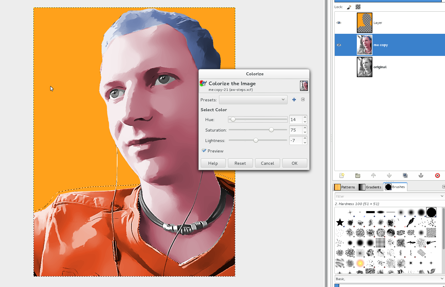
After that duplicate the background layer (the photo), so in case you mess up the colorizing, you can switch back. Work on the duplicate now.
I started with the colorization of the hair. Use the free select tool to make a very rough selection around the hair. Then I simply used Colors / Colorize with the values on the image to make the hair blue. Be sure to use a lowered saturation of the color.
-
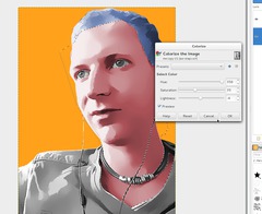
13

The next step was to create a selection for coloring the face. I again used a rouch selection with the free select too and refined it with the quick mask. You can see the active mask on the image.
-
14
Colorize the selection as you like it.
-
15

For my T-shirt I’ve used an orange color, this time with increased saturation.
-
16
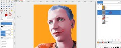
If you like, you can paint your lips with a soft red. This will get some more detail to the face. I selected red as new FG color (1), used the paintbrush tool and painted (on a new layer (2)) on the canvas over my lips. Then I lowered the opacity of this layer to about 25%.
-
17
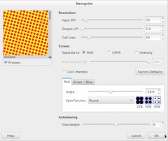
To get some kind of structure (i wanted some kind of “dot effect” á la Roy Lichtenstein) into the background I duplicated the orange layer and used Filter / Distort / Newsprint with the values from the picture.
-
18
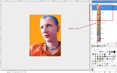
Lower the opacity of the dots layer to about 20%. Then right click in the layers dialog and choose “New from visible”. Do this 3 times.
-
19
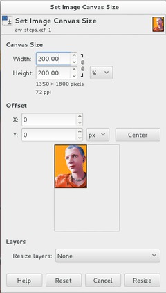
Then go to Image / Canvas size and set 200% width and height.
-
20
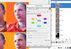
Move the “New from visible”-copies to the right, bottom, and bottom right. Then select one of these new layers and choose Color / Hue-Saturation and move the Hue ruler to get a different coloring for each copy.
-
21
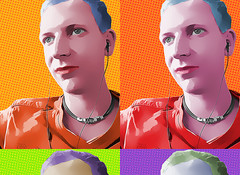
After that you should have something like that and you’re done ;) You can additionally sharpen the image if you want.
-
22

This is a variation I made before, here I applied more contrast before doing the bilateral filtering in GMIC. Almost all of the other steps are the same.
I hope you like the tutorial and I’d be happy to see your results ;) Have fun!


Comments
Post your own comments, questions or hints here. The author and other users will see your posting and can reply to it.
Of course, you can also ask in the chat.
Subscription management
Please log in to manage your subscriptions.
User rating
This topic (Create a Pop art photo effect (like Andy Warhol)) has been rated 4.0/5.0.
New comments are disabled because of spam.