


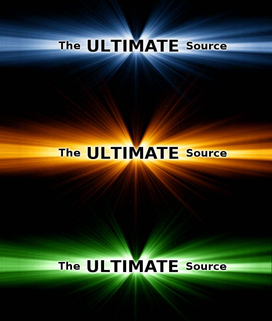
Tutorial: Rays of Light (behind text)
 is licensed under a Create Commons Attribution-Non Commercial 3.0 Unported license.")
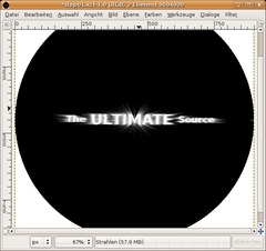
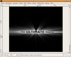
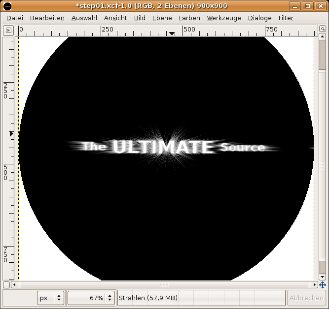
 — Result")
Download GIMP workspace (.xcfbz2) (480 KB)
Motivation
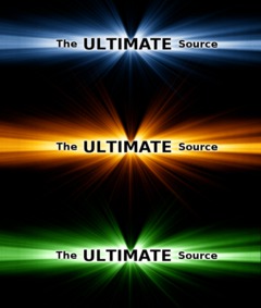
I bet you all know this effect where cool rays of light can be seen behind some text. In this tutorial I'll show you how to make such an explosion. This effect is also very often used by gaming companies.
Tutorial details
- Category: Special FX
- Time to reproduce: ≈15.0 minutes

- Tested with GIMP 2.3
-
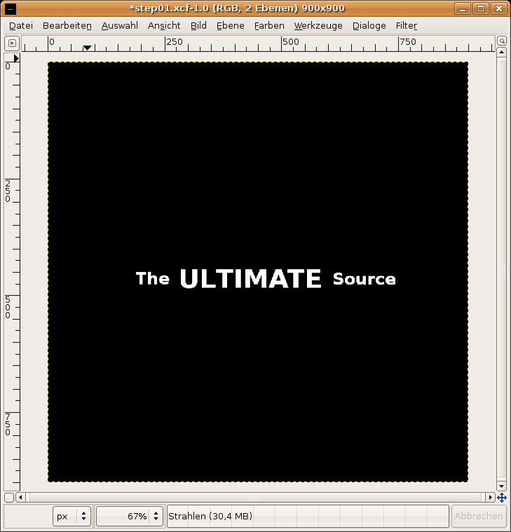
1
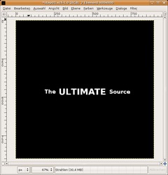
- New file: 900 × 900px. Black Background.
- add three text-layers: “The” “ULTIMATE” “Source”.
- Take a very bold font, that gives us a better look.
- “The” and “Source” should have a size of 35, “ULTIMATE” has a size of 55px.
- Move the 3 text-layers together (as seen on the picture below). -
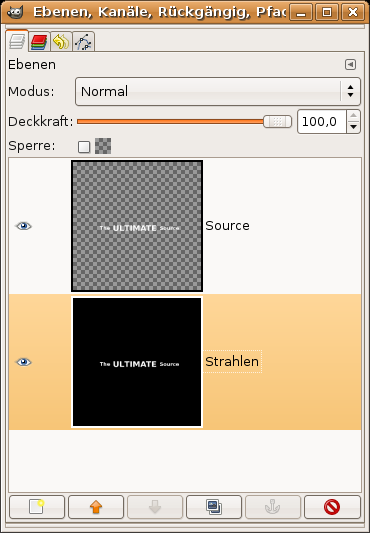
2

Merge these 3 layers. To do this select (in the layers-dialog) the text-layer thats on top of all the text-layers. Right-mouse-click and choose “Merge Down”. Repeat once.
Now the whole text should be on a single layer.
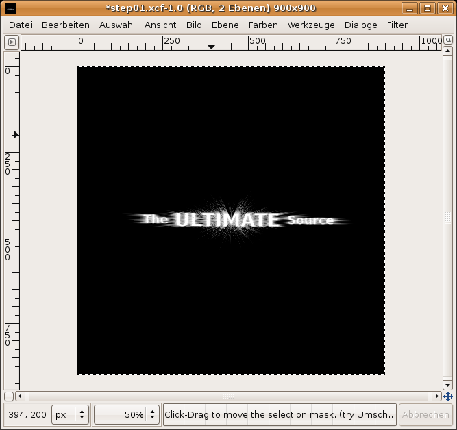
Move the Text to the very center of the picture. To do this you can either use the Alignement-Tool or just use guides. Go to Image / Guides / New Guide: Choose horizontal: 450px – then click OK, same again with a vertical guide. Move the text-layers “M” (from the “ultiMate”) to the point where the guides are crossing.Go to View / Show guides (Deselect).
Now go to Layer / Layer to Image Size. Duplicate this layer. Now merge the layer thats above the Background-layer down with the Background-layer.
Name that text-layer “Source” and the Background-layer “Strahlen” (which is the german word for “rays”).
Click the Eye-Icon for the “Source”-layer in the layers-dialog to make it invisible. After this long step your layers should look like this:
-
3
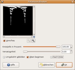
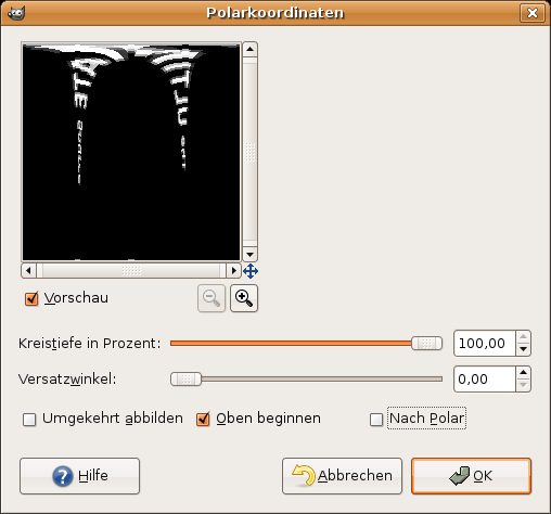
- Make sure that the “Strahlen”-Ebene is active.
- Go to Filter / Distorts / Polar coordinates and take the values from the picture below. -
4
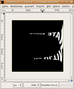
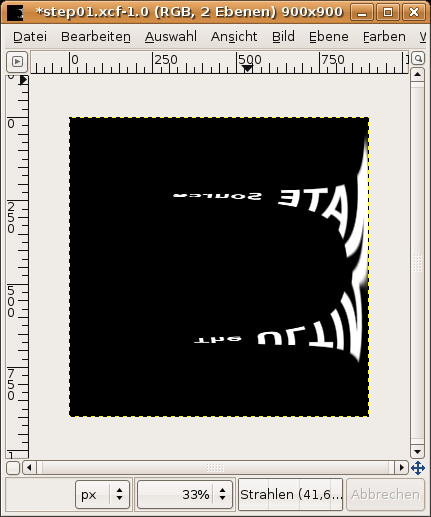
Go to Image / Transform / Rotate 90° clockwise
-
5
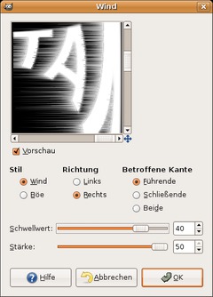
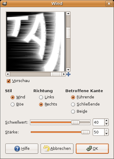
Go to Filter / Distorts / Wind and choose the options from the picture below.
-
6
Repeat the filter once but now choose “Left” as direction, the other options remain unchanged.
Go to Image / Transform / Rotate 90° counter-clockwise. After that apply the polar-coordinates filter again. Click the “To Polar”-option. The text should look like this now.
-
7
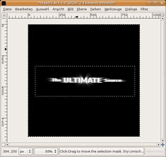
Choose the Rectangle-Select-Tool and draw a selection around the rays.
- Select / Invert.
- Choose black as FG-color.
- After that: Edit / Fill FG-color.
- Select / None. -
8
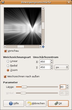
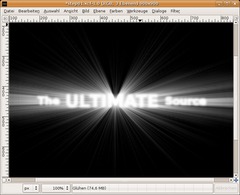
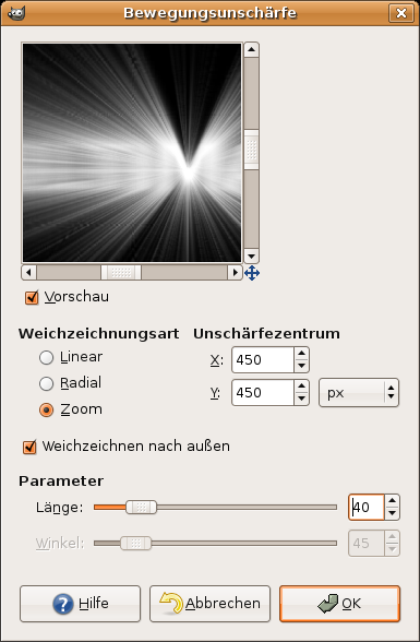
The rays look pretty bad… To change this go to Filter / Blur / Motion Blur and choose the values from the image below:
-
9
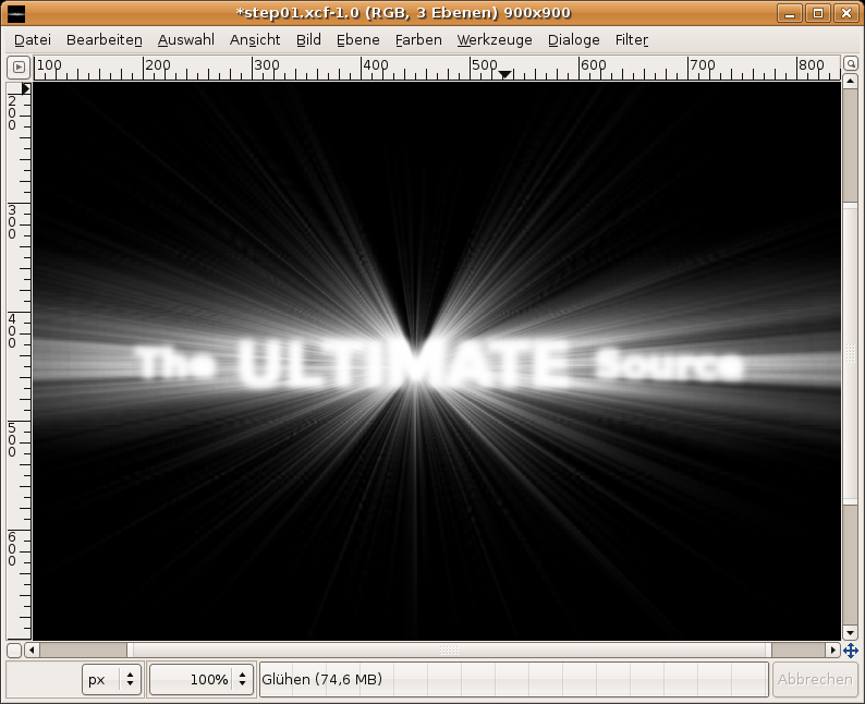
Click the Source-layer in the layers-dialog and choose “Alpha to Selection”. Create a new layer, name it “Glühen” (german word for glow). Activate the created layer.
- Select / Grow: 2px
- Fill the selection with white.
- Press CTRL+SHIFT+A to deactivate the selection
- Filter / Blur / Gaussian: 10px
- Choose “Screen” as layermode (you can find the layer modes dropdown-menu in the layers-dialog above the transparency-control. -
10
- Move this layer between “Source” and “Strahlen”, in case it is not already there.
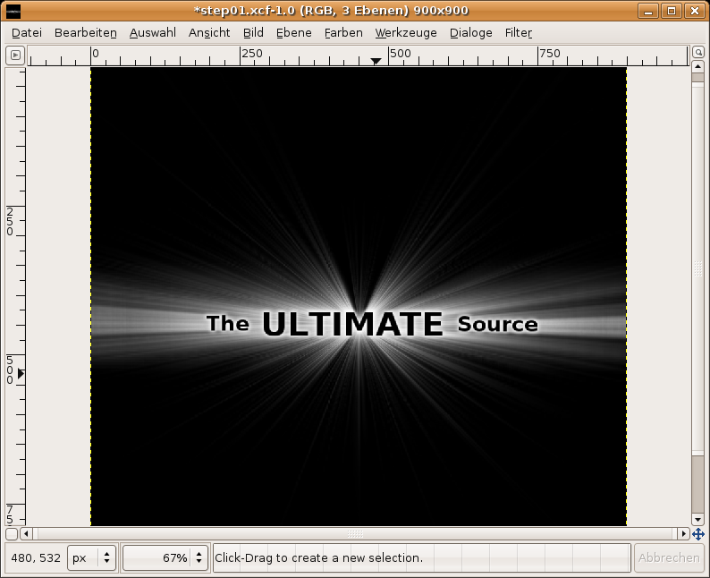
- Click the Eye-Icon of the “Source”-layer to make it visible. Go to Colors / Invert. (in Gimp 2.2 this option is under Layer / Colors / Invert). -
11
Choose the “Strahlen”-layer and go to (Layer /) Colors / Color Balance
For a blue shine take these values:
-————————————————-
Shadow 0 | +30 | +40
Midtones: -70 | -35 | +30
Highlights:-85 | -25 | -50For a gold shine:
-———————————————
Shadows 100 | +50 | -50
Midtones: +70 | -30 | -100
Highlights: +20 | 0 | -50Done ;)
Tip: If you want your rays to shine even more, duplicate the “strahlen”-layer, blur it with gaussian blur and set the layers mode to “Screen”.


Comments
Post your own comments, questions or hints here. The author and other users will see your posting and can reply to it.
Of course, you can also ask in the chat.
Subscription management
Please log in to manage your subscriptions.
New comments are disabled because of spam.