[GUI] Screen space usage
This discussion is connected to the gimp-developer-list.gnome.org mailing list which is provided by the GIMP developers and not related to gimpusers.com.
This is a read-only list on gimpusers.com so this discussion thread is read-only, too.
| [GUI] Screen space usage | scl | 28 Mar 15:45 |
[GUI] Screen space usage
Hi,
a recent discussion in IRC causes me to bring up a topic here – the use of screen space, in particular the Drag and Drop area in the toolbox.
Since version 2.6 there has been a drag and drop area in the toolbox
with the Wilber mascot (see the [specification]). There is an option to
turn it off in the gimprc configuration file. Originally it was built in
as a temporary workaround for technical presentation issues with the
horizontal toolbar layout. That’s why there was no intention to make it
a part of the UI.
In the meantime users and some developers complained about missing
screen space and that the of being a drag and drop target is not
obvious. So they have considered it as obsolete and wanted to turn it
off. Until now developers often advised to disable it by editing the
gimprc file. The situation has changed from the technical need for a
hack to a users’ need for a solution and positive signs by the UI
department. However, the wish to disable it in the UI has been rejected
on and on.
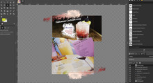
There are some disadvantages in it: The screen space blocks other, useful UI elements. An [image] shows the initial GIMP screen in Single Window Mode and with all toolbox buttons enabled. This is already on a big screen with 1080 pixels height. It gets even worse if the users reduce the toolbox width to one icon. Also the users with a need for more space have to search and edit a hard-to-find file. And what if they have a need and can’t help themselves? Ease of use looks different to that. We have to maintain code that is not expected to be used and thus superfluous. This makes GIMP harder to maintain.
Do we want to offer a useful program with our low development resources?
I propose to make a clear decision now: either we have this option or not – entirely yes or entirely no. To finish this topic we should also register our decision and the reasons in the UI spec. I personally am for having this option and contributed a [patch].
To the existing objections:
‘We need it as a branding’
The option itself doesn’t take away the branding. If it is enabled, the
branding will be there. There are also more ways to brand GIMP: the
splash screen, the big Wilber in the No-Image-Window, the title bar, the
taskbar button and the About dialog.
‘We need it for drag and drop’ The option itself doesn’t take away GIMP’s drag and drop capabilities. When enabled the drag and drop target will be there. When disabled, there is another drag and drop target there – the toolbox. Together with the No-Image-Window there are two much bigger and thus easier to handle drag and drop areas.
‘We have added it only temporarily to handle graphics problems with
horizontal toolbox layout.’
In the same thread on 5.10.2008 the UI team pointed out that they
preferred a vertical layout at that time. There were [related activities
in the UI wiki] in 2012, but I haven’t heard of them anymore. Is there
yet something to come? If not: which reason is still there to keep this
option at all?
‘We want it configurable, but also not. That’s why users shall disable
it in a file.’
Imagine a user who needs more space for editing images. First he has to
find the solution, then the configuration file somewhere deep in a file
system he is not familiar with, then know that he has to add the item
(which is not there by default), then save all open files, then restart
GIMP and wait and then reopen all the interrupted work. Half an eternity
full of desperation… If he has made it at all, he also could have
finished a dozen of images in the same time because the deadline is just
around the corner. With an option in the UI this could have been done in
less than a minute with immediate visual feedback. This meets our design
goal of ‘speed of use’ much better.
‘'We decided that the user interface decisions are made by the UI team. We can't just start to ignore their advice.‘ I explicitly respect the UI designer decisions. Contrary to the original state in 2008 the UI designer has [agreed to this change]. We decided that the user interface decisions are made by the UI team. We can't just start to ignore their advice.
‘The Preferences dialog is already too crowded.’ The patch respects the approved UI design patterns to enable/disable options in GIMP. This is an [option in the Preferences dialog] under Toolbox/Appearance, right where the other toolbox options are. Position and image reflect those on the toolbox: a Wilber icon at the top. I’m also open for better ideas.
‘No new UI strings to the stable branch.’ My patch is for GIMP master, not 2.8.
‘But we want it. Wilber is neat.’ Parents with children in their defiant phase know this argument very well. But unlike buying a toy this has impact on millions of people.
You might wonder why I stick so adamantly with this topic. I would have liked to do something more useful in the same time, too. But I find it wrong to exchange many satisfied users for some poor arguments. If we made this decision now and held on to it, either users could use their screen space better or we had less code to maintain. So or so we wouldn’t have to discuss this anymore then.
Greetings,
Sven
[specification]:
http://gui.gimp.org/index.php/No_image_open_specification#drop_zone
[image]: https://imageshack.com/i/fvw9sjp
[patch]: https://bugzilla.gnome.org/show_bug.cgi?id=726740
[related activities in the UI wiki]:
http://gui.gimp.org/index.php/Rethinking_GIMP_Tool_Options, see
‘Layouts: horizontal vs. vertical’
[agreed to this change]:
https://mail.gnome.org/archives/gimp-developer-list/2012-May/msg00125.html,
talk between guihipster and scl in IRC #gimp on 21.03.2014
[option in the Preferences dialog]: https://imageshack.com/i/n96p1rp

